Showing posts with label Dano Steinhardt. Show all posts

Wednesday, June 12, 2013

Celebrating the Black & White Print

clip_image001

My friend Dan Steinhardt at Epson has informed me that they’ve released a cool new video series called “In Celebration of the Black and White Print”. It features some great black and white workflows using my one of favorite black & white products, Silver Efex Pro (click here for the lowest price on the web) and my everyday printer – the R3000 by Dan and Tony Corbell. It also has some great print master interviews with John Sexton and Kim Weston.

If you love black & white printing, then I’m sure these super high quality video will be an enjoyable use of your time!

For more interesting printing topics, check out my printing series page.

Monday, August 6, 2012

The Art of the Black and White Print

Kelby Training Discount and Nik Software Discount
Learn from my mentor, on KelbyTraining.com

When I was working on my printing series (that led to my printing 101 eBook), one of the most helpful people I worked with was Dano Steinhardt at Epson. He is “the man” for Epson who can help you get the best results out of your Epson printer.

I was just noticing that Dano is now doing a class on KelbyTraining.com where he shares his knowledge with you, and my friend Josh Haftel from Nik Software joins in with a lesson on Silver Efex Pro – my favorite B&W conversion tool.

I highly recommend this video!

If you aren’t a KelbyTraining.com member already, you can read my review and get a discount.  There’s so much good stuff on their these days that you’ll never find a better value for getting training by the best pros in the industry.

Other Articles you may enjoy


review & discount

If you are an Epson user you might enjoy reading these articles:

I also encourage you bookmark my printing series page where I keep tons of info on printing related topics for Canon, Epson and more.

Learn More

Click here to learn more about this video and see the table of contents as well as a free intro video.

Silver Efex Pro 2

Disclosure

If you make a purchase using links found in this article, I may make a commission.

Friday, February 11, 2011

Enjoy Some Great Photos by Dan Steinhardt

If you’ve been following my printing series then you’ve seen the name Dan (a.k.a., Dano) Steinhardt come up a few times. Dano is the guy who gave me the content for Dano’s Dictionary and is a great scholar of fine art printing and papers.

Dan has released his new portfolio web site at http://www.dansteinhardt.com/ and there’s some really great stuff in there. I enjoyed it quite a bit and thought you might enjoy it too.

Check it out!

Happy Friday!

Monday, August 30, 2010

How To: Using Epson’s Advanced B&W Photo (ABW) printing feature

This article demonstrates how I use the Advanced B&W Photo (ABW) printing feature with a Epson Stylus® Pro 3880 for both a PC and a Mac using Photoshop CS4 and Lightroom 2.7 (respectively). Before people ask, it should be noted that I am aware of Eric Chan’s Epson 3800: Step-By-Step Printing Workflow and I disagree with enough of it that I can’t recommend it. My recommendations are based on close consultation with Epson and many of the print masters interviewed on this blog, as well as my own subjective opinions. If my workflow changes, I’ll be sure to update this article so that it always reflects my current ABW printing workflow.

Step 1 – Always Start with a good Black & White Conversion

While it is true that you could send your color image straight to the printer and let it do the conversion, it’s my personal opinion that this is like sending your photos to the drug store without ever looking at them on your computer. Sure you’ll get a result, but it isn’t likely to be one that reflects your artistic intent. For the image below, I love the color version but for this article I decided to do my own black and white conversion as it’s abundance of black and dark colors is a real test for any black and white output.

Before

After

Now there are many ways to get black and white output using Adobe Camera Raw (via Bridge, Photoshop, or Lightroom), in-camera presets, Photoshop’s grayscale conversion (never do this), Photoshop’s Adjustment Layer (Image->Adjustments->Black and White), and more, but none have really satisfied me. In fact, I went so far to say that I hated black and white images and that they should be a relic of the past.

A Better Way – Nik Software’s Silver Efex Pro

My disdain for black and white images vanished the day I discovered Nik Software’s Silver Efex Pro, and I’m not alone. During this series nearly every print master I spoke to has unanimously praised Silver Efex as being the best tool on the planet for getting great black and white images quickly and easily. Sure there are other ways to get identical results (which is true of every add-in product), but this product allows you to experiment and get great results very quickly that you will love – no matter what your taste is for black and white images.

There are many things you can do in Silver Efex, but most of it is clicking around and experimenting. You’ll start with using a preset on the left column (if so desired) and in this case I just did a Overexpose EV +1 since the image was so dark. The next thing i did was use the Agfa APX Pro 100 film type and boosted the Grain per pixel to eliminate the noise found in that film.  After that, I’m done – a click and voila – I’ve got a black and white image – in less than a minute with zero hassle and I love the results. There’s no other tool or product on the planet that can do that for me, so to say that I highly recommend this product when creating black and white images is an understatement. For me, it’s a must own!

Click here to see my review of Silver Efex Pro and go to my discount coupon code page to get a great discount on it.

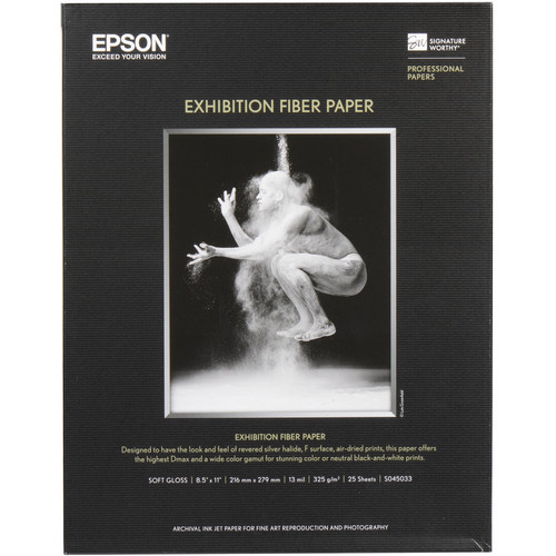
Step 2 – Use the right paper – Epson Exhibition Fiber

Epson Exhibition Fiber paper was designed to be like Silver Halide (AGX F) for the darkest blacks and the brightest whites. According to Epson, “with the introduction of EFP those using the darkroom finally had the tools to go digital.” It’s also suggested by Epson that it has the a DMAX that is better than any that could be done with AGX fiber papers (as high as 2.6 in ABW mode).

While you can definitely use other papers, I’ve been blown away with the results using this paper so it is definitely my preferred paper for black and white prints.

Step 3 – Understand How to Use the Color Controls Dialog (Color Toning & Tone Printer Color Adjustments)


Color Toning options

During my Advanced B&W Photo mode testing, I tested each of the 4 color toning options (shown above) and each of the 5 tone options (shown below in the Tone section). The color toning options are effectively presets of the horizontal and vertical values shown on the color wheel to the right of the before and after images. The results of these selections are reflected on the before and after images (by Greg Gorman), but these are not real-time applications of the color wheel values. Instead these are pre-built images that represent an approximation of what the effect will look like, so keep this in mind when making your adjustments. You may need to print to see the real impact of your changes, rather than relying on soft-proofing using the after image. It’s also important to know that these are simply presets that map to the following values:

  Horizontal Vertical
Neutral 0 0
Cool -8 -45
Warm 4 20
Sepia* 40 48

* = Sepia also sets Max Optical Density to –2

You may find that you’ll want to tweak these values for the best results given your paper choices as well. For example, printing legend R. Mac Holbert suggests using Horizontal +3 and Vertical +3 when printing on Epson Ultra Premium Photo Paper Luster, or Horizontal +1 and Vertical +3 when using Epson Exhibition Fiber paper when you are looking for a neutral color toning.


ABW Test Image 1 - Kit

I’ve had several print masters suggest (i.e., Greg Gorman, Vincent Versace, and many more) that Warm is their favorite preset. I agree that it is quite good, and I used it for the image above when printing, but it does effectively create a golden tone which isn’t always the best choice for every image. In fact,  usually find myself preferring the Neutral tone to be the most pleasing (see test image 2 below), especially when using the previously mentioned R. Mac Holbert adjustments. Please keep in mind that these are subjective comments, and your selection could vary on per image basis. You should always experiment with your own images for the color toning choice that works best for your artistic intent.

I will say that I found the Cool color toning option to be way too cool for my taste, and the sepia option was simply awful in my opinion. I personally can’t foresee a scenario where I’d enjoy using either of these modes, but you should do your own test and see which is right for images.

Tone


Tone options


ABW Test Image 2 - Zena

The default Tone value is Darker, but even Epson and several well respected print masters have suggested that darker is a poor place to start your ABW printing. After doing my own experimenting, I agree with the recommendation of Epson, Greg Gorman, Vincent Versace, and others who have all said that Dark is the appropriate default value. Using the image of Zena (shown above), I had the following observations with the different Tone values:

  Observation using Zena Image
Light Way too light in the background, but ironically for the jeans the tone is about right. Lips are too light.
Normal Pretty good - the lips and background could stand to be just a dash darker, but certainly a usable setting for this image - like the jeans better than Dark.
Dark Overall my favorite, so I agree with the recommendations. Lips starting to get a little dark and the jeans are pretty dark at the bottom - but still okay.
Darker Facial shadows getting too dark, and jeans disappearing at the bottom into darkness.
Darkest Skin tones are too dark and jeans are hard to make out at the bottom. Lips look gray and top of head is a black blob.

Unlike these Color Toning options, these aren’t presets that map to values you can adjust in the Color Controls dialog, so you must pick one and accept the changes it makes. It is for this reason that I HIGHLY recommend you chose one value and always use that value, and then modify your source image to get the desired black level. This will make your workflow much simpler should you need to do prints in the future and replicate your settings. What this exercise taught me on my own test image is that I may need to brighten up the jeans in post-processing to get the best overall result, but that Dark is the correct ABW printer driver setting.

UPDATE: These values correspond to gamma changes (i.e., 1.8, 2.0, etc…) , which is why it is okay to use something besides Normal.

Example 1: Adobe Photoshop CS4 on Microsoft Windows 7 Color Print Usage Walkthrough using Cool Tone

In this example I am using a 64-bit Windows 7 based PC to print from Adobe Photoshop CS4 (32 or 64-bit) to do a cool tone image on Super A3 (13x19”) paper fed through the rear manual feed tray on a networked 3880. The image is in the portrait orientation. Here are my printing steps:

  1. In Photoshop Print dialog shown above, we start by making sure we have the correct printer selected.
     
  2. Verify you have chosen the correct image orientation. It is CRITICAL that you set orientation (next to the Page Setup… button below) in BOTH the Print dialog AND the Epson driver – if you don’t, you’ll waste a sheet of paper.
      
  3. In this example we also are going to center the image and render it at 100%, so we clear the Scale to Fit Media checkbox.
       
  4. Make sure that Color Handling is set to “Printer Manages Colors” (for ABW ONLY)
      
  5. The Rendering Intent is supposed to be disabled, but it isn’t so choose Perceptual for Windows and Relative Colormetric for Snow Lepoard. I have reports from Epson and confirmed in my own testing that any other rendering intent can result in undesirable results.

    WARNING: Some combinations of operating systems, versions of Photoshop and Epson printers will have better results with Relative Colormetric than with Perceptual, so be sure to do an experiment with your configuration to see which works best.

    Once all of these settings are confirmed, click on the Page Setup… button and change the following:

  6. For Media Type the best choice (for something that uses the Photo Black Ink), is Ultra Premium Photo Paper Luster (because there isn’t a media type for Exhibition Fiber).
       
  7. For Color choose Advanced B&W Photo.
     
  8. For print quality, choose your desired values but for me that was 2880x1440 and High Speed On. 
       
  9. For Paper Config you are presented with this dialog which you can choose to adjust the Platen Gap to Wider if you like (I had better results with Auto):

  10. in the Mode area you should choose Custom radio button and then choose Color Controls. After this click on the Advanced… button where you’ll be presented with the Color Controls dialog shown in the windows below:

  11. In this dialog start by changing the Color Toning to your desired value. I chose Cool for this image because I wanted a subtle blue tint. However, typically I chose neutral or warm.
     
  12. From there (and order of operations is critical), I changed Tone to Dark (per Dan Steinhardt, Greg Gorman, Vincent Versace and more) as shown below:

  13. If you did everything properly, then your dialog should look like this (and pay close attention to the color wheel values of Horizontal –8 & Vertical –45 which is effectively what the “cool” preset is really doing):

Once you have all of the settings above set properly, you can simply choose to print from the aforementioned Photoshop CS4 dialog. It will launch (on Windows) your Print dialog (see below) where you simply need to confirm your printer and choose Print.

Example 2: Adobe Lightroom 2 on Apple Mac OS X Color Print Usage Walkthrough using Warm Tone

In this example I am using a Mac to print from Lightroom 2.7 to do a warm tone image on Super A3 (13x19”) paper fed through the rear manual feed tray on a networked 3880. The image is in the portrait orientation and has white borders around the source image. Here are my printing steps:

  1. As in the example above, we want to start by telling Lightroom that instead of using a paper profile that we want the Color Management to be “Managed by Printer”. This is required for Epson’s Advanced Black & White mode.
         
  2. Go to the left side of the the Print Module and click the Page Setup… button to chose your desired paper size, paper tray and orientation as shown below:

  3. The next step is to go to the Print Settings… button (the same can be accomplished via the Print… button as well). There are several pages we’ll modify in this dialog, but we’ll start with the Color Matching settings where we’ll ensure that “EPSON Color Controls ” is selected as shown below:

  4. Next up is the most important page – printer settings. For this we need to make sure that we set the Media Type to “Ultra Premium Photo Paper Luster” because that is the correct choice when using Exhibition Fiber.
       
  5. The next change we need to make is for the Print Mode where we need to select “Advanced B&W Photo”:

  6. Unlike on the PC, on the Mac we set the Color Toning to Warm (or your desired value) directly in the Printing Settings section. We also set our Output Resolution to “SuperPhoto – 2880 dpi” and check “High Speed”, but leave the other values unchecked.
       
  7. Next, you’ll go to the Advanced Color Settings tab of the Printer Settings page where the Color Toning has already been set based on the value selected on the “Basic” page.

    All you need to do here is change the Tone from the default of Darker to Dark as shown above and below:

  8. If you want to change the platen gap, then you need to go to the “Advanced Media Control” page and set it to Wider as shown below. Based on my results while making the prints for this article, I found this step was unnecessary as my best results were achieved with the default “Auto” platen gap setting. However, others have reported this is not the case (especially when doing borderless) so you’ll need to experiment and decide which is best for your printer. 

Here’s a snapshot below of the summary page with some sections opened just as a quick reference for some key settings:

Tip for Mac Users with Large Format Printers

While not applicable to the 3880, some Epson printers may have a “Process Job by Printer” checkbox under Additional Settings. IF you see this, make sure you uncheck it!


Always clear the Process Job by Printer checkbox

What about Printing in Color or using a RIP?

It’s certainly possible to get great black and white results by printing in color, but the ABW feature of Epson printers has been fine tuned to get better results. I highly recommend using this mode unless you are doing split-toning (which won’t work in Epson ABW mode) or you have created a paper profile optimized for black and white mode (outside the scope of this article).

I can say that my upcoming review of Colorbyte ImagePrint revealed some advantages over the Epson ABW mode thanks to its custom grayscale paper profiles. I don’t make the claim that Epson’s ABW mode is the only way to make great black and white prints – but I can say it’s very, very good!

Conclusion

I am very happy with Epson’s Advanced B&W Photo (ABW) printing feature when used with a Epson Stylus® Pro 3880 on either the PC or Mac platforms using either Adobe Photoshop CS4 or Lightroom 2.7. The results are consistently better than those I have seen from printing in color, or using any third party service for black and white printing (except for MPix.com’s True B&W Paper). I highly recommend it and hope this article will help you enjoy great results too.

It should be noted that I have used Lightroom 3 as discussed in this article and have been happy with the results, but for non-technical reasons I chose to do my exhaustive research with Lightroom 2.7. I have not done testing with Photoshop CS5 due to changes in the way CS5 prints, and because I simply don’t own that product yet. 

Disclosure

I may get a commission if you purchase using selected links in this article. Thanks for supporting this blog by using the links!

Thursday, August 12, 2010

Epson Stylus® Pro 3880 Review

Epson 3880 by Ron Martinsen 
Copyright © Ronald R. Martinsen – All Rights Reserved

In June I introduced you to the wide selection of Epson Stylus® Pro printers available for photographers in my Choosing the right Epson printer article. In thinking about which of those printers would appeal to the majority of my readers the most, I felt that the Epson Stylus® Pro 3880 was the best choice. The unscientific data that I have on printer sales suggests that the 3880 (and its predecessor the 3800) has been an extremely popular printer with pro photographers and advanced amateurs. With that in mind, I believe this is the Epson product that many of my readers would seriously consider to begin the exciting journey to printing their own work, so I felt it was the best product to review.

Thanks Epson and Dano Steinhardt

Epson was gracious enough to send me a 3880 for review as well as a wide selection of papers (which I’ll discuss in a future article) and extra ink. This allowed me to do some intense experimentation without worrying about wasting ink, paper or life of the printer. In fact, had it not been for Epson’s aforementioned generous support, this series would not have been possible as the level of testing I have performed specifically for this series would have been much for my personal pocketbook.

In addition to the products provided, Epson Professional Imaging Division’s Marketing Manager Dan 'Dano' Steinhardt (see Scott Kelby’s Blog and in Rangefinder & DoubleExposure), has been an incredible resource for information. Without his seemingly 24/7 support, it wouldn’t have been possible to provide you with the depth and quality of information that you’ll enjoy in the massive series of articles that will come out of my printing series.

I hope you will all enjoy this article, which is just the beginning of many for my printing series. I’ve collected mountains of data and with share many articles with you over the next few weeks.

Overview of the Features of the Epson Stylus® Pro 3880

Copyright Epson America, Inc. - Source: epson.ipressroom.com
Copyright Epson America, Inc.

The Epson Stylus® Pro 3880 is a professional printer, without question. During my research during this series (much of which will come out in future articles) I found the biggest name pro photographers in the world are using the 3880 or it’s predecessor the 3800 to print cut sheet images for customers, exhibitions, and fine art galleries.

Make no mistake, this is a first class citizen in the Epson’s Professional Imaging line-up, and one that I immediately fell in love with after my second print (more on that later).

Without repeating everything you can read on the Epson web site for the 3880, I’ll go over a few of the top features and discuss why you should care about this:

  • Epson UltraChrome K3™ Ink Technology with Vivid Magenta – These are high density pigment inks that result in a wide color gamut that dry quickly. There’s also a new magenta ink that helps to create extreme purples and blues. These are true archival inks used by many fine art master printers, so you’ll find this ink used on top quality fine art prints Its widely accepted by collectors, galleries and museums around the world. I found the blacks to be fantastic! Despite my past disdain for matte ink, I fell in love with this formula from Epson for its deep richness. The colors produced by the K3 inks were always vivid and faithful to the original. Once I knew what I was doing, I could tell right away this was far better than any ink I had ever used before. It also seemed to produce colors that were superior to those achieved from places where I had previously outsourced my photo printing.

    Click here to view print permanence data at Wilhelm Imaging Research for the Epson Stylus Pro 3880.
  • MicroPiezo® AMC™ Print Head Technology – This is a tiny one inch print head that allows such small dense drops that a maximum resolution of 2880x1440 is possible. I personally felt like I could tell the difference and see an improvement with the 2880 x 1440 dpi over the 1440 x 720 dpi resolution printing on some images when using high quality fine art paper. This is a true testimony as to the quality of both the print head technology and brilliant screening technology.

    MicroPiezo® print head technology results in extremely fine details being rendered with exceptional clarity at a reasonable speed thanks to its bi-directional support. In fact, in my testing I saw no disadvantage whatsoever to using bi-directional versus uni-directional printing so you can effectively print twice as fast with no loss in quality.
  • AccuPhoto™ HD2 Screening Technology – The quality of the screening technology is what separates one printer and/or brand from another as the better the screening, the better the tonal contrast, gradients, etc…. This technology was created from a collaboration of Epson and the Rochester Institute of Technology's Munsell Color Science Laboratory to build a complex mathematical architecture that produces results that many argue are the best of any printer manufacturer in the world. This technology allows for resolution density compensation so that only a single ICC profile is needed per media type, and it helps to create the rich color gamut and smooth transitions that Epson has become famous for.
  • Auto-Sharing Photo and Matte Black Ink – This means that you can load both Matte and Photo black ink into the printer and never have to physically swap the cartridges in and out (as was required by some printers in the past) when choosing to create prints that required a black ink change. With this feature, you can now let the printer do the work of the ink swap and always have the correct ink choice automatically loaded for the paper you are using.
  • Professional Media Handling – This printer can hold media as thick as 1.5mm poster board, yet still do 4x6 prints as well. In fact, it can even do border-free printing on cut sheet paper ranging from 4x6” to 17x22”. Since borderless cut sheet not possible on most wide format roll paper printers, it’s common for many master printers to own the 3880 in addition to their larger roll printer. For those using the 3880 for business duty (i.e., high end color reports), it can even hold up to 120 sheets of plain paper or up to 20 sheets of photographic paper making it an excellent overall printer.
  • Automatic Print Head Alignment and Nozzle Check Technology – Built-in sensors can read printed data to ensure proper print head alignment and nozzle head clogging and correction. Unlike some other printers, I’ve had numerous reports during my series investigation that the 3880 (and its predecessor the 3800) has been a workhorse for years for many printer masters and head clogging simply hasn’t been an issue with this model.
  • Epson PreciseColor™ Manufacturing – Put simply, Epson has developed a process for manufacturing that ensures that there is consistency from printer to printer and it goes a step further by calibrating every printer before it leaves the factory. This eliminates the need for costly internal calibration devices/procedures and ensures consistent results over time.

Installation

When this printer arrives, I recommend you get some help hauling it to its destination as the physical dimensions of the box can put a strain on your back if you try to do it alone. Once you have it in place and remove the printer from its box, you begin the joy of removing what seems like a hundred pieces of blue tape and widgets that all keep this printer safe and sound on its voyage to get to you. I estimate it took me about 15 minutes from the time I carried the package up to my studio until I had it on my desk, so unpacking will take a little bit of time.

This is a desktop size printer, for those with a big desktop. It’s 27 inches wide by 15 inches deep and weighs about 44 pounds, so don’t plan on putting this on your unstable particleboard table that’s falling apart, or one of those school cafeteria-style tables. Instead, I recommend that you put it on a sturdy desk designed to handle a minimum of 100 pounds (for added stability), and plug it in to a reliable power source. Personally, I chose to plug my 3880 into a uninterruptable power supply (like this) to avoid any damage to the printer in the event of a power failure while it was printing. I’d also recommend making sure the printer is out of direct sunlight and in a climate controlled environment that is not plagued with dust. In short,  I wouldn’t recommend putting it in an unfinished basement or garage without climate control.

USB Connection

For half of my testing I was connected via a USB cable to one of my Windows 7 (64-bit) based computers. I setup the printer using the latest software found here instead of using the supplied discs, because I wanted to make sure I had the latest versions of everything I needed.  Epson strongly recommends this practice, so file the disk away and get the latest drivers from the web at proimaging.epson.com.

The printer setup went flawlessly and I was printing within about 5 minutes after connecting it. I also tested this setup using an Apple MacBook Pro via a USB cable, and it took me about 15 minutes to get it setup (partially due to my being unfamiliar with that platform).

Networked Printing

image

I also decided to connect the printer directly to my router so I simply removed the USB cable, plugged a cable into the 3880’s Ethernet port of both my printer and router. Since I was using Windows 7, I just went to Start | Devices and Printers and choose Add a Printer from the toolbar. I selected networked printer and it automatically did a search for networked printers and identified the 3880.

Ignore a lot of what you see in the image above, but the important part is that the item in the list that has an IP address (i.e., the one with numbers with dots). It was the correct option to select, so if you are confused this is a good way to know which one to select. After clicking next this I just stepped through the remainder of the wizard and chose the Epson 3880 driver that I already had installed (when I was connected via USB) and it did everything else for me. Total time spent was about 10 minutes because for the first 8 minutes I tried to do things the geek way and it didn’t work.

 clip_image001

On the Mac the installation was equally easy as the only “trick” was to pay attention to the “Kind” column and select the one that reads TCPIP as shown above. After doing that and clicking Add, I was printing in no time.

Performance-wise there is no difference between USB and Ethernet, but if you are running a cable from your computer to your printer past 15 feet then you should use the Ethernet connection. Both can be used to share the printer on your network, so either option works just fine. USB is easier, so I’d do that unless you have a specific need to put it on the network directly. Even if you want to use the network connection, I found the setup easier with USB so I’d start with that and then do the networking option second just so you can fall back to USB if you have any networking problems.

The Joy of Printing on the 3880

Mouse over to see my first print, mouse out to see the source image
Hover over to see my poor first print – can anyone say RTFM?

Like most geeks with A.D.D., I tinker first and read directions later. This usually results in some trial and error mistakes, but it is also a true testimony as to how good (or bad) of a job a company has done in making their product user-friendly (at least for geeks). This is why I did my first print using the Epson Premium Luster Photo paper 10-pack that was included with the printer. I failed to notice the words “FOR USE WITH AUTO HEAD ALIGNMENT DURING PRINTER INSTALLATION ONLY” and I didn’t know what to set for the Photoshop and Epson driver settings, so I just took an educated guess. The result was that I guessed wrong and got a perfectly horrible print (hover over the image above to see the print results).

Now what happened with my first print is probably not a common experience, but I always like to test products this way to see if things are brain dead simple. Honestly I knew that printing is a complicated process, but I thought that it probably wasn’t as hard as everyone make it out to be. In reality it isn’t, but there are a few key things you’ve got to keep in mind when making your own prints. If you get these things wrong you’ll get horrible results as I did, which is why I’m happy to make plenty of new user mistakes on your behalf so you don’t have to.

Sample Print Settings

I’ll go deeper into the details of how to make great prints in many of the upcoming articles (including my Printing 101 article), but for those of you who can’t wait that long here’s a few simple tips to help get you started so you don’t end up with ugly prints like I have above:

  1. In Photoshop (Lightroom will be discussed in Printing 101), you should almost always choose “Photoshop Manages Colors” for Color Handling (as shown above in Photoshop CS4) if you intend to use paper profiles and do soft proofing. The exception to this generalization is when you are printing using the Epson Advanced Black & White mode where you will choose “Printer Manages Colors”. This printer does an amazing job using its own settings without using paper profiles, but for the best possible results they are definitely the way to go.
  2. The next most important thing to do is to choose the paper profile from the “printer profiles” list. This can be a little cryptic at first, but the quality of your print depends on the selection you make here (and the quality of that profile) so DO NOT get this step wrong. In short, you want a profile that is an exact match for the paper you are using (see my ColorMunki article to see how to create your own custom printer profile for your paper). When I discuss papers later in this series, I’ll be sure to mention and link to the paper profile that is appropriate for the paper discussed as well as step-by-step screen shots of how to get great results with that paper. For the sample paper that came with my printer, the correct choice was “Epson Stylus Pro 3880_3885_3890 PremiumLusterPhotoPaper”.
  3. Next up is Rendering Intent, for which I find Relative Colormetric to be the most accurate to my on-screen colors and artistic intent. On other printers I’ve found Perceptual to be better, and despite the technical differences between these choices (and heated internet forum arguments), it really boils down to user preference as to which one is right for you. The standard recommendation is to try both and choose your favorite, and for me that’s Relative Colormetric on the 3880. You should always soft proof to help you decide as you may also change your mind based on the content of the image as this is a generalization – not an absolute rule. Some people also prefer Perceptual for photographs which include people, but there’s no one size fits all rule. No matter which rendering intent you choose, ALWAYS make sure that black point compensation is checked.
  4. After Photoshop looks setup properly, click on the Page Setup button (under Copies in the top left of the dialog above) and turn off Color Management in the Epson driver by choosing the Custom mode (under print quality in the Main tab) and select “Off (No Color Adjustment)” from the list as shown below. While in this dialog you must also make an accurate media selection type which can sometimes be tricky. I chose the closest choice, Ultra Premium Photo Paper Luster, and I made sure the Page Layout tab had Landscape orientation selected for this photo (CRITICAL – both Photoshop AND the driver must be set properly). I also almost always choose the “Reduce/Enlarge” option to ensure my image is scaled to fill the page.

Main Settings Example Page Layout Example

There’s a lot more to it than this that I’ll discuss in my printing 101 article, but this is the gist of what’s required. Once you get the hang of how to dial these settings properly you can easily make great prints.

For fun, when I did my second print I just chose to let the printer manage color and chose some of the auto settings. Honestly the results were pretty good, and as I discovered when interviewing some great master printers for this series – it isn’t unheard of for people to actually skip paper profiles and just use these settings instead. I wouldn’t say that the built-in printer managed color settings are appropriate for the highest quality fine art print work, but my wife couldn’t tell the difference between this simplified method and the correct/optimal method using printer profiles so your customers may not either.

Advanced Black & White Mode

Settings or a warm toned black and white image

Epson’s are famous for phenomenally good black and white images, and the key to that is their Advanced Black & White mode (a.k.a., ABW). I’ll dive deeper into how to use this feature in an upcoming article, but both Greg Gorman and Vincent Versace (who will be featured in this printing series) have suggested choosing the “Warm” Color Toning option and “Dark” tone as a good starting point for a nice warm black and white image. It should be noted that when you select the Dark tone, your Color Toning option will change to “Current Settings” – this is okay as long as the color wheel shows “Horizontal 4” and “Vertical 20” for its settings (which is all that the Warm preset does). For those who like a more pure black and white, just experiment with the Neutral and Cool color toning presets as a great starting point. While real-time preview on your own image isn’t supported, a nice sample image taken by Greg Gorman is provided to give you an idea of the effects of your adjustments.

Loading the paper

Copyright Epson America, Inc. - Source: epson.ipressroom.com 
Copyright Epson America, Inc.

This printer supports loading cut sheet paper via three paper paths: front, rear and auto. Auto (shown in the above image) is the easiest and most flexible as it supports multiple pages in a wide variety of sizes. However, it isn’t suitable for all papers. For example, some fine art papers such as Watercolor Radiant White and Velvet Fine Art require the rear paper path only. I flagged page 29 of my manual’s “Choosing the Correct Paper Path” section as it lists a wide variety of media and what paths are suitable so I could make sure I chose the correct option when using a new paper. Epson papers also include a document with them which will tell you the appropriate settings, so make sure you are using the correct path for your paper to get the best result. Videos for loading fine art paper and loading matte canvas paper are available on Epson’s web site.

During this printing series, I found myself usually just doing one print at a time so I found the Rear paper path to be just as easy to use as the Auto Sheet feeder and it worked with almost every paper that I had on hand. For thick media that can’t bend through a paper path, such as poster board, the front option is available but it is the most challenging to use. When using the Auto sheet feeder to do multiple sheets (generally when I was printing with Luster), I found it useful to pull out the edge guide (consult your manual) on the right hand side of the rear loading tray to ensure that the paper was straight. The auto feeder worked fine and I loved how you could close the front and rear trays to close the printer up to protect the inside from dust.

I successfully printed borderless prints as small as 4x6 inches and as large as 17x22 inches without any problem at all. I found that using white “parade gloves” to be very useful to keep the oils from my hands from soiling the paper (which can have a negative impact on the ink absorption into the paper), but it was tricky to grab the paper with them on. In talking with a handful of printers, most only use gloves when doing limited run fine art prints which will sell for money that most of us could only dream of. 

As I mentioned in the previous section, the only important thing to remember is that you must choose the correct orientation for your print in both the Photoshop/Lightroom dialog AND the Epson printer driver dialog, or you’ll get undesirable results.

Canvas Media – Warning kids, don’t try this at home

Despite advice from multiple sources that said don’t try canvas, I tried the 17x22 Premium Canvas Matte anyway. As I had been warned, it proved to be very difficult to work with. The paper includes instructions for the 3800, but not the 3880, which should have been my first clue that I was heading down the wrong path.

The instructions say to use the rear sheet feeder, so I gave that a try. Even the instructions suggest the process will be difficult and take multiple attempts. On my first canvas print, after about 10 tries I gave up and went to the front loading setup, which proved to be very difficult as well. Ultimately I loaded the canvas through the rear exit to get it to do what I was needed by the rollers in the front. Once I had the paper loaded, the correct profile downloaded (for the 4880, not the 3880 as no 3880 profile was available when I wrote this article), I proceeded to change the driver settings per the instructions included with the paper. That went mostly well, except for when I chose the paper size in the driver. It would let me choose 17x22, but then it would force me to choose a smaller size for the output size. In the end I did what I thought was right (like my first print) and got the same kind of abysmal results that I did for my first print. I ended up with a print that was about the size of a legal sheet of paper in the bottom left corner of the landscape orientation about 2 inches from the bottom and 4 inches from the left.

When I talked to Epson about the problems I was having, I was told to watch this video on loading matte canvas paper. It didn’t really help a lot, but it gave me confidence that it was possible so I tried to do three more canvas prints. I managed to get the paper loaded in as little as 3 attempts – twice, and 10 attempts on my last go round. I have an incentive to make this work and was in no hurry, so I’m guessing that many of my readers would be very annoyed if they tried to load canvas into the 3880 rear feeder. 

I was given advice to:

… run another test with the Matte Canvas on the 3880 try using the Ultrasmooth Media Selection and for this particular product try running in the automatic mode vs a profile and let me know what you think.

The only Ultrasmooth option I saw was Ultrasmooth Fine Art Paper, so I chose that and tried doing “Printer Manages Color” with both the sRGB and Adobe RGB Color Adjustment Modes. The results sucked (incorrect color), but were good enough that with some image adjustments I could make it work. Now keep in mind this is an image that has been printed successfully on 16x24 canvas prints many times as it exists now, so theoretically no adjustments to the image should be required. My prints were printed successfully as full page borderless but my colors were always off. I decided to print using the 4880 paper profile again, and tweaking the image via softproofing, but the results were poor enough that it was clear to me that the 4880 paper just doesn’t work. I also tried printing my test print which has been highly optimized for this series and printed about 40 times on two different printers, and even it came out looking bad.

Epson reps say that loading paper via the rear feeder can be done repeatedly in one try. I didn’t find that to be the case, so I’ll leave it as an exercise to the reader if you want to try for yourself. They also say they get great prints on Canvas with the 3880, and I think if you build your own paper profile with a ColorMunki or better then you could too. In the end, I’m sure determination will win and you can get decent results with canvas with the 3880, but I strongly recommend you consider a roll feed printer like the 2880, 4880 or ideally the 7900 if canvas printing is important to you.

Stepping Down from the 3880

When you look at the Epson Pro Imaging website, you don’t see the R3000, but according to Dan “Dano” Steinhardt Marketing Manager, Professional Imaging for Epson America, Inc. this a great printer that produces pro-quality results for an affordable price. The reason why it doesn’t get the “pro” designation is because it lacks a maintenance tank and it is built for a lower volume usage than the pro series. With a maximum print size of 13x19” it may be all that many need to create their favorite print sizes with quality that is on par to the 3880 because it uses the same UltraChrome K3 with Vivid Magenta Ink and shares the same Advanced MicroPiezo® AMC™ print head with ink repelling coating technology. It’s also the only printer in this article that features WiFi networking which is a huge advantage.

Learn more here or buy one today at B&H & Adorama or consider other Epson models by reading my article on Choosing the right Epson printer.

Stepping Up from the 3880


4900 Image Copyright Ron Martinsen
7900 image - Copyright Epson America, Inc.

If you are like me, you’d rather spend a little extra cash and get “the best” rather than having buyers remorse later, then the 4900 might be the right printer for you. It features the best printer head technology and inks that Epson offers in an all-new design that is a big step up from the 3880. It’s a heavy printer and requires a lot of space, so don’t plan on putting it on your desktop (or reusing your 4880 stand), but if you’ve got the space then you can get the best prints Epson has to offer for a reasonable price.

At 54 inches wide and 187 pounds, the 7900 is a huge printer, so space considerations should certainly be noted when making your decision. However the 4900 isn’t exactly tiny either and it is generally recommended that you put it on a dedicated table rather than on a desk.

Buy a 4900 online at B&H & Adorama. You can find a 7900 online at B&H. Washington state residents should also consider the JVH Tech for all their professional printing needs. If you are still unsure consider other Epson models by reading my article on Choosing the right Epson printer.

Conclusion

Before I took on this series, I was already considering purchasing an Epson 3880. However, like many of you I had been so disappointed with the experiences I had with cheap sub-$100 ink jet printers. I really feared that I’d be wasting my money and end up with prints that weren’t as good looking as the online services, on paper that wasn’t as nice, and it’d be a royal headache that just resulted in a piece of junk with clogged heads that collected dust in my closet (like all of my other ink jet printers). After all, by my calculations I averaged at least $50 per 4x6” print on my cheap printers when you calculate the total cost of ownership before they died, so why would this be any different? How could I, someone who knew nothing about printing, get results better than Mpix.com, Millers Lab, Ez-Prints, Shutterfly, etc…?  Boy was I wrong!!!!

The realty I’ve discovered during this printing series is that it is very easy to get print results better than any I’ve ever seen from a third party before because I care more about my prints than any third party ever will. I will take the time to make sure I’m using the best paper profiles and driver settings for my images. I can soft proof my images, and when necessary make corrections to them to optimize my image for printing.

I can use the finest papers on the market and create amazing prints, yet the total cost is significantly less than a third party. For example as of August 8th, 2010, JVH Tech lists the costs of ink for the 3880 at 68 cents per ml and the most expensive 17x22” cut sheet paper (Epson Ultra Smooth 325gsm/19mil @ $177 for 25 sheets) at $7.08 a page. If I take my biggest print job so far which used about 3.9ml of ink, that’s $2.65 (0.68 x 3.9) in ink. Add that to the $7.08 for the sheet of the best possible Epson paper and you get a total cost of $9.73. So for less than ten bucks you get a huge borderless print on paper that is probably greater than anything you’ve ever held in your hands, and exponentially more expensive than anything you’d typically get from an online service, so it’s actually a pretty good deal!

The best part about self-printing is that once you figure out how to print properly, you can rest assured that the quality will be amazing for the prints of your best images, you don’t have to worry about transit damage, and you get instant gratification!

image

I haven’t had any clogged heads, so I’ve not been wasting ink on head cleanings as I had feared based on my experiences with older print head technologies. I’ve not needed to do a print head alignment as the results straight out of the box have been perfect (but I’ll be doing one soon just to make 100% sure that I’m getting the best results possible for this series). Despite doing over 50 prints, most of which have been borderless on fine art paper, including 17x22” (x9) and 13x19 (x28) prints covered in ink, I still have a lot of ink left (see above). I’ve also discovered that it’s the paper, not the ink, that is the major consumables expense in printing so my fears of “wasting ink” and worrying about replacing the ink cartridges have been unfounded.

Areas of Improvement

My biggest grip about this printer is that it doesn’t offer a dedicated line for the matte and photo black inks. This omission means that only one of these two inks can be active at a time, and when you choose to print a photo that uses the ink that is opposite of the active ink tank an automated ink switch has to occur. According to the Detailed specifications tab on the Epson 3880 website, the switch from Matte to Photo Black ink takes 3 minutes and 30 seconds and uses 4.6ml (about $3.30 in ink using current JVH prices). The switch back from Photo Black to Matte takes takes 2 minutes and 30 seconds and about 1.6ml of ink. Using a dedicated line like that found on my Canon imagePROGRAF 6300 (or the 3880’s competitor  – the 5100) there is zero time or ink lost in printing images using the different black ink types. I’d love it if Epson printers did the same thing!

I also don’t get the maximum size of 17x22. Digital cameras have an aspect ratio that would suggest that 16x24” or 17x25.5” would make more sense as a the maximum print size from a printer of this type. Now one could argue about sizes available from the paper industry, frame industry, leaving borders for framing, etc… but I say phooey. Give me a printer that is optimized for the aspect ratio of my digital camera, much as Scott Kelby discusses in this interesting article on his blog.

Naturally, it would be great to see a replacement for the 3880 hat is updated to feature the improved inks and print head technology found in the new 4900/7900/9900 series, so I’m hopeful such a product will be created like that one day. 

These quibbles aside, I am happy that Epson has offered so much in such a decent size package at a reasonable price. I also agree with the decision to keep the size down and their offering roll printing in the next step up.

Where to Buy

If you decide to purchase a 3880 online, I highly recommend Amazon, B&H or Adorama as that is where I make nearly all my online photography product purchases. Washington state residents should also consider the JVH Tech for all their professional printing needs. If you are still unsure consider other Epson models by reading my article on Choosing the right Epson printer.

Other Printing Series Topics

Check out the Printing Series link at the top of this page for a large collection of great printing series articles, and stay tuned for my Printing 101 eBook very soon.

Here’s a few other Epson related articles on this blog:

and more from Epson Stylus Pro Photographers:

Disclosure

As mentioned at the beginning of the article, Epson was extremely generous in providing me with a 3880 to review as well as extra ink and a huge selection of papers (which will be reviewed separately). Dano also provided me with an extensive amount of direct technical support which the average customer wouldn’t likely enjoy, but was necessary so I could make fast progress for this review. Epson was allowed to proofread this article for technical accuracy, but did not interfere with my content or conclusions. Epson has not paid to appear on this blog. I will get a commission if you use the sponsored product links (i.e., Amazon, Adorama or B&H’s websites) and make a purchase. Thank you for supporting this blog by using my links when you buy your printer, paper and supplies!

Friday, July 23, 2010

Epson Printing Series: Dano’s Dictionary of Fine Art and Photography Printing Terms (Concise Edition)

The following “dictionary” comes directly from Dan 'Dano' Steinhardt’s, an Epson Professional Imaging Division’s Marketing Manager, personal Dictionary of Fine Art and Photography Printing Terms. He has collected these terms as he’s learned them from others over the years. For the sake of trying to reduced the volume of information in this list, I have removed some definitions (hence the Concise Edition) which I’m sure at some point I’ll find myself adding back in.

Dano is a humble guy who acknowledges others who have educated him along the way. However, he is a true technical master of fine art printing that many photography legends (i.e., Greg Gorman, Douglas Dubler, Vincent Versace, etc…) have referred me to in my printing journey.

Terminology

Abrasion Resistance

The resistance to scratching of a surface of paper by other paper surfaces or other materials.

Absorbency

The ability of a material to take up moisture.

Acid Free

(Neutral pH of 7.0) During paper production, treatment employed with a mild base is employed to neutralize the natural acids occurring in wood pulp.  Buffering may also be used to prevent the formation of additional acids. If prepared properly, papers made from any fiber can be acid free.

Achromatic

Black, white and greys. Artwork that is executed without color. Also called monochromatic.

AP

Abbreviation for artist's proof.

Archival

Term with no definitive scientific meaning.

Artist's Proof

Traditionally, proofs pulled by the artist over and beyond the regular numbered edition, reserved for the artist's use. Now often used to designate any proofs pulled over and beyond the regular edition, whether printed by the artist or by his printer, but reserved for the artist's use.

Basis Weight

In the United States and Canada, the weight, in pounds, of a ream (500 sheets) of paper cut to the basic size. Also called ream weight and substance weight (sub weight). In countries using ISO paper sizes, the weight, in grams, of one square meter of paper. Also called grammage and ream weight.

Bleed

To extend the print image to the edges of the paper.

Brightness/Whiteness

Brightness is a measurement originally developed to monitor pulp bleaching. There are two predominant scales for conveying brightness: GE and European. Whiteness is a measurement taken by shining a bright light source onto a sample of paper. An electronic sensor takes a reading of the color of the reflected light—or whiteness.

Bronzing

The effect of seeing a flash of bronze color reflecting off pigment inks. Sometimes confused with gloss differential.

Calendering

The process of smoothing the surface of the paper by pressing it between rollers. Uncalendered papers — those not made smooth by calendering — have a less smooth texture.

Caliper

The measurement of thickness of paper expressed in thousandths of an inch or mils (millimeters).

Carbon black

A pigment made of elemental carbon and ash.

Cast-coated Paper

High gloss, coated paper made by pressing the paper against a polished, hot, metal drum while the coating is still wet.

Certificate Of Authenticity

The "cert", as it is called, is a statement issued originally by the publisher stating the total edition size, the edition number of the piece being sold, the year published, the fine art printer and the medium.

Chop

A printed or stamped symbol used by the printers and print workshop (and sometimes by artists and collectors) as a mark of identification. The chop may be inked or merely embossed.

Cold-pressed paper

A more textured watercolor paper. Cold-pressed paper offers more "tooth".

Colophon

A printers' or publishers' identifying symbol or emblem.

Colorants

Materials used to produce color, such as dyes, inks, pigments, toners, or phosphors.

Colorfast (Lightfast)

A paper color that is resistant to fading due to aging, or the action from external agents such as light, acids, heat, chemicals and other adverse conditions. Lightfast and sunfast are variations of the term.

Continuous-tone

All photographs and those illustrations having a range of shades not made up of dots, as compared to line copy or halftones. Abbreviated contone.

Deckle Edge

The irregular edge of handmade paper formed in a deckle by tearing.   After tearing, a bone knife is used to smooth the edge and create the deckle edge look.

Dot gain

Term used to describe the difference between the requested and the actual printed dot size. In inkjet printing, causes are dust on the surface of the paper that causes the ink to spread, and ink bleeding. On presses, a whole slew of mechanical, optical, and chemical factors can cause the dot size to increase, and in print manufacturing, the term "dot gain" is slowly being deprecated in favor of the term "Tone Value Increase" or TVI.

Double Bump

To print a single image twice so it has two layers of ink.

Dull Finish

Any matte finished paper.

Dummy

Simulation of the final product. Also called mockup.

Dutch

Any deckle edged paper, originally produced in the Netherlands.

Edition

In visual arts, an edition is a set of duplicate prints or casts of a particular image. The types of reproduction that the term edition refers to can be offset-lithography, lithographs, serigraphs, etchings, offset-lithography or cast sculpture. If the number of prints to be produced is unlimited, the edition is usually referred to as an open edition, whereas, if the number if prints is predetermined and limited, the edition is then preferred to as a limited edition.

Edition Size

The size of an edition is the TOTAL number of pieces printed by the publisher and includes all artist proofs (AP), printer's proofs (PP), "Roman numeral" pieces and all other pieces signed and numbered of that image. Therefore, though your piece may have an edition number of 150/295, the TOTAL edition size may be substantially higher than 295, depending on the number of AP's, PP's, etc.

Emboss

To press an image into paper so it lies above the surface. Also called cameo and tool.

English Finish

Smooth finish on uncoated book paper; smoother than eggshell, rougher than smooth.

Equivalent Paper

Paper that is not the brand specified, but looks, prints and may cost the same. Also called comparable stock.

Facsimile Reproduction

Making an exact copy of a work of art

Felt Finish

Soft woven pattern in paper.

Film Laminate

Thin sheet of plastic bonded to a printed product for protection or increased gloss.

Fine Art

A term used to refer to fields traditionally considered to be artistic. "Fine art" is a distinction referring to its aim to be purely aesthetic, having only the purpose of inspiring or stimulating the viewer's emotions. Crafts, on the other hand, are more commonly used as simple decorations or made to serve a practical purpose.

Fine Papers

Papers made specifically for writing or commercial printing, as compared to coarse papers and industrial papers. Also called cultural papers and graphic papers.

Finish

(1) Surface characteristics of paper. (2) General term for trimming, folding, binding and all other post printing operations.

Finished Size

Size of product after production is completed, as compared to flat size. Also called trimmed size.

Fuzz

A term for the fibers that project from the paper surface.

Gallery

A building, an institution, a room or a website used for the exhibition/display and or sale of artistic work.

Gallery Proof

A print set aside for a Gallery's use; usually for display purposes.

Giclée

A French word which loosely translates to "little squirt" or "to spray".   Its a marketing term with no definitive meaning.

Grain Direction

Predominant direction in which fibers in paper become aligned during manufacturing. Also called machine direction.

Grain Long Paper

Paper whose fibers run parallel to the long dimension of the sheet. Also called long grain paper and narrow web paper.

Grain Short Paper

Paper whose fibers run parallel to the short dimension of the sheet. Also called short grain paper and wide web paper.

Grammage

Basis weight of paper in grams per square meter (gsm).

GSM

(Gram per square meter) The gram weight of a hypothetical square meter of a particular type of paper, a good comparative measurement because it does not vary with sheet size.

Hand-Enhance

See Unique.

Hickey

A term used to describe the effect that occurs when a spec of dust or debris adheres to the printing plate and creates a spot or imperfection in the printing.

Hor commerce proof

(French, "not offered for sale") A proof of a completed print (aside from the edition) that is not intended for sale and is marked "hors commerc" or "h.c." such proofs are sometimes retained as archival impressions by the artist or the publisher, or are used as demonstration proofs in marketing the edition.

Hot Pressed

A paper surface that is smooth, produced by pressing a finished sheet through hot cylinders.

Ink holdout

A quality of paper to be resistant to ink absorption, allowing the ink to dry on the paper surface.

Laid finish

A parallel lined paper that has a handmade look. Laid lines are close together and run against the grain; chain lines are farther apart and run with the grain.

Lamination

Bonding one product to another by pressure for protection or appearance.

Landscape

Artistic style in which width is greater than height. (Portrait is opposite.)

Lay Edge

The edge of a sheet of paper feeding into a printer.

Lignin

Substance in trees that holds cellulose fibers together. Lignin causes papers to yellow if not removed.

Limited Edition Print

An edition of identical prints, numbered sequentially and individually signed by the artist, having a stated limit to the quantity in the edition.

Linen

A paper that emulates the look and texture of linen cloth.

Linting and Surface Contamination

Problems occurring when lint, paper fibers or other surface contamination causes spots or uneven inking when printing.

Lithography/Litho

A printing process in which the image to be printed is rendered on a flat surface, as on sheet zinc or aluminum, and treated to retain ink while the non image areas are treated to repel ink. Also see Offset

Machine finish

A paper finish that results from the interaction of the paper with the Fourdrinier process as opposed to post machine embossing.

Matte finish

A coated paper finish that goes through minimal calendaring.

Machine Glazed (MG)

Paper holding a high-gloss finish only on one side.

Margin

Imprinted space around the edge of the printed material.

Media

Primary or underlying material on which other materials (such as ink, coating, paint, or treatment) are applied, or from which other materials are made. Also called Substrate

Metamerism

Often confused with metameric failure, metamerism is the phenomenon that makes all color matches possible. Sample metamerism is a psychophysical phenomenon commonly defined as the situation when two samples with different spectral reflectance curves produce a visual color match under one light source but fail to do so under another. Observer metamerism describes the phenomenon where two observers see the same sample as having a different color: comparisons of the difference between the way our eyes see a color and the way a camera sees color are examples of observer metamerism.

Metameric Failure

The inability of color samples to maintain a color match under different light sources. Often, when people talk of metamerism, they’re really describing metameric failure. Metameric failure is often seen with pigment ink prints where the ink pigment, often yellow, appears green under daylight or magenta/red under tungsten light.

Mock Up

A reproduction of the original printed matter possibly containing instructions or direction.

Modern Art

The general period from 1905 to 1955, when Pop Art ushered in the postmodern period in art.

Mouldmade Paper

Paper made by a slowly rotating machine called a cylinder-mould that simulates the hand paper-making process. Fibers become more randomly intertwined in machinemade papers, producing a stronger, more flexible sheet or roll.

Mottle

A term used to describe spotty or uneven ink absorption. Also called sinkage. A mottled image may be called mealy.

M Weight

Weight of 1,000 sheets of paper in any specific size.

Museum

A building, place, or institution devoted to the acquisition, conservation, study, exhibition, and educational interpretation of objects having scientific, historical, or artistic value.

Nominal Weight

When the basis weight of paper differs from the actual weight, the term nominal weight is used.

Natural

A term to describe papers that have a color similar to that of wood; also called cream, off-white or ivory.

Offset

In commercial printing, a widely used technique in which the inked image on a printing plate is imprinted on a rubber cylinder and then transferred (offset) to paper or other material.

Opacity

Quality of papers that defines its opaqueness or ability to prevent two-sided printing from showing through.

Opaque

A quality of paper that allows relatively little light to pass through.

Open Edition

An edition issued without limit, individual number, or artist's signature.

Out-Gassing

A phenomenon where the humecitant or anti-drying agents in inks come out of the print and are deposited on a surface such as the glass in front of a framed print.

Overlay

Layer of material taped to a mechanical, photo or proof. Acetate overlays are used to separate colors by having some type or art on them instead of on the mounting board. Tissue overlays are used to carry instructions about the underlying copy and to protect the base art.

Overprint

To print one image over a previously printed image, such as printing type over a screen tint. Also called surprint.

Pigment Print

A print made using inks based on pigment instead of dyes. Pigment prints are considered longer lasting.

Pica

A unit of measure in the printing industry. A pica is approximately 0.166 in. There are 12 points to a pica.

Picking

Phenomenon of ink pulling bits of coating or fiber away from the surface of paper as it travels through the printer, thus leaving unprinted spots in the image area.

Plate Finish

Any bond, cover or bristol stock with an extremely smooth finish achieved by calendaring.

Pleasing Color

Color that the customer considers satisfactory even though it may not precisely match original samples, scenes or objects.

Point

(1) Regarding paper, a unit of thickness equating 1/1000 inch. (2) Regarding type, a unit of measure equaling 1/12 pica and .013875 inch (.351mm).

Pop Art

A school of art that emerged in the United Kingdom in the 1950s and became prevalent in the United States and the United Kingdom in the 1960s; it imitated the techniques of commercial art and the styles of popular culture and the mass media

Portrait

An art design in which the height is greater than the width. (Opposite of Landscape.)

Poster

An artistic work, often a reproduction of an original painting or photograph, printed on a large sheet of paper that carries limited value. Can also be a reproduction from an original commercial painting or drawing.

Postmodernism

Late-twentieth-century critical, literary, and performance movement that reacts to modern art and literature; postmodernists suggest that truth is no longer verifiable, and that new art forms are best created by freely mixing previous styles and themes.

Preferred Portfolio Edition

Print editions designated by the artist and intended to be presented and contained in a portfolio or folio collection of prints.

Presentation proof

Proofs pulled over and beyond the regular numbered edition which are distributed at the artist's discretion.

Principal Portfolio Edition

See notation above for Preferred Portfolio Edition.

Print

Any type of analog or digital output used in any art form. Graphic Print used to connote collectable works of art that have been reproduced vs “Print” which tends to mean a photograph.

Print Permanence

Print permanence refers to the longevity of printed materials, especially photographs, and preservation Issues. Over time, the density, color balance, luster and other qualities of a print will degrade. The rate at which deterioration occurs depends primarily on two main factors: the print itself, that is, the colorants used to form the image and the medium on which image resides, and the type of environment the print is exposed to. For ink jet prints, dye-based inks generally last longest when used with specific paper types, whereas pigment-based inks can be optimal on more types of paper. Ink jet paper types include swellable paper, porous paper, and cotton fiber paper. Environmental factors that hasten the deterioration of a print include exposure to heat, ozone and other pollutants, water or humidity, and high levels of light. Though light-induced fade often gets the most publicity, greater than 90 per cent of consumer prints are stored in the dark where the effects of heat, humidity, and/or pollutants can dominate. While ISO (International Organization for Standardization has developed standards for the testing of image permanence, those standards have yet to be extended to digital print output, though the organization has signaled its intent to provide such standards.

Proof

Test sheet made to reveal errors or flaws, predict results from the printer and record how a printing job is intended to appear when finished.

Publisher

In the fine art world the publisher is the company who contracts with an artist to print an edition. The publisher is usually responsible for the printing and the marketing of the artist's work. By printing an edition, many art collectors are able to enjoy the same image, and at a greatly reduced price from the original painting.

Published Edition

This is the regular edition of each print, numbered in arabic numerals.

Quarto

(1) Sheet folded twice, making pages one-fourth the size of the original sheet. A quarto makes an 8-page signature. (2) Book made from quarto sheets, traditionally measuring about 9' x 12'.

Rag paper

Papers with a complete or partial content of cotton fibers.

Replacement Proofs

These proofs, pulled over and above the published edition, are unnumbered duplicates intended to replace prints which may become damaged in shipment, handling, etc.

Reproduction

The term used to refer to the copy of a fine art piece. A reproduction could be in the form of a print, like an offset-lithographic print, an inkjet print on different substrates or even reproduced in the same medium as the original, as in an oil painting.

Register

To place printing properly with regard to the edges of paper and other printing on the same sheet. Such printing is said to be in register.

Register Marks

Cross-hair lines on mechanicals and film that help keep flats, plates, and printing in register. Also called crossmarks and position marks.

Satin Finish

Alternate term for dull finish on coated paper.

Score

To compress paper along a straight line so it folds more easily and accurately. Also called crease.

Screen Printing

Printing technology that is used to print everything from t-shirts and short-run posters, to novelties like coffee mugs and decals. Screen printing is most valued for its ability to print on a wide variety of materials with flexibility. Also known as Serigraphy.

Secondary Market

A market, largely operated by retail galleries, where limited edition prints are bought and sold by collectors after the edition is sold out at the publisher. Generally prints offered for sale on the secondary market are at values above the original published price.

Serigraph

Print made using a stencil process in which an image or design is superimposed on a very fine mesh screen and printing ink is squeegeed onto the printing surface through the area of the screen that is not covered by the stencil. Also called Screen Printing.

Setoff

Undesirable transfer of wet ink from the top of one sheet to the underside of another as they lie in the delivery stack of a printer. Also called offset.

Show Through

A problem that occurs when the printing on one side of a sheet is seen from the other side.

Size (Sizing)

Compound mixed with paper or fabric to make it stiffer and less able to absorb moisture.

Slip Sheets

Separate sheets (stock) independent from the original run positioned between the "printed run" for a variety of reasons such as eliminating out-gassing.

Smoothness

That quality of paper defined by its levelness that allows for pressure consistency in printing, assuring uniformity of print.

Sold-Out Prints

Where a print is shown as "sold out", this means sold-out at the publisher. "Sold-out" prints are sometimes available from galleries at the original publisher's price, depending upon the length of time elapsed following publication.

Spoilage

Paper that, due to mistakes or accidents, must be thrown away instead of delivered printed to the customer, as compared to waste.

Stability

The quality of paper to maintain its original size when it undergoes pressure and moisture changes.

Substrate

The material on which an image is printed, usually paper but can be any substance for which a method of adhering ink can be achieved.

Super calendaring

A machine procedure that produces a high finished paper surface that is extremely smooth and exceptional for printing.

Swellable Paper

Paper whose surface absorbs inks to allow quicker drying and somewhat longer display life. However, swellable papers remain sensitive to water and moisture and prints can be ruined by even small amounts of moisture.

Tone Compression

Reduction in the tonal range from the original scene to the printed reproduction.

Tooth

The rough surfaced finish of papers.

Total Numbers of Prints

It is often difficult to determine the total number of existing impressions of any single print unless the edition is carefully controlled and the documentation made public. Because of the complexity of the various trial and state proof series of work, absolute numerical accuracy cannot be assured though every effort has been made to achieve this end.

Trial proof

Trial proofs are taken for various reasons, such as to test various inks, papers, make-ready, and the press. Often they are discarded if the test produces unsatisfactory results.

Vignette

Decorative design or illustration.

Vintage Print

An image printed around the same time as the negative (or original capture) was made.

Unique

To Unique or Enhance an image on a print --usually by painting over, or "highlighting", the focal points of the image with original paint, thus giving the print "texture", "dimension" and added "distinction". (Also known as "Hand Enhance" or "Hand Highlight")

Uncalendered

Papers that are not smoothed by going through the calendering process.

Watermark

Translucent logo in paper created during manufacturing by slight embossing from a dandy roll while paper is still approximately 90 percent water.

Weatherability

The ability of a material to withstand the effects of exposure to weather conditions, significant change in physical or chemical properties.

With the Grain

Parallel to the grain direction of the paper being used, as compared to against the grain. See also Grain Direction.

Woodfree Paper

Made with chemical pulp only. Paper usually classified as calendered or supercalendered.

Working Proof

A trial proof bearing the artist's printer's notes and corrections.

Wove

A smooth paper made on finely textured wire that gives the paper a gentle patterned finish.

Enjoy more of Dano’s work

I encourage you to enjoy more of Dano’s articles and videos on Epson’s “Inside Epson” and “Focal Points”.

I highly recommend enjoying his Signature Worthy Series videos where photography industry legends discuss their (and my) favorite Epson papers. It’s an inspirational and enjoyable series that truly captures the joy of using Epson’s wonderful Signature Worthy Papers (which I will discuss in an upcoming article).

Dano has also been featured on Scott Kelby’s Blog and in Rangefinder & DoubleExposure. Check them out to learn more about this legend of photography printing.

Disclaimer

The origin of these words are not from a single source or individual, and in many cases are unknown. This is merely a collection of terminology which is provided to offer a common language and understanding of the following terms when used in a discussion of Fine Art Printing. When used outside the context of a Fine Art Printing discussion, these terms may have entirely different meanings which is true of many words in the English language.