Showing posts with label P600. Show all posts

Tuesday, September 18, 2018

REVIEW: Epson PictureMate PM-400 - A Great Whole Family Photo Printer


Epson PictureMate 400

Despite my history of printing my own images and even writing a book on the subject as part of my Printing Series, my beautiful wife has no desire to geek out on printing like me. As a result, she's been frustrated with the bottleneck (me) in getting prints made from her iPhone pics or from the photos I share with her from my DSLR and mirrorless cameras. To address this frustration, I decided to test the wildly popular Epson PictureMate PM-400 wireless compact color photo printer to see if it would meet her needs.

Setup

The nice thing about this printer is you don't need a computer, so you just turn it on - plug in the 4 color ink cartridge and you are in business. You can then quickly print to Epson 4x6 or 5x7 photo paper directly from your cell phone or SD card.

The wireless networking setup was easy and my Windows 10 PC had no problems discovering the printer. I also connected it via USB and saw no noticeable performance difference so I decided to take advantage of wireless printing so I could put the printer anywhere in the house where we were sitting when we wanted to crank out some pics while talking or watching TV.

AirPrint vs Windows

AirPrint is known for being easy and reliable, but it's also known for being very simplistic. With this in mind, I decided to print some photos off of my iPhone X and everything went pretty smooth. For large photos not taken on the phone it did seem to take nearly an extra 30 seconds to print a photo via AirPrint vs Windows, but if you aren't hovering over it like someone trying to watch water boil, the difference was tolerable.

Test Images & Performance

For comparison, I also pitted the inexpensive PM-400 against the excellent Epson SureColor P800 which costs nearly $1000 more just to see how wide the quality and performance gap was between the two - and the results surprised me!
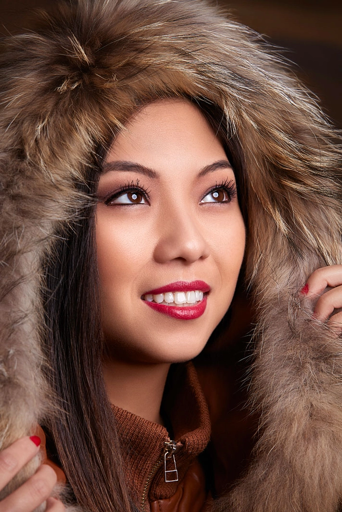
Into the Light by Ron Martinsen on 500px.com

For my first image, I thought I'd start with an excellent photo with a wide range of tones to see what was the best this printer could do. The PM-400, which had been turned off for a couple weeks took  2 minutes 17 seconds for first print with 46.5 seconds for head prep before paper feed from cold start. This means roughly a minute and 30 seconds for this image to print for a roughly 36mb print job which was NOT specially prepared for this printer - I just threw an original JPEG at it.


PM-400 From Photoshop with Printer Manages Colors & Default Settings

The quality was average viewer good, but obviously with 4 colors you aren't going to get a match to the original. It actually looks quite a bit better in real life than the scan of the print here, so don't let the quality here scare you - in real life it seems "good enough" for most users and I think better than what you get from discount photo printing labs like Costco, Walgreens, Target, etc...

For my photography geek friends, here's the Photoshop and printer driver settings I used:

Epson PM-400 Photoshop Print Settings

Epson PM-400 Windows Print Driver Settings

Surprisingly the P800 took 2 minutes and 3 seconds with 11 seconds before the paper feed on a cold start. This means it took one minute and 52 seconds, but the tonal range was significantly better in the highlight areas on the cheeks.


Epson SureColor P800 from Photoshop with Printer Manages Color using the sRGB preset

Despite being printed on the same Epson 4 Stars Premium Glossy paper and not using any ICC profiles or complex print features, the P800 was pretty darn close the original photo. Had I used an ICC profile I could have got an identical match.

Again, for my printing geek friends here's the settings I used to get this print:

image

Epson Windows P800 V3 Driver Settings

Black & White Test

To the novice who has never done fine art printing, one would think that Black & White printing would be very easy and there's no difference between the two. However, the reality is that B&W printing is actually rather complicated and hard to get right simply because printers aren't using just black ink to print out a "black and white" image (which is really a grayscale image).

Here's the source image I used:

Sigma85ArtModel-531-Edit

When the PM-400 was warm it only took 10 seconds before the paper had been pulled into position and it started printing resulting in a total print time of 1 minute 37 seconds for a 57.4 mb job over a wireless network connection.  The P800 ABW did it in 2 minutes 2 seconds with 11 seconds which was the real kicker that I'd see consistently in my testing - the PM-400 was actually faster at cranking out a 4x6 photo!


Epson PM-400 Grayscale

No, your eyes aren't deceiving you - the black and white images often taken on a blue/purple tone depending on the ambient light that you view them under. It doesn't look quite as extreme as what you get from a scan in real life, but it's off - way off - from reality. Again, my wife thought it was fine but this one that was tough for me to accept.

I used the same Photoshop settings as above but here's the settings I used for the driver:

Epson PM-400 Windows Print Driver Settings

This time there was no contest in terms of tonal fidelity - the extra $1000 made a huge difference as you'd expect from a high end photo printer:


Epson P800 using Epson's Advanced Black & White (ABW) Mode

Epson P800 Windows V3 Driver using Advanced B&W Photo mode

For more information about Epson Advanced B&W Photo mode see my ABW article.

Casual Print Test

Here's a 100% unedited photo I took with my iPhone X:

IMG_3543

I printed directly from from my phone using AirPrint to the PM-400 and in 1 minute 30 seconds I had a nice borderless print.

Using my P800 via AirPrint on my phone was 1 minute 56 seconds which was surprising.

Windows Print Pictures Wizard

On Windows with Photoshop even when I told the driver to do borderless with max expansion, the aspect ratio of the photo caused me to get white bars on both the left and right side. To fix this problem I simply tried right-clicking on the photo in Explorer and choosing Print to use the Windows Print Pictures Wizard which resulted me in getting the same borderless results as AirPrint.  This is primarily due to the aspect ratio of iPhone prints vs digital camera prints which means that a true borderless print is going to crop more off the top and bottom of the print than one with white bars on the side. Keep this in mind when choosing borderless!

Quality-wise I saw the same differences in skin tones especially in the hot spots of the photos and in the cheeks as I saw with the model shot above, but it was less noticeable in a natural light photo.

Conclusion

In the end my wife loved the PM-400 so it was EXACTLY what she wanted and it works for her. I appreciated it for its ease of use and speed when the kids need a quick print of a photo that's on my iPhone for a school project where quality doesn't matter. It was also great for sending pics to the grandparents who don't really give a hoot about the quality as long as the pics are of their precious grandchildren!

For me, I obviously won't be giving up my P800 for the photos I care about. With that said, you don't need to spend a fortune as my P600 is almost as good for substantially less than the P800.

For the price, I loved the speed and ease of use I got out of the PM-400 so I can easily give it a strong recommendation for everyday non-color critical use. It's fast and certainly worth the great reviews it gets on Amazon for printer that cost less than a set of ink for my P800!

Where to Buy?

CLICK HERE to learn more or buy a Epson PictureMate PM-400 today.

Other articles you may enjoy

If you enjoyed this article, you may also enjoy my printing series. Also be sure to check out my Reviews tab as well as Ron's Recommendations.

Disclosure

If you make a purchase using links found in this article, I may make a commission. It doesn’t cost you a penny more, but it does help to support future articles like this.

Friday, July 21, 2017

REVIEW: Red River Paper Palo Duro Etching Fine Art Paper

If you've followed along in my printing series, you know that I'm a fan of Red River Paper as a suitable alternative to more expensive papers. In fact, my article entitled Red River Paper vs Epson Papers has been one of my more popular articles because I offer my honest opinion on similarities and trade offs for going with Red River over various Epson papers. In fact, my last review entitled Red River Paper - San Gabriel Baryta Semi Gloss 2.0 I declared it just as good as the more expensive Baryta's.

It's no wonder that when Red River came out with their Palo Duro Etching paper a few months ago that they immediately reached out to me to get my thoughts on it. I printed with it and liked it right away, but I've been so crazy busy I haven't found time to write about it. Lucky for you and some insomnia after the baby waking me up in the middle of the night means that you'll finally get to hear my thoughts on this hearty fine art paper.

No Epson Comparison

While I've got a lot of Epson papers, for this review I only had 13x19 and 5x7 versions of this Red River paper. I have no other 5x7 papers to compare against and I can't scan 13x19 sheets, so this review will simply judge it on its own merit.

I will say that the closest thing I've used to this paper is the Hahnemühle German Etching, but that is still a very different paper that has no equal that I've seen (yet). I reference that paper because it's one that has a heavy texture, and that is something this paper definitely has - loads of visible texture. If that is something that bothers you, then stop reading as this isn't the right paper for you. However, if you can look at a canvas print and ignore the texture then read on.

Now the feel of this paper reminds me of the gritty feel of Epson Velvet or Epson Ultrasmooth  paper.

Tech Specs

Media: 100% cotton rag
Weight: 315gsm
Thickness: 21mil
Coated: Microporous coated one side
Color: Natural warm white tone
Surface: Heavy textured matte

Pigment Ink Users: This media is designed for Matte Black ink 

Archival Characteristics: Acid free, lignin free, OBA free, museum grade

Color Quality

Click here To get an ICC profile.

Color gamut of Palo Duro Etching (larger) vs Epson Cold Press Natural (smaller)

Matte black ink on fine art matte papers are always going to have a smaller color gamut than photo black on resin coated papers, but the color gamut of the Red River ICC color profile for the Epson SureColor P600 completely consumes that of the excellent Epson Cold Press Natural as shown in the graph above. What this means is that you'll get better color across the entire color spectrum using Red River's profile with this paper than you will with Epson's.

Color gamut of the Canon PRO-1000 (larger) vs Epson P600 (smaller) using the RR ICC profiles

The Canon PRO-1000 had a wide color gamut in the ICC profile that I used for my testing

Now before the hate mail comes in, for the record here's the Epson P800 profile compared to the PRO-1000 and it's smaller too:

image

and to counteract more conspiracy theories - here's the settings I used for the above graph where the PRO-1000 shows a larger color gamut than the Epson P800:

ICC Profiles Used for Testing

Here's a scan of 5x7 print made on the Epson P600 using the Red River profile on Paulo Duro Etching and you can see the color gamut is quite impressive for a matte paper:


Full Resolution Tiff V850 Scan of a SureColor P600 Pal Duro Etching Print

It should be noted that my scanner couldn't pick up the full range of grayscale so I had to scan it twice to get the gray squares and the grayscale gradient is better in real life than what's shown in the photo. Simply put, the scan doesn't do it justice compared to what you'll see in real life.

Click here To get an ICC profile.

In The Hand

At 21mil and 315gsm, this is no flimsy paper! It's got a hearty chalky feel with a noticeable texture. It doesn't flex easily and Red River recommends using the fine art media tray, but I was able to run it through the Auto sheet feeder on my P600 without any problem, so it's not unbearably thick!

Photo Quality

The following are unedited s of actual 5x7 prints made using my P600 (my dedicated matte black printer). In the first photo, this is Epson's Advanced Black & White mode of a color photo:


Full Resolution Tiff V850 Scan of a SureColor P600 Pal Duro Etching Print
Advanced Black and White Mode (Warm | Dark setting)

It was a little darker than I hoped so some of the details were muddy in the vest, but it looks better in real life than in the scan. Here's the color print which is remarkably close in tone to what I get using photo black and luster paper:


Full Resolution Tiff V850 Scan of a SureColor P600 Pal Duro Etching Print
Photoshop Manages Color using Red River P600 ICC Profile

Here's the actual photo file used for the print  which of course has a much wider dynamic and tonal range:


Gary Original Image printed from Photoshop

In this next photo, the loss of color fidelity in the reds and yellows can be seen fairly easily - as well as the hearty texture of this paper:


Full Resolution Tiff V850 Scan of a SureColor P600 Pal Duro Etching Print using RR ICC

It should come as no surprise, this isn't a great paper for high fashion, but that's not its intent. Landscapes, abstracts, and images with lots of texture are the ones that will benefit the most. 

Model Original Image printed from Photoshop


Full Resolution Tiff V850 Scan of a SureColor P600 Pal Duro Etching Print using RR ICC

Naturally the best type of image for this type of paper is going to be a images with lots of texture, so I've printed my famous Treehouse photo using both the P600 (above) and the Canon PRO-1000 (below) using ICC profiles provided by Epson and I was quite pleased with the real world results.

The wider gamut of the Canon comes through in the form of warmer tones and deeper blacks. In real life under a light box in ideal lighting conditions, the Canon really shines but in normal tungsten lighting conditions the Epson print doesn't feel as dark so it is easier to see some of the detail in the shadows.  Simply put, both look good but if you have great lighting conditions then the Canon will produce the more visually pleasing print.


Full Resolution Tiff V850 Scan of a Canon PRO-1000 Pal Duro Etching Print using RR ICC

Epson Driver Settings (Windows)

For Epson SureColor printers, the driver will be basically the same so here's the settings I chose:

Epson SureColor Settings on Windows for Red River Palo Duro Etching

I did Cold Press Natural so I could use the sheet feeder, despite Red River's recommendation for using Velvet because 5x7 paper can't be used for the manual feeder (required for Velvet).

No matter what paper you use, you have to set Paper Thickness to 5 in Paper Config(uration):

Epson P600 Paper Configuration for Red River Palo Duro Etching

In all of my testing, I had no issues with the paper being scratched - even when I forgot the paper thickness set to 2. You'll also noticed below that I did LEVEL 4 (1440x1440 dpi) per Red River's guidance. 1440 does variable size dots vs 2880 which uses fixed size, so the lower resolution can still result in higher quality results which was my observation with this paper. As a result, I agree with Red River's recommendations:

Epson SureColor Settings on Windows - Summary Red River Palo Duro Etching

In Photoshop I chose to do Perceptual rendering intent (despite my normal preference for Relative Colormetric) for the best results:

Epson SureColor P600 Photoshop Settings Red River Palo Duro Etching

Mac settings look different, but the values are all the same so what you see here - despite looking very different - still applies to the Mac.

Canon PRO-1000 Settings (Windows)

For the Cano - PRO-1000 I chose Heavyweight Fine Art Paper so I could use the Rear Tray (for the same reason as above for Epson - you have to do this with 5x7 paper). I also chose the highest quality which with the optional XPS (non-default for Canon) driver can result in better color fidelity:

Canon PRO-1000 XPS Driver Settings (Windows) for Red River Palo Duro Etching

On this page the key thing to remember is to click Advanced Settings and Color Intensity to Manual (then click Set):

Canon PRO-1000 XPS Driver Main Settings (Windows) for Red River Palo Duro Etching

For color you want None so Photoshop can apply the ICC profile without double color management:

Canon PRO-1000 XPS Driver Manul Color Adjustment Matching for Red River Palo Duro Etching

For Advanced Settings you have to set Print Head Height to "Avoid Paper Abrasion" which just means this is thick paper:

Canon PRO-1000 XPS Driver Paper Detailed Settings for Red River Palo Duro Etching

Canon PRO-1000 Photoshop Settings for Red River Palo Duro Etching

Conclusion

This paper feels substantial in the hand with a hearty texture so some will perceive that as high quality and others will be think ugh, that's too chalky for me. However, that's the art of choosing the right paper for the right photo. When paired with a texture heavy image like the treehouse shot, it's a great choice that feels good in the hand.

This paper has the fine art "special" feel that separates it from your cheapo prints, so even a novice will know that this wasn't printed at your local discount warehouse or volume online print service. When commanding a premium price for your images, this is important so that's where paper like this really pays for itself!

Red River has done a good job of offering a museum quality paper at a reasonable price with excellent ICC profiles. As a result, this paper is an easy one to recommend to both Canon and Epson fine art printer users.

Where to Buy?

CLICK HERE to learn more or buy today.

Photographer's Choice Sample Kit Special Offer

Other articles you may enjoy

If you enjoyed this article, you may also enjoy these:

Disclosure

If you make a purchase using links found in this article, I may make a commission. It doesn’t cost you a penny more, but it does help to support future articles like this.

Wednesday, February 17, 2016

REVIEW: Epson Legacy Etching & Video Tutorial (Legacy Series 3 of 5)

Epson Legacy Etching Paper

Epson Legacy Etching paper is a cotton fiber substrate that uses matte black ink to create archival quality fine art prints. Here are a few important facts about this paper:

  • 100% cotton fiber
  • Image Permanence: 200 years color / 400 years B&W (when used with Epson HD and Epson HDX Ink)
  • 20 mil / 508 Mu caliper
  • Acid and lignin free / pH buffered
  • No Optical Brightening Agents (OBAs)
  • Smooth surface / Matte finish

Check out the Print Your Legacy landing page with videos here to see what some well respected photographers think of this and all of the Legacy papers.

For more on my thoughts, continue reading.

Geeky Comparison

If you aren’t a geek you might want to skip this section.

When comparing Etching next to a variety of other Epson papers you’ll see that its color gamut isn’t quite as large as some of the others:


Epson Legacy Etching vs Legacy Fibre,
Cold Press Bright & Natural, and Hot Press Bright and Natural

Click  for a larger view

However, in practice the differences don’t feel that large. In fact, if you compare the color gamut as a 2d chart (from ColorThink Pro) against Cold Press Natural then you’ll see they are fairly similar:


Epson Legacy Etching vs Cold Press Natural Color Gamut
on a Epson SureColor P800

In The Hands Analysis

When holding the paper in my hand I observed that it is slightly darker than Epson Velvet and much brighter than Hot Press Natural, despite the absence of OBA’s. This makes it more aesthetically pleasing paper with whites, yet it still retains the archival longevity of papers that do not have OBA’s.

The texture and thickness of my sample paper felt much like the Hot and Cold Press papers which is a good thing, as I love a hearty matte paper that doesn’t flex when you hold it. This coupled with a noticeable texture when viewed at an angle that feels good in the hand, but doesn’t stand out on the print means that you get all of the advantages of a textured matte paper without it distracting from your photo. I like that – a lot!

In terms of durability, it’s like all matte papers with matte ink – you have to be careful as it’s easy to scratch or smudge so using gloves is recommended and protect as soon as possible. However, it seemed less fragile than the Fibre in real world testing use and abuse.

If you are someone who appreciates things that feel good in your hands, you will definitely love this paper!

Real World Print Analysis


Epson V850 scan of Legacy Etching on a Mac (16-bit)

(Click for Original Mac Version above or Windows Version Here)

While the colors look a bit washed out in the scan, in real life it isn’t quite so faded looking. In fact the prints vibrant and the blacks look deep, but it’s not like Baryta bright and deep. As a matte paper, I found it to be very good. In fact, unless you have it next to better color gamut papers you’ll most likely find that feels exceptionally vibrant for a matte paper. This is definitely true of this photo (image provided by Epson for this review):


Actual Epson V850 Scan of a Print from SureColor P9000 on Legacy Etching

as well as this one which is available as a full resolution 24MB TIFF scan printing using Epson Advanced Black & White mode:


Full Resolution Tiff V850 Scan of a SureColor P800 Legacy Etching Print

Advanced Black & White Mode Used (Warm / Dark presets)
Faded old photo look created using Texture Effects

The ABW print has excellent grayscale tonal range, but it comes at the cost of not faithfully reproducing the color. Just for completeness sake I’ve included this one which is available as a full resolution 24MB TIFF scan printing in color using the icc paper profile for the P800:


Full Resolution Tiff V850 Scan of a SureColor P800 Legacy Etching Print

For reference, I’ve also done a print and scan using Epson Hot Press Natural:


Full Resolution Tiff V850 Scan of a SureColor P800 Hot Press Natural Print

and one using Velvet Fine Art:


Full Resolution Tiff V850 Scan of a SureColor P800 Velvet Fine Art Print

During my testing I observed that the Legacy Etching had the best overall result when printing as a color image when compared to the Hot Press Natural and Velvet Fine Art papers. In theory the Hot Press should have better blacks, but the Etching print just had a richer feel to it thanks to the most accurate reproduction of the original colors – presumably due to a great paper profile. The Hot Press Natural was the warmest toned paper of the trio with the Etching landing right in the middle as the Velvet was the brightest.

The Velvet was also the worst print with more muddled blacks, so I really appreciated the Legacy Etching even more after this test – especially using Advanced Black and White mode where the grayscale range was excellent.

On a scale of 1 (worse) to 10 (the best I’ve ever seen), I’d give it a 8.8 whereas I’d give the Hot Press Signature Worthy papers a 8.5, and Velvet a 6. This is an excellent paper that feels wonderful in the hand and its great paper profile means fantastic color and black and white prints that are faithful to the original image (assuming you have a properly calibrated display – which most don’t).

Tutorial Video with ABW

This video teaches you how to print on this paper in both Photoshop CC 2015 and Lightroom CC 2015 on OS X El Capitan with an emphasis on Advanced Black & White mode, but future reviews will also cover Windows 10:

If you’d like visual instructions, including Advanced Black & White, then be sure to check out the visual tutorial in the Epson Legacy Papers Reviews & Tutorials video which covers both Windows and Mac.

The printer paper profile you use will be in the format <printer> LegacyEtching_MK_<version>.icc (or sometimes icm) so for the Epson SureColor P800 you’d choose SC-P800_Series LegacyEtching_MK_v1.icc

Conclusion

I had such a high regard for the Epson Hot Press papers for their incredible dmax and color gamut (for a matte paper) that I went in wanting to declare them the winner. When I saw the “data” that confirmed my gut instincts, I was even more ready to say this wasn’t as good. However, when I held prints in my hand and compared them under my GTI lightbox it became clear that Epson has generated an excellent icc paper profile which creates great prints that rival the statistically better Hot Press papers.

I was also a huge fan of the cold press papers for their wonderful texture, so again I expected that etching would disappoint me. However, I found the texture on this paper to be substantial enough to see and feel but subtle enough so as not to distract. In fact, I wish it was a little more aggressive with the texture, but then again I’m a huge fan of the heavily textured Hahnemühle German Etching.

As matte papers go, this is one of the finest I’ve tested. I’d have to toss a coin when comparing the Legacy Etching to the Hot Press Natural as to which is better, so I’d probably purchase the cheaper of the two if there was a deal. All things equal, I’d probably go for the Legacy Etching. With that said, I enjoy bright papers so I’d probably do Cold Press Bright or Hot Press Bright for my fine art matte paper needs, but they are all so good I can’t see a customer who appreciates matte prints being disappointed with any of them.

I highly recommend Legacy Etching for its bright OBA free color, its wonderful but not over done texture and its wide color gamut that allows for faithful reproduction of my fine art prints.

Where to order

Click here to learn more or order at Adorama and click here to learn more or order from B&H.

Other articles you may enjoy

If you enjoyed this article, you may also enjoy these:

Disclosure

If you make a purchase using links found in this article, I may make a commission. It doesn’t cost you a penny more, but it does help to support future articles like this.

REVIEW: Epson Legacy Fibre & Video Tutorial (Legacy Series 2 of 5)

Epson Legacy Fibre Paper

Epson Legacy Fibre paper is a cotton fiber substrate that uses matte black ink to create archival quality fine art prints. Here are a few important facts about this paper:

  • 100% cotton fiber
  • Image Permanence: 200 years color / 400 years B&W (when used with Epson HD and Epson HDX Ink)
  • 19 mil / 483 Mu caliper
  • Acid and lignin free / pH buffered
  • No Optical Brightening Agents (OBAs)
  • Smooth surface / Matte finish

Check out the Print Your Legacy landing page with videos here to see what some well respected photographers think of this and all of the Legacy papers.

For more on my thoughts, continue reading.

Geeky Comparison

If you aren’t a geek you might want to skip this section.

When comparing Fibre next to a variety of other Epson papers you’ll see that its color gamut isn’t quite as large as some of the others:


Epson Legacy Fibre vs Legacy Etching,
Cold Press Bright & Natural, and Hot Press Bright and Natural

Click  for a larger view

However, in practice the differences don’t feel that large. In fact, if you compare the color gamut as a 2d chart (from ColorThink Pro) against Cold Press Natural then you’ll see they are fairly similar:

Epson Legacy Fibre vs Cold Press Natural Color Gamut
on a Epson SureColor P800

In The Hands Analysis

When holding the paper in my hand I observed that it is slightly brighter than Epson Velvet and much brighter than Hot Press Natural, despite the absence of OBA’s. This makes it more aesthetically pleasing paper with whites, yet it still retains the archival longevity of papers that do not have OBA’s.

The texture and thickness of my sample paper felt much like Ultra Premium Presentation Paper Matte in that it is very flexible. If you hold it at the edge it will flex down unlike Hot or Cold Press papers that stay rigid. However, the sample provided by Epson using Vincent Versace’s print felt more solid like a 19 mil paper should. As a result, I think might have received a sample that was closer to 10 mil vs the final paper that is 19 mil.

UPDATE: I did confirm that two of the three sample packs I had contained 10 mil Fibre Etching whereas the third contained 19 mil – which fills like the hot and cold press papers. I confirmed that the print results didn’t change, but the feel in the hand was significantly better without the flexing.

The texture is extremely smooth with no hint of any texture, so I really liked that. While there are times that I like texture, and appreciate papers like Etching, there’s also certain subjects that can be ruined if the paper has too much texture (i.e., a smooth vegetable or fruit). As a result those who are looking for a super smooth paper that isn’t going to have annoying reflections like RC papers, will find this to be an excellent choice.

In terms of durability, it’s like all matte papers with matte ink – you have to be careful as it’s easy to scratch or smudge so using gloves is recommended and protect as soon as possible.

Real World Print Analysis


Epson V850 scan of Legacy Fibre on a Mac (16-bit)

(Click for Original Mac Version above or Windows Version Here)

While the colors look a bit washed out in the scan, in real life it isn’t quite so faded looking. In fact the prints vibrant and the blacks look deep, but it’s not like Baryta bright and deep. As a matte paper, I found it to be very good. In fact, unless you have it next to better color gamut papers you’ll most likely find that feels exceptionally vibrant for a matte paper. This is definitely true of this photo (included by permission of Vincent Versace author of Welcome to Oz 2 and Oz to Kansas: Black & White Conversion Techniques):


Actual Epson V850 Scan of a Print from SureColor P9000 on Legacy Fibre

as well as this one which is available as a full resolution 24MB TIFF scan:


Full Resolution Tiff V850 Scan of a SureColor P800 Legacy Fibre Print

On a scale of 1 (worse) to 10 (the best I’ve ever seen), I’d give it a 7 whereas I’d give the Hot Press Signature Worthy papers a 8.5. It’s very good and pleasing to both the eye and hand.

Tutorial Video

This video teaches you how to print on this paper in both Photoshop CC 2015 and Lightroom CC 2015 on OS X El Capitan, but future reviews will also cover Windows 10:

If you’d like visual instructions, including Advanced Black & White, then be sure to check out the visual tutorial in the Epson Legacy Papers Reviews & Tutorials video which covers both Windows and Mac.

The printer paper profile you use will be in the format <printer> LegacyFibre_MK_<version>.icc (or sometimes icm) so for the Epson SureColor P800 you’d choose SC-P800_Series LegacyFibre_MK_v1.icc

Conclusion

Of the four Legacy papers I tested, this was my least favorite. While I did like it and found it to be very good, I honestly would go for Hot Press Bright (despite the OBA’s) if I wanted a bright smooth paper and if I wanted no OBA’s I’d reach for Hot Press Natural. If I wanted texture, I’d go for Legacy Etching, so this paper is left in a category where I’d use it if I had it but I probably wouldn’t buy it or chose it over the others for an important fine art print. 

Where to order

Click here to learn more or order at Adorama

Other articles you may enjoy

If you enjoyed this article, you may also enjoy these:

Disclosure

If you make a purchase using links found in this article, I may make a commission. It doesn’t cost you a penny more, but it does help to support future articles like this.