
This article demonstrates how I use the Advanced B&W Photo (ABW) printing feature with a Epson Stylus® Pro 3880 for both a PC and a Mac using Photoshop CS4 and Lightroom 2.7 (respectively). Before people ask, it should be noted that I am aware of Eric Chan’s Epson 3800: Step-By-Step Printing Workflow and I disagree with enough of it that I can’t recommend it. My recommendations are based on close consultation with Epson and many of the print masters interviewed on this blog, as well as my own subjective opinions. If my workflow changes, I’ll be sure to update this article so that it always reflects my current ABW printing workflow.
Step 1 – Always Start with a good Black & White Conversion
While it is true that you could send your color image straight to the printer and let it do the conversion, it’s my personal opinion that this is like sending your photos to the drug store without ever looking at them on your computer. Sure you’ll get a result, but it isn’t likely to be one that reflects your artistic intent. For the image below, I love the color version but for this article I decided to do my own black and white conversion as it’s abundance of black and dark colors is a real test for any black and white output.

|

|
|
Before |
After |
Now there are many ways to get black and white output using Adobe Camera Raw (via Bridge, Photoshop, or Lightroom), in-camera presets, Photoshop’s grayscale conversion (never do this), Photoshop’s Adjustment Layer (Image->Adjustments->Black and White), and more, but none have really satisfied me. In fact, I went so far to say that I hated black and white images and that they should be a relic of the past.
A Better Way – Nik Software’s Silver Efex Pro

My disdain for black and white images vanished the day I discovered Nik Software’s Silver Efex Pro, and I’m not alone. During this series nearly every print master I spoke to has unanimously praised Silver Efex as being the best tool on the planet for getting great black and white images quickly and easily. Sure there are other ways to get identical results (which is true of every add-in product), but this product allows you to experiment and get great results very quickly that you will love – no matter what your taste is for black and white images.
There are many things you can do in Silver Efex, but most of it is clicking around and experimenting. You’ll start with using a preset on the left column (if so desired) and in this case I just did a Overexpose EV +1 since the image was so dark. The next thing i did was use the Agfa APX Pro 100 film type and boosted the Grain per pixel to eliminate the noise found in that film. After that, I’m done – a click and voila – I’ve got a black and white image – in less than a minute with zero hassle and I love the results. There’s no other tool or product on the planet that can do that for me, so to say that I highly recommend this product when creating black and white images is an understatement. For me, it’s a must own!
Click here to see my review of Silver Efex Pro and go to my discount coupon code page to get a great discount on it.
Step 2 – Use the right paper – Epson Exhibition Fiber
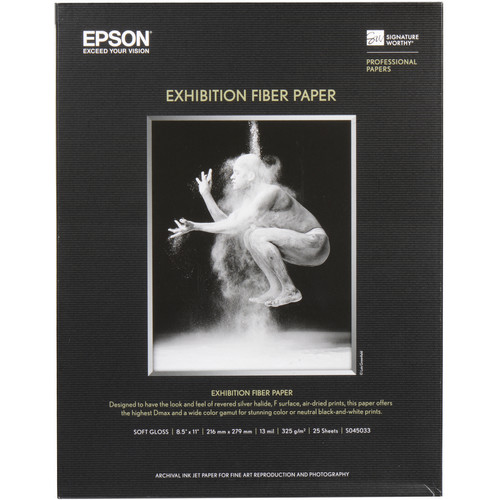
Epson Exhibition Fiber paper was designed to be like Silver Halide (AGX F) for the darkest blacks and the brightest whites. According to Epson, “with the introduction of EFP those using the darkroom finally had the tools to go digital.” It’s also suggested by Epson that it has the a DMAX that is better than any that could be done with AGX fiber papers (as high as 2.6 in ABW mode).
While you can definitely use other papers, I’ve been blown away with the results using this paper so it is definitely my preferred paper for black and white prints.
Step 3 – Understand How to Use the Color Controls Dialog (Color Toning & Tone Printer Color Adjustments)

Color Toning options
During my Advanced B&W Photo mode testing, I tested each of the 4 color toning options (shown above) and each of the 5 tone options (shown below in the Tone section). The color toning options are effectively presets of the horizontal and vertical values shown on the color wheel to the right of the before and after images. The results of these selections are reflected on the before and after images (by Greg Gorman), but these are not real-time applications of the color wheel values. Instead these are pre-built images that represent an approximation of what the effect will look like, so keep this in mind when making your adjustments. You may need to print to see the real impact of your changes, rather than relying on soft-proofing using the after image. It’s also important to know that these are simply presets that map to the following values:
| Horizontal | Vertical | |
| Neutral | 0 | 0 |
| Cool | -8 | -45 |
| Warm | 4 | 20 |
| Sepia* | 40 | 48 |
* = Sepia also sets Max Optical Density to –2
You may find that you’ll want to tweak these values for the best results given your paper choices as well. For example, printing legend R. Mac Holbert suggests using Horizontal +3 and Vertical +3 when printing on Epson Ultra Premium Photo Paper Luster, or Horizontal +1 and Vertical +3 when using Epson Exhibition Fiber paper when you are looking for a neutral color toning.

ABW Test Image 1 - Kit
I’ve had several print masters suggest (i.e., Greg Gorman, Vincent Versace, and many more) that Warm is their favorite preset. I agree that it is quite good, and I used it for the image above when printing, but it does effectively create a golden tone which isn’t always the best choice for every image. In fact, usually find myself preferring the Neutral tone to be the most pleasing (see test image 2 below), especially when using the previously mentioned R. Mac Holbert adjustments. Please keep in mind that these are subjective comments, and your selection could vary on per image basis. You should always experiment with your own images for the color toning choice that works best for your artistic intent.
I will say that I found the Cool color toning option to be way too cool for my taste, and the sepia option was simply awful in my opinion. I personally can’t foresee a scenario where I’d enjoy using either of these modes, but you should do your own test and see which is right for images.
Tone

Tone options

ABW Test Image 2 - Zena
The default Tone value is Darker, but even Epson and several well respected print masters have suggested that darker is a poor place to start your ABW printing. After doing my own experimenting, I agree with the recommendation of Epson, Greg Gorman, Vincent Versace, and others who have all said that Dark is the appropriate default value. Using the image of Zena (shown above), I had the following observations with the different Tone values:
| Observation using Zena Image | |
| Light | Way too light in the background, but ironically for the jeans the tone is about right. Lips are too light. |
| Normal | Pretty good - the lips and background could stand to be just a dash darker, but certainly a usable setting for this image - like the jeans better than Dark. |
| Dark | Overall my favorite, so I agree with the recommendations. Lips starting to get a little dark and the jeans are pretty dark at the bottom - but still okay. |
| Darker | Facial shadows getting too dark, and jeans disappearing at the bottom into darkness. |
| Darkest | Skin tones are too dark and jeans are hard to make out at the bottom. Lips look gray and top of head is a black blob. |
Unlike these Color Toning options, these aren’t presets that map to values you can adjust in the Color Controls dialog, so you must pick one and accept the changes it makes. It is for this reason that I HIGHLY recommend you chose one value and always use that value, and then modify your source image to get the desired black level. This will make your workflow much simpler should you need to do prints in the future and replicate your settings. What this exercise taught me on my own test image is that I may need to brighten up the jeans in post-processing to get the best overall result, but that Dark is the correct ABW printer driver setting.
UPDATE: These values correspond to gamma changes (i.e., 1.8, 2.0, etc…) , which is why it is okay to use something besides Normal.
Example 1: Adobe Photoshop CS4 on Microsoft Windows 7 Color Print Usage Walkthrough using Cool Tone
In this example I am using a 64-bit Windows 7 based PC to print from Adobe Photoshop CS4 (32 or 64-bit) to do a cool tone image on Super A3 (13x19”) paper fed through the rear manual feed tray on a networked 3880. The image is in the portrait orientation. Here are my printing steps:

- In Photoshop Print dialog shown above, we start by making sure we have the correct printer selected.
- Verify you have chosen the correct image orientation. It is CRITICAL that you set orientation (next to the Page
Setup… button below) in BOTH the Print dialog AND the Epson driver – if you don’t, you’ll waste a sheet of
paper.
- In this example we also are going to center the image and render it at 100%, so we clear the Scale to Fit Media
checkbox.
- Make sure that Color Handling is set to “Printer Manages Colors”
(for ABW ONLY)
- The Rendering Intent is supposed to be disabled, but it isn’t so choose
Perceptual for Windows and
Relative Colormetric for Snow Lepoard. I have reports from Epson and confirmed in my
own testing that any other rendering intent can result in undesirable results.
WARNING: Some combinations of operating systems, versions of Photoshop and Epson printers will have better results with Relative Colormetric than with Perceptual, so be sure to do an experiment with your configuration to see which works best.
Once all of these settings are confirmed, click on the Page Setup… button and change the following:
- For Media Type the best choice (for something that uses the Photo Black Ink), is
Ultra Premium Photo Paper Luster (because there isn’t a media type for Exhibition
Fiber).
- For Color choose Advanced B&W Photo.
- For print quality, choose your desired values but for me that was
2880x1440 and High Speed On.
- For Paper Config you are presented with this dialog which you can choose to adjust the Platen Gap to Wider if you like (I had better results with Auto):
-
in the Mode area you should choose Custom radio button and then choose Color Controls. After this click on the Advanced… button where you’ll be presented with the Color Controls dialog shown in the windows below:
-
In this dialog start by changing the Color Toning to your desired value. I chose Cool for this image because I wanted a subtle blue tint. However, typically I chose neutral or warm.
-
From there (and order of operations is critical), I changed Tone to Dark (per Dan Steinhardt, Greg Gorman, Vincent Versace and more) as shown below:
- If you did everything properly, then your dialog should look like this (and pay close attention to the color wheel values of Horizontal –8 & Vertical –45 which is effectively what the “cool” preset is really doing):


Once you have all of the settings above set properly, you can simply choose to print from the aforementioned Photoshop CS4 dialog. It will launch (on Windows) your Print dialog (see below) where you simply need to confirm your printer and choose Print.

Example 2: Adobe Lightroom 2 on Apple Mac OS X Color Print Usage Walkthrough using Warm Tone
In this example I am using a Mac to print from Lightroom 2.7 to do a warm tone image on Super A3 (13x19”) paper fed through the rear manual feed tray on a networked 3880. The image is in the portrait orientation and has white borders around the source image. Here are my printing steps:

- As in the example above, we want to start by telling Lightroom that instead of using a paper profile that we
want the Color Management to be “Managed by Printer”. This is
required for Epson’s Advanced Black & White mode.
- Go to the left side of the the Print Module and click the Page Setup… button to chose your desired paper size,
paper tray and orientation as shown below:
-
The next step is to go to the Print Settings… button (the same can be accomplished via the Print… button as well). There are several pages we’ll modify in this dialog, but we’ll start with the Color Matching settings where we’ll ensure that “EPSON Color Controls ” is selected as shown below:
-
Next up is the most important page – printer settings. For this we need to make sure that we set the Media Type to “Ultra Premium Photo Paper Luster” because that is the correct choice when using Exhibition Fiber.
-
The next change we need to make is for the Print Mode where we need to select “Advanced B&W Photo”:
-
Unlike on the PC, on the Mac we set the Color Toning to Warm (or your desired value) directly in the Printing Settings section. We also set our Output Resolution to “SuperPhoto – 2880 dpi” and check “High Speed”, but leave the other values unchecked.
-
Next, you’ll go to the Advanced Color Settings tab of the Printer Settings page where the Color Toning has already been set based on the value selected on the “Basic” page.
All you need to do here is change the Tone from the default of Darker to Dark as shown above and below:
-
If you want to change the platen gap, then you need to go to the “Advanced Media Control” page and set it to Wider as shown below. Based on my results while making the prints for this article, I found this step was unnecessary as my best results were achieved with the default “Auto” platen gap setting. However, others have reported this is not the case (especially when doing borderless) so you’ll need to experiment and decide which is best for your printer.


Here’s a snapshot below of the summary page with some sections opened just as a quick reference for some key settings:

Tip for Mac Users with Large Format Printers
While not applicable to the 3880, some Epson printers may have a “Process Job by Printer” checkbox under Additional Settings. IF you see this, make sure you uncheck it!

Always clear the Process Job by Printer checkbox
What about Printing in Color or using a RIP?
It’s certainly possible to get great black and white results by printing in color, but the ABW feature of Epson printers has been fine tuned to get better results. I highly recommend using this mode unless you are doing split-toning (which won’t work in Epson ABW mode) or you have created a paper profile optimized for black and white mode (outside the scope of this article).
I can say that my upcoming review of Colorbyte ImagePrint revealed some advantages over the Epson ABW mode thanks to its custom grayscale paper profiles. I don’t make the claim that Epson’s ABW mode is the only way to make great black and white prints – but I can say it’s very, very good!
Conclusion
I am very happy with Epson’s Advanced B&W Photo (ABW) printing feature when used with a Epson Stylus® Pro 3880 on either the PC or Mac platforms using either Adobe Photoshop CS4 or Lightroom 2.7. The results are consistently better than those I have seen from printing in color, or using any third party service for black and white printing (except for MPix.com’s True B&W Paper). I highly recommend it and hope this article will help you enjoy great results too.
It should be noted that I have used Lightroom 3 as discussed in this article and have been happy with the results, but for non-technical reasons I chose to do my exhaustive research with Lightroom 2.7. I have not done testing with Photoshop CS5 due to changes in the way CS5 prints, and because I simply don’t own that product yet.
Disclosure
I may get a commission if you purchase using selected links in this article. Thanks for supporting this blog by using the links!
8 comments:
Hi Ron - thanks for posting this article. I have been struggling with the printing end of black and white and this morning you made it all come together in a fantastic way. The results were astonishing!
Thanks, this is very helpful. One question though, above you said:
"For this we need to make sure that we set the Media Type to “Ultra Premium Photo Paper Luster” because that is the correct choice when using Exhibition Fiber."
In Lightroom I have an "Exhibition Fiber Paper" setting in the media type popup (not the profile). It's better to use PPPL?
Hi Jim,
Thanks for reading!
This article was written for a 3880, but if you have 4900 your printer driver will have media type for Exhibition Fiber. If it does, then by all means use that and stop reading here.
The last I checked, the 3880 doesn't have a media type for the 3880, but you can get a media profile. I haven't used my 3880 in a while, so it's always possible that a driver update could have changed this.
Remember, media type is about the thickness and ink absorption of the paper whereas media profile is about how to adjust the flow of the various colors (including shades of gray here) of ink applied to the paper to get an accurate color matching experience.
Lightroom only supports two things that it mislabels as media types - Glossy and Matte. This choice is found under the print job panel on the right side under the print sharpening option. The choice here isn't even for the true media type, but rather a selection to determine how much sharpening is applied. This is a carryover from PixelGenius PhotoKit Sharpener 1.0 where this code was licensed from.
For Advanced Black and White Mode you should be letting the Printer Manage Color so you should be getting to your settings via the Page Setup... or Print... buttons whereby you set the printer driver to ABW mode as described in the article, and your media type in the printer driver to Ultra Premium Photo Paper Luster (and a wide platen gap) only when there's no option for Exhibition Fiber.
Ron, Do these comments apply to R3000? I have had difficulties using ABW from PS4, prints lcaked fine details and with magenta tint. However, printing from color is much improved but still a slight magenta tint.
Would appreciate any advice. thanks
gkl
George,
Yes they still apply but the R3000 has a little different entry point to the UI. See my r3000 review for details.
If you have magenta then you probably have a clogged head so do a nozzle test pattern,
Thanks for your advise. Yes, indeed, the LK cartridges is having issues.
gkl
Great Stuff.
I use Nik Silver Efex too and find it does a great job. You mentioned that use use a little toning in Silver Efex but doesn't that toning get "thrown out" when you then Print with Epson Advanced B&W Photo option?
So if you want to keep that Silver Efex toning, then you need to print using "Photoshop Manages Color."
Your thoughts on this?
Anonymous,
Yes, you are 100% correct - nice catch. All color data is discarded.
I use the toning for my "optimized for web" version and for when I print in color.
The ABW mode has great value for people who are into pure black and white, but I'm more of a duo-tone person myself - especially now vs when this article was written - so it's common for me to print my duo-tone images in color where my toning values would be preserved.
I should delete that line from this article though because as you indirectly point out it's confusing in this context.
Thanks for bringing this to my attention and for stopping by my blog!
Ron
Post a Comment