Wednesday, August 31, 2011

REVIEW: Topaz Labs B&W Effects -vs- Nik Silver Efex Pro 2.0

Topaz Labs B&W Effects

Topaz Labs has introduced B&W Effects at a perfect time because Black & White photography is getting hot again. Products like Nik Software’s Silver Efex Pro 2 is selling like hot cakes; Epson printers like the 3880 and 4900 are being used heavily in their Advanced Black & White mode for black & white printing; and photographers like Vincent Versace are coming out with books like Welcome to Oz 2.0 to capitalize on this boom. As a result, I was super excited to see what Topaz had to offer in this super affordable product.

Why Do I Need Black & White Software?

To the newbie, black and white seems easy – just desaturate the color away or use the grayscale mode in Photoshop. Some will even say – just use a black and white preset in Lightroom, but if all of these methods left you unsatisfied with the result – you are not alone.

The key to good black and white is very subtle, but the key part is that you want your black and white image to look like something you have in your mind. Perhaps it was the way Ansel Adams did it, or perhaps the way you it done in a magazine recently, but whatever “it” is, simple methods don’t seem to have “it”. As a result the quest begins to get good black and white and dial in the perfect results.

Using Photoshop, Lightroom or even Aperture can be maddening because images tend to be too dark, too washed out or too blocked up. Getting that perfect balance is an art form in and of itself, hence the need for products like B&W Effects.

BWEffects - Warm Tone I with a White Border
Traditional Collection - Warm Tone I with a White Border

User Interface

B&W Effects User Interface

If the user-interface for a Black and White product doesn’t help you to get good results quickly, then there’s really no advantage of it over Photoshop, Lightroom or Aperture. However, I’m please to say that the folks at Topaz Labs have tried really hard to make it MUCH easier to realize your black and white vision.

To the left of the user-interface is something that will seem familiar to Lightroom users – a preview window and a bunch of presets. The effects list is just a container for groups of presets. In all there are 8 different effect styles and over 100 presets, so many will find the exact look they want by just clicking through the list.

For those who want to use a preset as a starting point, but then fine tune their image there’s the right side which offers a wide variety of things that can be done to dial in adjustments to give you the exact look you want. Fortunately you can save (and even export) all your changes for use as a future preset, so once you have your favorite “look” then you simply need to click a preset and you are done.

Here’s a quick look at each of the sliders and parameters options, each of which can be enabled and disabled as needed using a checkbox and tweaked by expanding the control.

1 - Conversion

This is where you start to get your image looking good as a black and white based on the preset you have chosen. It’s not uncommon for converted black and white images to be too dark or too washed out, so basic adjustments can help a lot here.

2 - Creative effects

Once your image is looking good you can start making it more interesting using the Creative Effects section.

3 - Local Adjustments

One of the problems with black and white is that you don’t want to lose detail during the conversion and it’s not uncommon for some areas to just look blocked up or bleached out. This is where the Local Adjustments section comes in so you make adjustments or add selective color if desired to your image (think Sin City b&w with red lips).

4 - Finishing Touches

Once your image is done you may want to add some finishing touches like grain, a border, etc… You may also want to reduce the opacity so that the B&W work you’ve done is effectively letting the color bleed through, so there’s transparency (which is very useful for products like Lightroom since it doesn’t support layers).

User Interface Thoughts

My day job that pays the big bills is a user-interface programmer so I am passionate about user-interface design. Overall the design here is fairly solid as it organizes a lot of options in a easy to follow manner. However, when you drill down on the right side most of the options end up offering too much freedom.

For example if I choose Color Filter, rather than getting a list of common color filters I’m just presented with a complex slider which makes things more complex than Nik Software’s design which just has little filter icons for common types.

It’s little things like this that exist throughout the user-interface, or in some cases (like border) it’s been simplified too much (only black and white borders are possible).

One of my biggest concerns is that the preview appears to be sRGB which results in a quite a bit different result when going back into Photoshop  with a 16-bit ProPhoto RGB (my default from Lightroom Edit in Photoshop). This meant that I was sometimes unhappy with the color shifts, and even though my final image ended up in sRGB – it was never exactly like I saw in the UI.

Overall the user interface isn’t bad, but its far from perfect. It’s also a time sync at first because you can spend an hour+ just scanning through all of the effects and presets. You can probably spend another hour on the right side tweaking as well, so flexibility to do whatever you want has come at the cost of ease of use / rapid editing.

Performance

The performance felt fairly sluggish on my Windows 7 computer (compared other plug-ins). It’s usable on my 8GB reasonably powerful system, but I’d hate to use it on a slow system. Hopefully this is something that will be addressed in an update as it is slow enough that I’d find myself not wanting to fire it up and use it.

Features

If you were doing those checkbox comparisons that marketing people like to do, you’d probably come up to the conclusion that B&W Effects is more feature packed than the competition. However, when you actually use it you realize that some features aren’t fully baked. For example, films (under finishing touches) only feature grain and not full effect of the film. Sometimes an image can be edited using competing products just by selecting a film, but here you just get the noise and not the actual image processing.

In the end, I’d say there’s a lot of features here – but don’t be fooled into thinking that makes this product easy – it doesn’t. If you don’t get a preset to do what you want you might find yourself spending a lot of time dialing in the results using sliders that are about as friendly as Photomatix – which is to say that it’s daunting!

It’s worth noting that there is Photoshop Smart Filter support for those who want the opportunity to do non-destructive editing and/or be able to go back and changing their settings without having to start all over again.

Example Images

Here’s a few example that show what B&W Effects can do for your images:

Mouse over to see before, mouse out to see after
Opalotype Collection - Hand Tinted Chiffon
Hover for before and mouse out for after

Topaz B&W Effects Opalotype Collection - Hand Tinted Chiffon
Opalotype Collection - Hand Tinted Chiffon in the User Interface

The following image was created using the Cartoon Color Effect in the Stylized Collection. It uses logic from Simplify to give the image a cartoon look and this variety lets the color bleed through.

Mouse over to see before, mouse out to see after
Stylized Collection – Cartoon Color Effect

There’s plenty more too. As I said, you could spend hours just going through all the presets, so your take here is that there’s some cool presets in B&W Effects.

How does it compare against Nik Software’s Silver Efex Pro 2?

User Interface Comparision - Mouse over to see BW Effects, mouse out to see Silver Efex Pro
Silver Efex Pro 2 features a more polished and easy to user interface
that responds quickly to changes

Nik Software’s Silver Efex Pro 2 is extremely popular and for a good reason – it’s an outstanding product, but it is also $199.95 versus B&W Effects which lists for $59.99 (and is currently on sale for half that). So it begs the question, is this Nik Software product really worth the extra price?

If you read my What plug-ins should I buy? article you’ll notice that Silver Efex is in my top 10 list of products (#8 as of this writing), so naturally I think very highly of it. Some might even say that makes me a tad bit biased, but what I can tell you is that no single event has turned me on to Black & White or Duotone photography more than Silver Efex, and the reason is simple – it makes experimentation fun so that you can get the exact look that you find visual satisfying.

In the right hands, I’d say that someone could create the same results in BW Effects as one could create in Silver Efex Pro, but I think the Silver Efex Pro user-interface is much easier to use and definitely performs significantly faster to input. It also works with Wacom tablets whereas my Intuos 3 fails in select Topaz products such as this so I had to resort to plugging in another mouse to use BW Effects.

There are quite a few differences though, so the devil is in the details. For example, “edge exposure” in BW Effects isn’t nearly as good as burn edges in Silver Efex Pro. There’s no advanced border support, filters are harder to use, film types aren’t nearly as good, and doing duo-tones is drastically easier/faster in Silver Efex Pro. I also prefer the thumbnail previews in the user-interface of SEP over BWE’s navigator window. Finally, the U-Point controls, adjustment features, and zone histogram features all in SEP make it a much more powerful tool for the professional – especially those who like to tweak, but who aren’t geeks.

Similar Results Are Possible

As you can see from the images below, similar results are possible. To be fair I spent more time tweaking the Silver Efex Pro version to get the duotone colors just right, but I didn’t have the patience to try to get it to match in the BW Effects version below.

Silver Efex Pro 2
Chris in Silver Efex Pro 2 (processing details)

B&W Effects - Traditional Collection - Warm Tone
Chris in B&W Effects
Traditional Collection - Warm Tone Black Border
film grain turned off and a 0.01 brightness boost

I’ll admit that I am not skilled enough to get ‘identical’ results so some may subjectively favor one of the photos above over another, but the real message from the comparison is that similar results are possible. You’ll also notice that the Traditional Collection - Warm Tone Black Border preset tends to be a bit more aggressive with the sharpening (and noise) so you’ll have to adjust that out if you don’t like it (as I did with the noise).

The Verdict

Times are tough and there’s an endless amount of stuff we photographers find ourselves buying, so if money is tight I’d say that BW Effects is a suitable alternative to Silver Efex Pro.

If a friend asked me to give up one of these two products, I’d give up BW Effects because I really prefer the user-interface of Silver Efex Pro 2 much more. I find that I can get my work done quickly and get amazing results with Silver Efex, so that’s really important to me. However, if that same friend asked which one they should get I’d probably say “get Silver Efex if you can afford it, but BW Effects is decent enough to get the job done – especially if you only click presets anyway”.

I’d say kudos to Topaz for competing in this tough space as I figured they’d not have a chance against Silver Efex Pro, but they pulled off a great first effort.

Click here to learn more.

Topaz Labs will also be offering Intro to B&W Effects webinars starting Wednesday August 31st. We invite you to attend and hope that you will also spread the word! You can sign up online at: www.topazlabs.com/webinars. All webinars are FREE.

Special Offer

Until September 18, 2011 you can click here and use the coupon code bwandbeyond to get B&W Effects for only $29.99 USD (prices subject to change). After that you can use my Topaz Labs discount found here which is good for 15% off ALL Topaz Labs products.

Visit my Discount Coupon Code page for the latest details and discounts.

Disclosure

I was provided with an evaluation copy of both BW Effects and Silver Efex Pro. I may also get a commission if you make a purchase using the links in this article.

NOTE: This site requires cookies and uses affiliate linking to sites that use cookies.

If you enjoyed this article, please support future articles like this by making a donation or saving money by using my discount coupon codes. Either way, your support is greatly appreciated!

This blog is intended for freelance writing and sharing of opinions and is not a representative of any of the companies whose links are provided on this site.

The opinions provided are of Ron Martinsen alone and do not reflect the view of any other entity

Tuesday, August 30, 2011

Photo of the Week Winner - Rain Sunset Lacrosse

RainSunsetLacrosse_G2X1950
Click to go to flickr and click again to view full screen

This is a neat shot that proves shooting in the rain isn’t all that bad. With a typical killer sunset over Seattle, Kurt nailed this shot with a  Canon 1Ds Mark III and his 70-200mm lens set to f/7.1 for an astonishingly slow 1/10 sec at ISO 200. As Kurt says, it must be viewed at a large size to be appreciated, but even in this small version I really love the shot – well done Kurt!

Be sure to click this photo above and leave some feedback on Flickr so this reader can get your feedback both good and bad (be gentle) and feel the love from our readers here!

Learn more about how you can participate in the Photo of the Week contest by clicking here.

NOTE: This site requires cookies and uses affiliate linking to sites that use cookies.

If you enjoyed this article, please support future articles like this by making a donation or saving money by using my discount coupon codes. Either way, your support is greatly appreciated!

This blog is intended for freelance writing and sharing of opinions and is not a representative of any of the companies whose links are provided on this site.

The opinions provided are of Ron Martinsen alone and do not reflect the view of any other entity

Monday, August 29, 2011

Understanding Epson’s Printable Area Feature to Avoid Uneven Margins on the 4900

In my original review of the Epson Stylus® Pro 4900 I complained about a problem where the margins on my printed page were not even and despite choosing “center image” in Photoshop. Here’s a scan of a print that demonstrates this issue:

Mouse over to see centered maximum printable area, mouse out to see standard printable area
Scans from a V750 of Actual Prints from a 4900
Mouse over to see centered maximum printable area with even top and bottom margins
Mouse out to see standard printable area with the large bottom margin
The aspect ratio of the actual image file causes the wider side margins, and this is expected

Notice when you hover over the image you see a corrected version printed on the 4900, but when you mouse out you see the default behavior which is a large bottom margin. Based on my initial research the explanation I was given was that the cut sheet media margins are .12 inch (3mm) for the top, right, and left margins and .56 inch (15mm) for the bottom margin, and the workaround I found on several sites on the web said to create a custom paper size that .25 inch larger than the actual paper size and print as normal to trick the printer into doing the right thing.

This advice may have been a workaround in the past for older printers which were rumored to have a similar issue, but Epson has a built-in solution for this issue on the 4900. On the Mac it is just a paper size setting, but on Windows you need to use the Printable Area feature.

Mac versus Windows

I should point out that this issue is pretty easy to resolve on the Mac, but its quite a bit more complicated on Windows. I use the Windows 7 64-bit primarily for my printing so I hit a snag that you might hit as well.

Mac Solution

Here’s a video that shows how to solve this issue on a Mac:


Play in HD

For those who can’t view video, here’s some screen shots that show how to fix the problem:


Step 1 – Go to the Layout portion of the Print dialog

Step 2 – DO NOT Choose the (Sheet) Option
Choose just the paper name (US Letter here), or (Sheet – Maximum)
Notice how each option will show the margins
and you want options with even margins on all four sides


Step 3 – Verify your selection on the summary page


Photoshop’s preview can be misleading, but when you’ve done it right you should see big white margins on the top and bottom

On Windows things get more complicated

I don’t suspect many Mac users will face any issues with the margin, but Windows users have a completely different user-interface from Epson for printing and I found it to be a little bit more tricky than the Mac. As a result it is much easier to hit the problem where it seems there’s nothing you can do to get rid of the gap at the bottom of your page, but I’m happy to report that there is a solution.

Demystifying the Paper Settings Source List

Mouse over to see the Printable Area button change, mouse out to see it come back

In this dialog I want you to pay attention to the section that reads Paper Settings and notice the Source row. This is where you choose between Roll, Roll (Banner), Paper Cassette and Manual Feed.

If you change the source to Paper Cassette or Manual Feed you get a Printable Area … button.

If you change the source to Roll Paper or Roll Paper (Banner) then the button changes to Roll Paper Option... button. (Tip: you should always open this dialog and change Auto Cut to Normal Cut if you would like the printer to automatically cut the page after printing and use Auto Rotate to ensure that printer will rotate the document to economize the roll paper).

Mouse over the image above to see the Printable Area button change to “Roll Paper Option…” when the source changes to Roll Paper. Mouse out to see the button change to Printable Area… when the source is Manual Feed.

Using the Printable Area Feature

Now that you know how to find the Printable Area feature, let’s talk about how to use it and why it is so important.

Here’s the default settings for the Printable Area Button when you click on it:


This is what causes a 0.56 inch (15mm) bottom margin

What this means is that your printable area will have margins that are .12 inch (3mm) for the top, right, and left margins and .56 inch (15mm) for the bottom. Printing with these settings will cause the printing problem where the bottom margin has too much space. Photoshop won’t always make this issue obvious when showing its preview as you can see here:


Everything seems okay in Photoshop’s Print Dialog, but it is not
Print now and you’ll have a big bottom margin and your print won’t be centered

What you need to do is click the Centered check box as shown here:


This is one fix to the problem
Check the Centered Option

When you choose the centered option, your image will be centered to the page. If your image is like mine where its height was set where you don’t check Scale to Fit Media in Photoshop, then clipping will occur, so you’ll see this dialog when you try to print:

That is rarely a good thing when you see that dialog, so stop printing. Fortunately Photoshop seems to show the problem that will occur in its print preview as you can see here:


Photoshop is pretty good about showing clipping as you can see above
Notice how the black lines are clipped from the top and bottom of the image
But also noticed that at least the image is with correct margins shown

My Preferred Solution For Windows

The way I like to solve this problem is to use the Maximum Printable Area option with the Centered check box checked as shown here:


My Favorite Settings
Maximum and Centered

However, be aware that when you click OK you will get this warning:


Maximum Printable Area Warning
Use at your own risk

In my testing I haven’t had the smearing issue that this warns me about, but I’m quite certain this dialog is here for a good reason so your mileage may vary. If it turns out that you do have smearing issues then set your printable area to Standard and check centered, but in Photoshop make sure you check the “Scale to Fit Media” option (which most people do anyway).

If you continue then you’ll end up with a Print dialog in Photoshop that looks like this (print preview area is the same in CS4 & CS5):


When all is well you should see what seems like 0.12 inch (3mm) Margins
On the top and bottom of your print and your image is centered

Video for Windows Users

Believe me, I know this is terribly confusing so I’ve created a video for Windows users as well so they can see how to work around this problem:


Play in HD

WARNING: The Printable Area Settings reset when you switch sources…

When I review a printer I try very hard to read the manual and be very careful with my settings to make sure that everything is tested fairly and accurately. However, in this case I hit an unexpected snag that ended up being user error due to behavior in the dialog that I did not expect.

Based on my notes, screen shots, etc… it appears that my error was that I had a custom setting (the preset stuff at the top of the dialog) created which used manual feed as the source, yet when I was doing my testing I was switching that value to paper cassette which resets the values in the Printable Area dialog. My notes indicate that I was checking the Printable Area settings, but I was doing this BEFORE switching the source to paper cassette and therefore causing those values to reset. While this isn’t a very user friendly feature, and it would be handy to have this value displayed in the current settings window, I now understand my operator error and apologize to Epson for the error in my original review.

What about Position Center Image in Photoshop?

At first I thought this check box was useless because of the problem I was seeing, but once you have the 0.12 inch bottom margin then it works as expected, so generally speaking you’d want it checked.

Yes, this means that to have a centered image you need to check one seemingly hidden checkbox in the printer driver and another one in Photoshop. This is true both on the Mac and Windows.

What about Lightroom or Aperture?

I have not tested it, but the solution shown above should work for both Lightroom and Aperture since the workaround is contained in the operating system print driver and not in the application. If it doesn’t then I encourage you to use this information as the basis for a workaround, and if you do get one then create a document like this for others to learn from you.

Conclusion

Professional printing certainly requires a lot more attention to detail than printing out your email or plain text word document which is why I always capture screen shots and keep notes for EVERY print I make. It’s also why I am careful to take my time and check everything before hitting print to make sure I get the best results possible.

There are a lot of settings that need to be checked (and in this case re-checked) to ensure an accurate print, so sometimes mistakes happen. Keeping a checklist and working slowly and carefully is your best bet to uncovering why something went wrong and ensuring that your checklist is updated to avoid the same problem again in the future. Please visit my printing series page for more information on printing.

I hope this document helps to solve what can be a very frustrating problem, and that you’ll share this link with others. I apologize for the inaccuracy of my review on this subject initially, but as you can see in this huge document that on my Windows system it is kind of easy to make a mistake.

Disclaimer

This article contains links which may result in a commission if you make a purchase.

NOTE: This site requires cookies and uses affiliate linking to sites that use cookies.

If you enjoyed this article, please support future articles like this by making a donation or saving money by using my discount coupon codes. Either way, your support is greatly appreciated!

This blog is intended for freelance writing and sharing of opinions and is not a representative of any of the companies whose links are provided on this site.

The opinions provided are of Ron Martinsen alone and do not reflect the view of any other entity

Thursday, August 25, 2011

Epson 4900 – $1000 Instant Rebate until August 31st ($5 LESS than 3880!!!)


Epson Stylus® Pro 4900
Image Courtesy of Epson America, Inc

For only $1145 you can get the world class Epson Stylus® Pro 4900 printer with HDR inks and roll paper support from B&H (as of 8/25/11 – prices subject to change without notice).  That’s only $5 LESS than the 3880 (based on current prices at B&H) for a high output pro printer with significantly better print heads and ink, plus huge ink tanks (which means you’ll save in the long run on ink).

To see this price you must add it to the cart. Here’s what happens:

Add to your cart to see the $1145 price for the 4900

You can read my review here. I can say that it is far superior to the 3880 in terms of image quality and the added support for roll paper and a large capacity sheets is a very handy feature. If you are currently on the fence trying to decide if you should go with the 3880 or the 4900, then your search is over – the 4900 is the way to go now – without question.

Learn more about printing in my printing series where I cover a wide variety of topics on the printing workflow.

NOTE: This printer is huge and requires special shipping. Please confirm you have the space and a heavy duty surface to hold it (ordinary desks can’t hold this beast). This is not a desktop printer like the 3880, so think before you buy!

Here’s some good papers to throw in the cart with your purchase as well:

Roll or sheets up to 17 inches wide are fine with this printer.

******* See my full 4900 review here. *******

NOTE: This site requires cookies and uses affiliate linking to sites that use cookies.

If you enjoyed this article, please support future articles like this by making a donation or saving money by using my discount coupon codes. Either way, your support is greatly appreciated!

This blog is intended for freelance writing and sharing of opinions and is not a representative of any of the companies whose links are provided on this site.

The opinions provided are of Ron Martinsen alone and do not reflect the view of any other entity

Photo of the Week–Ely

Ely

Here’s a fun shot taken in Milan, Italy by Emilio Dellepiane. I love the lines and pattern created by the bikes, the backlighting that creates a nice forward shadow, and the emotion of the model who appears to be very happy. It’s a fun and well executed natural light shot taken with a D700 at to f/5.6 for 1/500sec at ISO 200 and a focal length of 110mm using a Nikon AF-S 70-200mm f/2.8G ED VR II.

Be sure to click this photo above and leave some feedback on Flickr so this reader can get your feedback both good and bad (be gentle) and feel the love from our readers here!

Learn more about how you can participate in the Photo of the Week contest by clicking here.

NOTE: This site requires cookies and uses affiliate linking to sites that use cookies.

If you enjoyed this article, please support future articles like this by making a donation or saving money by using my discount coupon codes. Either way, your support is greatly appreciated!

This blog is intended for freelance writing and sharing of opinions and is not a representative of any of the companies whose links are provided on this site.

The opinions provided are of Ron Martinsen alone and do not reflect the view of any other entity

Wednesday, August 24, 2011

REVIEW: Epson Stylus ® Pro 4900 (Updated 8/30/11)


Epson Stylus ® Pro 4900 17” Printer

I first wrote about the Epson Stylus ® Pro 4900 printer in my first impressions article here when I first got it. I was pretty happy then, and I’m pleased to say that I’m even more happy with the print results now that I’ve had more time to use it more extensively. While I still think there’s a place for my 3880 as my dedicated matte ink sheet printer, most will find that this workhorse printer will meet all of their needs. 

Overview of Features

Epson 4900 Ink Cardridge Loading
Large Ink Cartridges are Easily Loaded in the Left and Right Bays
Image Courtesy of Epson America, Inc

My first impressions article covers this topic fairly well so I won’t rehash everything here, but I will say that the most important things the 4900 brings to the table over its predecessor the 4880 and its smaller sibling the 3880 are:

  • Epson UltraChrome HDR Ink: The marketing materials say this is “10-color pigment based ink system provides outstanding short-term color stability for mission-critical proofing applications and long-term display permanence for photography and fine art; uses 11 high capacity 200ml ink cartridges with automatic Matte and Photo Black switching.”  (Click the Features & Benefits tab here for more info)

    In plain English, I’ll tell you that this means you are using the best wide color gamut inks that Epson makes and your images will have color improvements over the *880 printers. Once you see this ink, it’s hard to go back to the older K3 ink technology.
  • MicroPiezo TFP Print Head: The marketing materials say this is a “One-inch wide, high performance print head with 360 nozzles per channel capable of handling ten separate ink channels; low vibration meniscus control provides highly accurate dot shape and placement and ink repelling coating dramatically reduces nozzle clogging.” (Click the Features & Benefits tab here for more info)

    In plain English, I’ll tell you that this means that the best printer head technology that Epson offers and once again this is a big improvement over the *880 printers. It offers better detail, tonal transitions and speed all of which are easily seen when comparing prints from a previous generation printer.

There’s lots of other good stuff too, but those are by far the biggest that will make the biggest impact on the results you hold in your hands. For those coming up from the 3880, this printer also has high capacity ink cartridges, large capacity paper trays as well as roll paper support for high volume printing.

Installation

At 115 lbs (52.2 kg) and 34.0 x 16.0 x 30.0" (864 x 406 x 762mm), this is not a tiny printer you can just toss on your desk or ship via UPS. No, this big monster requires special shipping which is one of the advantages of either shopping local or using B&H’s white glove service. When this beast arrives you can’t move it by yourself (and guys don’t ask your wife to break her back helping you either). This is a very important reality for you to realize that you’ll need lots of space, a very strong solid surface to set it on (it doesn’t like to be on the carpeted floor due to the way the ink loading doors work (shown earlier), so a big well built table is required. For those upgrading from the 4880, My Epson contact mentioned that the stand designed for the 4880 WILL NOT WORK, so don’t try. Plan accordingly.

Once you have your printer in place, you only need a power source (and I recommend plugging it into a uninterruptible power supply) and either a USB (2.0) cable or network cable. If you connect directly to your computer then you’ll want to visit Epson’s website and install all of the latest versions of the software BEFORE you plug it in to your computer. You can use the included discs as well, but the software included on the disc is already outdated so getting the updates online is a great idea. On Windows 7 or Mac OS X (Snow Leopard and up) just plug in the USB to a USB 2 slot (it doesn’t support 3, so don’t waste a 3 slot on this device) and play after the software is installed and everything just works.

WARNING: Read this if you are using Apple’s OS X Lion BEFORE you do anything.

If you’ll be doing a network connection then you should consult the Network Guide for installation instructions. You can run EpsonNet Config to find your printer on your network, configure it via its web interface, and note the IP address should you need it during setup:

EpsonNet Config 3.7

I had no troubles installing this printer via either connection on both my Windows 7 (64-bit) and Mac OS X 10.6.5 based systems.

I’d like to thank JVH Technical for helping me carry the 4900 from my front door (where FedEx’s “lift gate” service stops) to my studio. Even though they didn’t make a penny off this printer, they helped me simply because I asked – Thanks John & Ryan!

Printing with the 4900

Moonhee Seattle 392 - Copyright Ron Martinsen - All Rights Reserved
First Image I Printed With The 4900

The first image I printed was actually an old image I took back in early 2008 because I had used this image in my testing of the 3880 and I wanted to see how different the result would be with the better ink and print head technology. This time I printed it on a 17x22” sheet of Epson Velvet Fine Art Paper, and the results were good enough for me to realize this image wasn’t imaged well enough to be printed that large! The funny thing about great printers and large prints is that if your image isn’t perfect, you’ll see it in print, so keep that in mind for all of those images where you thought “ah, that’s close enough” – it won’t be when you print!

I was able to get outstanding results using this printer from Photoshop CS4, Lightroom 3, ImagePrint and QImage. All I can say here is wow, and there’s not much negative I can say.

I will say that I got better prints from Photoshop CS4 on the PC than I did on Photoshop CS5 for the Mac or PC using Epson’s profiles. As a result, I will not be using Photoshop CS5 for printing and would recommend using the other products listed in the prior paragraph.

NOTE: This is NOT an Epson issue as it seems to occur with other brands of printers on Adobe Photoshop CS5 based on my experience as well as other printing experts interviewed on this blog.

Paper Handling

One really nice feature of this printer is that it supports roll paper as well as a high capacity sheet tray as well as manual – all without having to do any paper swaps. This is really handy if you’ve used a roll printer before and had to eject the roll before you could manually insert paper.

The sheet tray is also large enough to support 17x24” sheets but 13x19 was the largest I could try. Of course some papers aren’t suitable for the tray (i.e., thick papers like Hot Press Bright aren’t meant for this path), but for the ones that are you can hold quite a bit of paper in there.

Exhibition Fiber Curling - Immediately after printing
Nothing has been done to enhance the curl
I simply dropped the papers as if they
fell out the printer and snapped a shot

While I love Epson’s Exhibition Fiber paper, I am unhappy with the curling I get from my 17” roll of it (see above). There are $235+ solutions to de-curl paper like D-Roller, but I have not invested in one. I’ve been using my Exhibition Fiber roll that I bought with my own money as test paper as any important work I prefer to do on sheets or use other papers with less curl. I should note that this curling is a nuisance, but it hasn’t impacted print quality – there has been no print head strikes or other issues beyond the need to flatten the prints after the fact.

I found that loading paper manually is significantly harder for me on the 4900 than it was on the 3880. On the 3880 I’d just insert the paper, wait for it to grab, and then I was in good shape 95% of the time (remainder were skew errors). However, on the 4900 I found myself missing the auto grab feature and when pressing to continue it would frequently complain about paper skews. This was true of all the papers I used, but definitely thicker papers more so than than thinner papers. You eventually get used to it, so this shouldn’t be a significant cause for concern.

I really do not like front manual feed slot on any printer and this printer was more annoying than the others I’ve used. Naturally you must consider the space behind the printer when you use this option, and it’s the only choice when using very thick papers. I had quite a bit of trouble using the front loader on this printer when compared to the ease of use of the 3880.

Control Panel

Mouse over to see before, mouse out to see after
Control Panel Home and Menu Options (mouse over)

The color LCD is a welcome addition to the 4900 over the other printers I’ve used. It’s a really nice display that is easy to use. Even more helpful are the hard buttons for common operations such as switching inks, cutting paper and more.

I was also pleased to discover that Epson has included some help in the menu which was really handy when the manual or quick reference guide wasn’t within arms reach. Of course the help is pretty brief so it wasn’t always as helpful as the manual, but I like that it was included.

My only gripe with the control panel is that its error messages or instructions are frequently rather obtuse so its difficult to really know what to do. Fortunately the manual is somewhat more useful than your traditional printer manual, so that helps quite a bit.
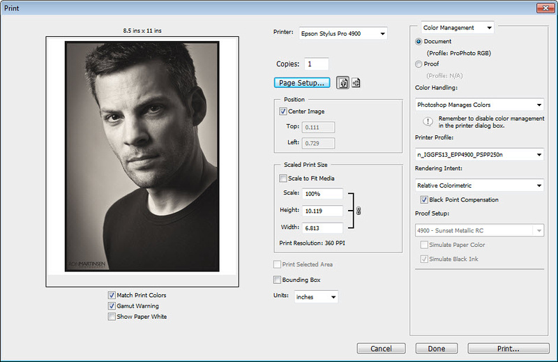
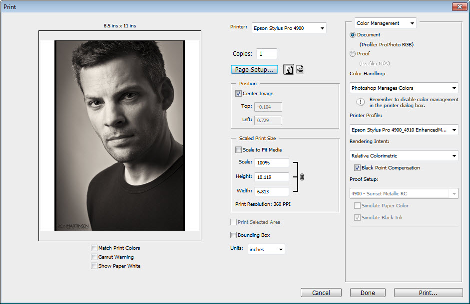
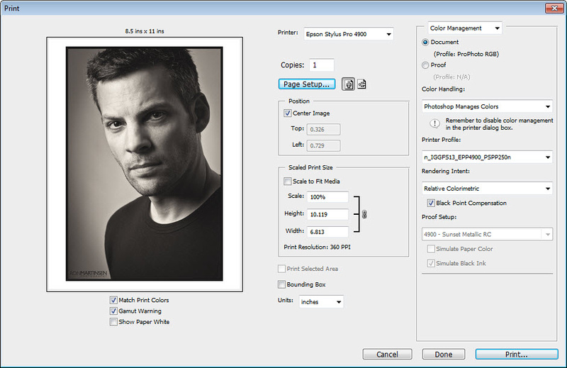
Software / Driver

Here’s a quick screen shot of the main pages of the printer driver on the PC:


Main Printer Page


Page Layout Page


Current Settings Page

Advanced Black & White Mode on 4900

For previous Epson users, not much has changed with the driver on the 4900 over other models. One pleasant addition that isn’t shown above is the inclusion of the Epson Signature Worthy papers in the media type list. There seems to be more enforcement of rules for those media types as well as the pleasant addition of being able to print in matte or photo black in for Enhanced Matte paper (something I couldn’t do on my 3880).

Overall everything works pretty much like the 3880 (see my review). Advanced Black & White mode appeared to be identical as did the normal workflow for printing in color as I discuss in my EFP and Hot and Cold Press Papers reviews.

One issue to be aware of when printing cut sheet paper is that you can sometimes get a gap at the bottom of the page. I’ve written a detailed article that addresses the issue and shows how to easily fix the problem on both the Mac and Windows (videos included). While this subject is documented in the manual, I read the manual and still got it wrong due to the design of the driver on Windows so hopefully my article will prevent you from wasting any paper on this issue.

One feature missing that I enjoyed with my 3880 was the ability to get a log of my print jobs so I could examine ink usage per color and more from Printer Watcher. This feature seems to be entirely absent on the 4900, but you can still print the last 10 jobs report on paper. However, there does not appear to be a soft copy option like Printer Watcher for the 3880 offers. I was extremely disappointed about this as Canon’s outstanding Accounting Manager helps you to know the exact cost of each print when billing your clients, so I like to do the same thing using Excel for my Epson printers. There appears to be nothing in the box (nor anything well advertised for an additional fee) to do that with the 4900 without wasting paper, and the myEpsonPrinterStatus feature didn’t seem to do anything (my unit will only say disabled).

Areas of Improvement

I love the 4900, but nothing’s perfect. If products were perfect there would be no reason to ever have new models, so in the spirit of that reality here are some areas where I think the 4900 could improve:

  • User-friendliness – At first glance it seems that the 4900 is the most user-friendly pro Epson printer, and it may be, but I think it can and should be much easier to use. It takes too long from the time you think “I want to print this” until the time you are holding a print in your hand. Forget the stats on the website because they don’t account for things like the 4 minutes I waited when changing black inks, or the annoyingly long nozzle checks (which don’t seem to help), or the finicky paper loading. Not all of these things happened with every print, but there was always a reason to wait longer than I wanted to or need to with my other three printers.

    I know from using my Canon iPF6300 that there’s huge room for improvement here. Of course some will say that the 4900 can’t be compared to the iPF6300 as they are totally different category of printers, and that may be true, but ease of use for the act of getting an image on my screen output from a device is product independent – it should just work. Currently it’s a lot more hassle on the Epson platform of pro printers that I’ve used than the Canon platform printers I’ve used, and neither is perfect.
  • Manual loading front & rear could be easier – The 3880 does manual paper loading very well, so my wish here is that the 4900 would be just as easy (if not easier). It’s not. In all honesty when I have a sheet that I need to print I use the 3880 and when I want to print on a roll I print with the printer that has the paper I want loaded in it, so of the four printers I currently have the 4900 doesn’t get as much use as it should given its excellent image quality.
  • Auto Nozzle Checks – The engineers at Epson probably had their reason for enabling auto nozzle checks at startup for a reason, so I refuse to disable it. Perhaps its because one of the biggest complaints I heard from 4880 users was that it was prone to head clogs. However, this feature takes a lot of time and sadly in my case it didn’t help. In just a couple of months with less than 50 prints the yellow head was completely clogged and light cyan head was mostly clogged. This was the first of my four printers to have a clogged head (which includes a cheap MP560) and it took two full cleanings to get it 90% clear. This begs the question – what’s the point of auto nozzle checks if it doesn’t work and it doesn’t warn me that a head is clogged? I’m still scratching my head over this one. FWIW, this feature can be disabled via the Printer Setup menu’s Auto Nozzle Check option. It’d be awesome too if there was a way to tell the printer to just clean the clogged head and not waste ink from the other colors when they aren’t clogged. As an Engineer, I can not think of any technical reason why they couldn’t do that, so add this to my wish list of future printer feature requests.

    NOTE: An Epson representative suggested that my yellow clogging was an anomaly so I will be discussing this matter with Epson support to see if there are any issues specific to my printer for this issue.
  • Ink Switching – This appears to be a printer that was redesigned from the ground up. I’m perplexed why Epson didn’t choose Canon’s design of having dedicated lines for all of the inks which would make black ink switching between photo black and matte black unnecessary. It’s time consuming, wasteful, and downright annoying. If you’ll be doing lots of prints using both black inks, and you can’t batch your jobs, then my advice is to get two printers (perhaps a 3880 and 4900) to avoid this problem. I say welcome to the 21st Century – please, please, please catch up with Canon and add dedicated lines to your next round of pro printers.
  • Paper Eject Support – Who designed this tray that extends on the front of this printer? OMG, this is the most annoying thing I’ve ever used. It’s noisy and it always gets stuck on me both when extending it and retracting it. I thought about doing a video that shows why I’m so frustrated, but if I did I fear it might scare away potential buyers who might not get a chance to experience the great things this printer has to offer. I also wish this was something that was unique to my printer or my lack of skill, but I’ve seen the same issue on two others 4900’s and we all agreed it is simply a poor design. I’d love to see Epson fix this and offer an exchange program for those frustrated by the current design.
  • Stronger front door locks – The design of the front doors on the printer that hold the ink cartridges is pretty good, but one issue I’ve had is that these doors open up too easily. I’ve bumped one of them open (usually when working on the control panel) well over a dozen times, so a stronger lock mechanism would be much appreciated. My 2 year old son has also discovered how easily they open which is a super bad thing as well.
  • Artificially restrictive borderless support – Perhaps I’m dense, but if this printer can do a borderless print at 17x22, then why can’t it do the same at letter size? Why does the printer care? It should just work. On my Canon iPF6300 I can do a 24” wide strip at 6 inches tall – borderless – for a sheet of 4x6’s, but this driver won’t let me do it to save my life. Of course I can probably do it with ImagePrint, but I just don’t understand why this printer driver won’t let me do what I want to do.
  • It is not a workgroup friendly printer – My day job for 4 years involved creating software that solved problems for small businesses, so I have extensive experience with interacting with them (via site visits) and studying them (usability studies and marketing research). In the real world small businesses are on tight budgets, so when a business owner make an investment in a printer at this price point they want it to solve more than one need. As a result of this reality, I think it’s not unreasonable to hope that a printer like this could have its tray loaded up with plain paper and serve as a workgroup printer and its roll loaded with fine art paper for its fine art printing needs.

    While it is technically possible to do this, the slow startup times and driver complexities make this not a very practical option in typical businesses where workers simply hit file print and expect the printer to do the right thing. ImagePrint offers a solution with its hot folders, but Epson should make this easier as well. They obviously get this point with the driver design for the V750 scanner (review), so why not here too?
  • Where’s the wireless networking support? – Attention external device makers of the world – it’s 2011 and wires should be obsolete. Please add WiFi™ support and/or Bluetooth™ support. Fortunately I think Epson gets this and has it offered on the R3000, but why not this printer too?
  • Where’s my free accounting manager software? – I really miss this feature from my Canon printer and the lack of software logs from Printer Watcher as I could do with the 3880 is very disappointing. A buyer should be able to answer the question “what was my cost of this print” without a calculator or going through hoops (like wasting paper printing a log), and that can’t be done. It’s technically possible as the printer has the data, so I’d love to see Epson with a competitive solution here.

Why You Should Get This Printer

Now that you’ve seen my massive griping above, you might think – Ron doesn’t really like this printer. However, that’s not true at all – in fact, I like it a lot. In fact, it’d be easy to say I love it like a sibling. You know how you can bitch all day about your siblings faults, but at the end of the day you’d be lost without them – well that’s how I feel about the 4900!

At the end of the day a printer should be judged most heavily on one thing – the quality of its prints. Make no mistake – this printer makes amazing prints!

The ink is fantastic and the roll support means that I can print my favorite print size – 16x24” – and still have a little white space around the edges for framing. I can also do nice panos so the need for the larger 7900 becomes less necessary for those who mostly stay within the 17” on the short end range.

I’m no paper expert, but of all the papers I’ve used thus far the Epson Signature Worthy papers are my favorite. These papers when paired with the great ink in this printer, and the factory paper profiles means that great print results from a good source image file (which requires proper display calibration) is fairly easy. There’s value in knowing that you can get consistent high quality results without thinking about, and that’s where this printer really delivers.

I also feel that this is best built printer in my studio. If the Epson Stylus® Pro printers at the 4900 and up price point were cars, I’d say they were built like Rolls Royce’s. They are super solid and quiet and have a construction that inspires confidence for years of service.

Stepping Down from the 4900

Epson R3000 – Copyright Epson America, Inc.

Space should be a consideration, so if the 4900 is just too big for your needs then Epson has two great products to meet your needs – the 3880 and R3000. I love my 3880, and the R3000 features the same print quality plus the support for wireless networking and roll support, so it’s a great solution. The small capacity of the R3000 ink cartridges make it less economical to operate than the 3880 and 4900, but low volume printers might find it is the perfect solution for their desktop fine art printing needs.

Epson 3880 - Copyright Ron Martinsen
Epson 3880 – Copyright Ron Martinsen

Stepping Up from the 4900


Epson 7900 – Copyright Epson America, Inc.

Want the same great image quality of the 4900, but the wonderful 24” wide format? The Epson Stylus® Pro 7900 is your printer. This beast is huge, but it’s the dream machine for those looking to do large 24” prints and its huge ink cartridges mean significantly lower costs per print. However, this printer is less suited for sheet fed prints than the 4900, so if sheets will be a major part of your workflow then a dual printer setup makes more sense.

Profile Note

The 4900 uses the same print head and ink technology as the 7900 and 9900, so many have incorrectly assumed that the same profiles can be shared between all three printers. While this seems to be true of sharing between the 7900 and 9900, my experience thus far has shown that the 4900 requires is own profiles for the best results. I won’t make any guesses as to why this is necessary, but I’ve found it to be true in my testing. All of the x900 printers are close enough that you can still get usable prints by profile sharing between them, for the best results you should always get custom profiles created using targets printed on a Epson Stylus® Pro 4900 specifically for a profile for use with a 4900 only.

Conclusion

I’ve got a love hate relationship with this printer. I love the final product it creates – it’s prints are amazing, but I hate how complex and time consuming it is to get one of those prints. Epson can and should do better, so hopefully driver and firmware updates in the future will make this product better. I also hope that competition from others will help the next wave of Epson printers to meet or exceed what competitors are doing with the things that I’ve complained about in the areas of improvement section. However, none of those issues should deter you from purchasing this printer as none directly impact the most important reason to own this product – its great print quality.

This is an extremely well built product from what I’ve seen, and it’s pretty darn quiet too. I think anyone doing fine art prints with the 4900 will be thrilled with the results and therefore it is without hesitation that I HIGHLY RECOMMEND this product.

Where to Buy (and save $1000)

For those purchasing online, I highly recommend that you click here to purchase from B&H. When purchasing you may also want to consider some Exhibition Fiber paper and the Epson Hot & Cold Press Papers for your fine art printing needs, and some Epson Ultra Premium Presentation Paper (matte) &/or Epson Ultra Premium Luster as your more economical high quality photo papers.

Click here to see my digital darkroom page on B&H’s website for more info.

Save $1000 Until August 31st, 2011

Until August 31st, 2011 you can save $1000 via an instant rebate at B&H – click here to learn more. It’s worth noting that with this deal, this makes this fantastic printer for $5 LESS THAN (at B&H as of 8/25/11) an Epson Stylus ® Pro 3880, so its really a deal you can’t pass up on if you have the space.

Shop Local in Seattle with JVH

If you are in the Seattle area, then I’d advise you to consider purchasing from JVH Technical. They are super customer oriented and will go the extra mile AFTER the sale to make sure you get the most out of your printer. Tell them I sent you and they’ll hook you up with some paper samples and great advice. In addition, they have a great deal on ImagePrint for use with this printer when you mention this blog.

More Info

Check out my Printing Series page for more information that will help you to get the most of this printer. As of the time this article was written, here are some articles you’ll find super helpful:

Here are also some web links that you may enjoy:

While some of these articles were written while I was using my 3880, all the concepts apply to the 4900 as well. I also have avoided duplicating much information found in my Epson Stylus® Pro 3880 article, so shoppers may find the information in it very useful and relevant to this printer as well.

Disclosure

Epson has provided this printer and ink to me for the purpose of reviewing and using in my printing series. I may also get a commission if you make a purchase using links in this article.

NOTE: This site requires cookies and uses affiliate linking to sites that use cookies.

If you enjoyed this article, please support future articles like this by making a donation or saving money by using my discount coupon codes. Either way, your support is greatly appreciated!

This blog is intended for freelance writing and sharing of opinions and is not a representative of any of the companies whose links are provided on this site.

The opinions provided are of Ron Martinsen alone and do not reflect the view of any other entity

Monday, August 22, 2011

REVIEW: Rogue Lighting Filters (Gels)

Rogue Gel Band Up Close

This is a review of the new lighting filters (aka gels) by Expoimaging under the brand name – Rogue. They are the makers of the Rogue Grid and Rogue Flashbenders that I use, so when I heard about their new lighting filters product I was pretty excited to see what they came up with.

I should make a disclaimer that I am using pre-production units for this review so what you see in the photos might be a little more heavily worn and unpolished than what you’d get if you purchased them.

This also isn’t a tutorial on how to use gels, but I do briefly demonstrate the usefulness of correction gels as well as what effect you may get using the colored gels.

With that said, let’s take a look at these new products and why you might want them.

Solving a problem as old as the flash

Gels have been used for quite some time with constant lights for video production (i.e., movies & TV) so naturally someone got the idea of how cool it would be to use those gels on a flash. However, the age old problem here has been – how do I attach the gel to my flash and for most the answer is usually something like this:


Gaffer’s Tape Gel Attachment
Rogue Lighting Filter Attached

Of course many nervous nannies don’t want to stick tape on their flash so all sorts of concoctions have been invented, but until now I’ve not seen an affordable solution that doesn’t require something stuck to the flash (like Velcro).

Why you should care about gels…

Many of my readers probably aren’t familiar with gels, so I’ll say up front that this isn’t a tutorial (although I hope to do one in the future). I will say that the reason why you use filters (also called gels) is primarily for correction so that you can do things like balance the color of the flash (using a CTO gel) with the tungsten lights in a room to create a consistent color that is easily white balanced across the image instead of a mixed color scenario (subject hit with the flash is one color, and the ambient background light is another color – which is near impossible to correct with white balance alone). Here’s an example:

Notice how the white of the text seems nice and white yet the background lights are very orange. This is an in-camera jpeg without any corrections (beyond cropping) to illustrate what you would get if you just fired your flash with no gel. Now, let’s see what happens when we use Lightroom or Adobe Camera Raw’s White Balance tool and click on the text to get a white balance with the RAW file:

At first glance to the untrained eye you might think – wow, that’s much better – the orange cast is gone and all looks well. However, you should take note that the light under the cabinet in the background still has a strong orange tint to it.

Now let’s shoot the same shot with a full cut CTO gel (orange gel):

What you’ll notice now is that the background is really orange, but when we set the white balance on the raw by clicking the eyedropper on the white text look what happens:

Notice how the light in the background no longer has an orange tint anymore? Now mouse in and out of the image below to see the white balanced versions of the shots with and without the CTO gel to see what a difference this makes:

Mouse over to see CTO gel correction, mouse out to see Bare Flash
Mouse Over to see with CTO correction
Mouse Out to see Bare Flash

Notice how much better the CTO gel corrected version looks? This is even more noticeable when you use people as subjects in a large room with tungsten lights.

Here’s what you get…

At the heart of the Rogue Lighting Filters for flashes is this new Rogue Gel-Band which is included with the Universal Filter Kit. It’s special an elastic band that is designed to hold the specially cut gels onto any size flash head as shown here:

Rogue Gel Band Up Close

As you can see, it’s a simple but effective design that works quite well. If you click the image above you can see that these filters also feature the LEE Filter™ name of the gel printed on the side. Not shown on the other side is the amount of light loss printed at the opposite edge.

Rogue Lighting Filters for Flashes (left) and the Rogue Grid (right) Rogue Universal Lighting Filter Kit for Flashes (left)
and the Lighting Filters for the
Rogue Grid (right)

Each kit features a generous collection of 20 dynamic color and correction filters in the form of 14 color effects gels, 5 color correction gels, and 1 diffusion gel inside a nice compact storage pouch with quick reference dividers to keep the gels safe, organized, and easy to grab when you need them.

Here’s an example of what the kit for the Rogue Grid along with the gel inserted:

As you can see the gels are nicely labeled and feature notches to help them slide in nicely into the grid system. As a result, there’s no band required for use with the grid and the perfect fit ensures no unfiltered light spillage.

Examples

The following sample shots were taken by simply doing a straight handheld shot into white seamless paper (although black is generally better for background lighting). As you can see, when done properly these gels have no spillage issues and you get great edge to edge uniformity:


Canon 1D Mark IV
1/125 sec at f/5.6, ISO 100, 95mm using the Canon 70-200mm f/2.8L IS II USM lens
Some jpeg compression artifacts and dust spots shown
Deep Purple Filter using a 580EX II in ETTL

Here’s another example using the same camera, lens and flash with the Rogue Grid:


Rogue Grid Example
1/125 sec at f/11, ISO 1600, 70mm
Just Blue Filter

You control the tone, so your color palate is huge

Like any gel, you can combine filters or simply adjust the power of your flash or your camera settings to get drastically different results. For example, using the Moss Green filter below I get two entirely different results simply by changing the ISO from 100 (top) to 400 (bottom):


Moss Green Filter
1/80 sec at f/2.8, ISO 100, 70mm
Flash
Exposure Compensation -1 2/3


Same as above at ISO 400 instead

This means with a little effort, you can pretty much get whatever color you want using this wide set of filters.

The Competition

Honl Photo makes a competing product that uses their expensive Speed Strap ($9.95 at B&H on 8/22/11) that I’m not a fan of because they fall off the flash and are easy to lose. They offer a color correction filter kit, color effects, Hollywood, and Autumn kits each of which cost $19.95 (+ $3.35 shipping at B&H on 8/22/11) and includes 5 colors (2 per color) for cost of about $3.99 per color (or $2 per filter). They also offer a sampler kit which is a little better as it has 10 colors (x2 of each).

With the Honl solution it that to get 20 colors and a speed strap you’d spend about $90 to get what is offered in the Rogue Lighting Filters Universal Kit for $29.95 (or $60 if you bought two to have 2x of each). Of course there are other expensive solutions like Sticky Filters which are $50 for 5 and the Nikon SJ-3 Color Filter set which are $23.95 for only 8, but the Rogue solution seems to be the value and variety leader.

Conclusion

This is a great solution that is more effective than the competition. They are well designed and durable filters created from LEE Filter™ gels, so the quality is good. The gel-band works well and is easy to use once you get the hang of it. I really loved the case that organizes the filters and the fact that they are all well labeled so I know FOR SURE if I have a half cut or a quarter cut of orange. I also love the wide selection of colors.

These are nice kits that are reasonably priced and should hold up for quite some time. I highly recommend them and feel that every photographer should toss these in their bag for the correction filters alone.

Go to B&H or ExpoImaging (see discount below) to purchase these products. At the time of this article, only ExpoImaging has them in stock, but they will be offered elsewhere (i.e., Amazon, Adorama, B&H, etc… ) in the near future.

Special Offer

ExpoImaging Store - Redeem Discount Coupon
NOTE: You MUST provide your credit card info before the Redeem button will work!

My blog already has a discount coupon code in place for existing ExpoImaging products like the Rogue Flashbenders, Rogue Grid, ExpoDisc, and RayFlash, but I’m pleased to announce now that you can also save 15% when you use the coupon code ronmart09 to order your .

Codes change so check the discount coupon code page for the latest code if this code doesn’t work.

Disclaimer

Like most of my reviews, I was provided a copy of the Rogue Filters to test at no obligation from ExpoImaging. While I may get a commission if you purchase using the discount from this blog or at one of my partners like B&H, it would take a hell of a lot of grid sales to pay for my son’s diapers <g>. I won’t be getting rich off you using the links, but every little bit helps to support this blog so I appreciate when you do use the links!

NOTE: This site requires cookies and uses affiliate linking to sites that use cookies.

If you enjoyed this article, please support future articles like this by making a donation or saving money by using my discount coupon codes. Either way, your support is greatly appreciated!

This blog is intended for freelance writing and sharing of opinions and is not a representative of any of the companies whose links are provided on this site.

The opinions provided are of Ron Martinsen alone and do not reflect the view of any other entity