
When I saw the announcement for the Z7 and Z6 I wasn't expecting much, but I knew I had to review it - like it or not. What would happen over the next month was an initial negative opinion, that was happy to believe some of the trolls complaints on the web, would be turned into a new respect for Nikon's first legitimate attempt at doing a proper mirrorless camera suitable for pros.
Overall Impressions
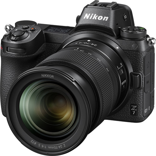
Initially I was very put off at the decision to change lens mounts and a slot that only takes expensive XQD cards, but as I got to know this camera all was forgiven. The ergonomics were great and the joystick and "i button" meant that it didn't suffer from Sony's initial mirrorless mistakes. In fact, outside of the decision to only do one XQD slot, I have no complaints at all with the body.
The battery life was disappointing so I found myself running out of battery in just one day out shooting in Shinagawa, Japan. I also found the performance of the in-camera card reader when transferring images over the USB-C cable back to my Windows computer to be painfully slow.
Unedited JPEG's
My Z7 kit arrived just as I was about to fly to Japan for a business trip, so during the limited time I had to myself I managed to put it through a pretty good stress test under a variety of conditions.
The images you see below are just like my "real world pics" (except these aren't so real world -- it's cool places in Japan) where I'm showing the 100% unedited in-camera JPEG. You can click the photo to see the full size original, but I don't provide the raw files which enjoy +/- 5 EV of recovery which is a fantastic tool to have at your disposal!
Most shots are shot with A2 White Balance that keeps warm colors. In cases where it's obviously a bit heavy on the yellow side, I've typically put the camera in Shade white balance (and in some cases forgot to reset it back to A1 - like the first shot below).
You may view the images at full-size, but you may not save, print, edit or otherwise use any of the images in this article or in the gallery. All photos are copyright Ron Martinsen - ALL RIGHTS RESERVED. I do ask that you also leave the article open in your browser while you view the images.

f/22 @ 43mm for 1/200 sec at ISO 2000
I was impressed with the Diffraction Compensation feature as it gave me the confidence to
shoot at f/22 without the fear of getting a very smeared details caused by diffraction

f/5.6 @ 70mm for 1/80 sec at ISO 10000
As you start to see on the highlight area, shots like this typically get blown out where the light hits the hardest. The Z7's highlight-weighted metering was good, but this was one scene that defeated it. With that said, this does highlight the wide dynamic range even in the in-camera JPEG, so recovering this to perfection in a raw editor is trivial.

f/13 @ 37mm for 1/640 sec at ISO 1600
I was very pleased with the 24-70 kit lens and default in-camera noise reduction of the in-camera JPEG's. While the costumes and makeup are cheesy, this shot did make me say WOW when I saw it on the back of the camera and even more so at home on a 4K display!

f/6.3 @ 70mm for 1/250 sec at ISO 100
I wanted to get a shot of this fish on the roof, but in the default FX mode it was so tiny with the 70mm kit lens

f/5.6 @ 70mm for 1/250 sec at ISO 100
DX mode (3600 x 5408) gave me an in-camera result that was closer to my intention and there's still plenty of megapixels to crop in even closer. While this is a bit of a gimmick since you can crop in and get the same result from the FX mode (5504 x 8256) version, if you aren't ever going to use those extra pixels why waste the storage space for them?

f/4 @ 70mm for 1/1000 sec at ISO 125
This was my first shot where I tried focus peaking and it worked like a champ on these leaves that were kind of hard for AF to pinpoint and moving a lot in the breeze. I was super happy to see this feature on this camera!

f/5.6 @ 70mm for 1/320 sec at ISO 11400
This was a classic case where the flicker reduction feature could have easily prevented the banding you see in this scene, but sadly we got seated at our table before I got a chance to try it out. Despite my best efforts on the trip to get another great flicker scene like this, Murphy's Law kicked in and I couldn't do it - even standing in the same exact spot again later!
The good news is that IF I did, this camera has the perfect feature to make ugly banding like this go away when you enable flicker reduction.

f/7.1 @ 24mm for 1/100 sec at ISO 110
One of the features of higher megapixel cameras is more shallow depth of field, but f/7.1 did ok for a scene like this where I expected more out of focus areas much sooner. The full gallery has similar scenes at f/14 and f/18 which are more appropriate for a scene like this, but I just liked this one more for the content of the scene itself (not that it has anything to do with this review - ha ha)
f/5 @ 65mm for 1/500 sec at ISO 640
(623px crop of 5504 x 8256 original - click for original)
I didn't have a macro lens and I didn't want to get too close to this spider,
but I can crop to see the hairs the spider legs!


f/7.1 @ 70mm for 1/400 sec at ISO 100
This was the image that made me love the lens and sensor in this camera - there's definitely a lot to love about this camera and its razor sharp kit lens, so don't sell yourself short by trying to bring the clunky F mount 24-70 when this Z mount lens is so good.

f/4 @ 31mm for 1/125 sec at ISO 3600
The lack of a hood for the kit lens is unforgivable, so I was irritated when this shot got ruined by lens flare that could have easily been canceled out by a proper hood.

f/11 @ 41mm for 1/200 sec at ISO 560
I thought this shot was a pretty good representation of the wide dynamic range and buttery smooth continuous tones you can get from your landscape skies. Shooting RAW for this also means you can bring back more details in the shadows to make a very interesting edit for this shot.

f/8 @ 46mm for 1/200 sec at ISO 14400
I had to double-take when I saw the ISO for this shot. Granted, noise is easier hidden in brighter scenes, but this was actually shot as the sun was setting but you can never tell thanks to ability to do a clean ISO 14,400 shot

f/4.5 @ 58mm for 1/250 sec at ISO 4000
The real scene was extremely dark and I was at an awkward angle to take this shot. I fully expected to have motion blur, but 1/250 plus in-camera stabilization meant a super sharp shot that you might mistake for a tripod shot

f/9 @ 28mm for 1/125 sec at ISO 20000
Again, in a dark scene shooting into the sun, I was pretty happy with this ISO 20,000 result

f/11 @ 30mm for 1/125 sec at ISO 22800
Again, this scene makes you think that this is just before the sun is setting but the truth is that the sun was below the tree line so the shrine was closing. I got to hand it to Nikon for doing an incredible job with the in-camera noise reduction!

f/5.6 @ 38mm for 1/160 sec at ISO 3200
Highlight-priority metering mode gave me something to work with on the RAW later, but this also illustrates about what the lighting felt like in real life for most of the scenes at this shrine

f/22 @ 24mm for 1/13 sec at ISO 25600
This scene looked like the above scene in real-life yet the image stabilization and high ISO performance let me pull off a shot that I can work with. ISO 25,600 is totally usable with this camera!

f/22 @ 28mm for 1/125 sec at ISO 2800
This was my one and only in-camera HDR and it did a reasonable job, but I'd personally still use Aurora 2019 to get a lot better results than this

f/7.1 @ 24mm for 1/100 sec at ISO 6400
While in Shinagawa, Tokyo I had to stop by the Nikon Museum again where they have nearly every Nikon camera ever made on one wall!

f/5.6 @ 25mm for 1/100 sec at ISO 4000
While not relevant to the article, I had to point out that they have the first Nikon camera on display too! Sadly it's behind a glass case so it's not easy to get a shot due to all of the reflections

f/5.6 @ 66mm for 1/320 sec at ISO 9000
Yes, they even had the Z7 & Z6 on display which proved to be too much for the default metering

f/5.6 @ 57mm for 1/250 sec at ISO 4000
This camera definitely makes me feel that cutting D5's like this is probably the more interesting use of them in the not too distant future as mirrorless is here to stay

f/7.1 @ 47mm for 1/200 sec at ISO 16000
They have nearly every Nikon lens ever made, so it was cool seeing the display case with a 1979 20mm mounted to the Z7 using the FTZ adapter

f/5.6 @ 41mm for 1/160 sec at ISO 500
Canon has a mini-museum in a nearby building where the next mirrorless I'll be reviewing is on display. Based on the body design alone, I'm not expecting it to be as enjoyable as the Z7.

f/4 @ 70mm for 1/800 sec at ISO 4500
Highlight-priority metering helped me to get a more usable shot of this train which was blown out with the default metering

f/11 @ 44mm for 1/640 sec at ISO 100
In yet another case where highlight priority metering saved the day, the sun was shining on this castle so the white was pretty blown out. As such, I was glad I had highlight priority metering available to me

f/6.3 @ 24mm for 1/60 sec at ISO 25600
This tea room in the castle was pitch black and behind glass so I didn't think I could get anything, but after a little focus hunting I got a "I was here" shot

f/8 @ 27mm for 30 sec at ISO 100
I love mirrorless for long exposures as a 2 second timer and a tripod are typically all that is needed to get a super steady and sharp shot. I also didn't have to disable stabilization either - it seemed to take care of that for me as I didn't notice any vibrations in the scene. The light trails are laser sharp - sweet!

f/9 @ 53mm for 1/250 sec at ISO 4000
This was a tough scene, but no metering option on this camera could do this shot justice. I settled on the matrix metering with the focus on the bright white objects on the table on the left. Had it not been so crowded I would have tried HDR, but I was with a friend and had to move on before I could do that.

f/11 @ 58mm for 1/250 sec at ISO 160
I encourage you to click this image to see the full-size image and pay attention to the wires and crane detail - it's fantastic and highlights the real benefit of using a 45.7mb camera.

f/4 @ 68mm for 1/320 sec at ISO 20000
I tried several settings, but settled on A2 white balance to keep the warm colors, but this red was definitely a good case for shooting raw and correcting in a higher color space than sRGB

f/5.6 @ 29mm for 1/125 sec at ISO 3200
No trip to Japan is complete without a sushi shot, so you're welcome - looks exactly as it did just before I ate it - ha ha.

f/10 @ 34mm for 30 sec at ISO 100
This shot was quite a torture test too, but I was satisfied with the in-camera result. I thought the colors were preserved very well as was the tonal range of the greens under very difficult conditions during a long exposure

f/5.6 @ 52mm for 1/30 sec at ISO 800
I had to use my handheld trick to pull this shot off without motion blur, but the aggressive in-camera noise reduction destroyed the detail captured in the original. Again, raw to the rescue but still a usable JPEG for social media
Click here to view a gallery of over 80 images from the 2500 images I took during my Z7 review.
Poor Autofocus at Night
I found the autofocus to be terrible in low light and the face detection to be even worse. What's more, if you are in a big crowd it just flat out gives up rather than doing like other cameras that seem to just look for foreground faces and stop. Here's one of hundreds of out of focus shots I had in Shibuya Crossing in Tokyo, Japan on Halloween:

f/5.6 @ 70mm for 1/320 sec at ISO 25600
Obviously this is a tough shot for face detection, but I question the algorithm that decides to pick the subject the farthest away from the camera. A typical failure would have focused on the guy in the right edge or the guy behind the girls lookin at his phone
I was so disappointed at the failure rate both here and other places on the trip when the light went low - especially when people were the subject, so I definitely would NOT recommend it for street photography.
Here's another example where literally the subject stopped for me and despite getting 6 tries, not one frame was in focus - for anyone! It seems that the camera tries and fails then just defaults to infinity which is almost always wrong:

f/5.6 @ 26mm for 1/125 sec at ISO 9000
How in the world did the AF miss this stationary subject after 6 tries?!!!!
Nikon did a fantastic job on their website describing the features of the Z7. The also highlight the similarities and differences between the Z7 & D850, so if that's something you are interested in then I suggest you check it out!
FTZ Adapter
The FTZ Mount Adapter enables the use of nearly any Nikon F-mount lens on Z-mount mirrorless camera bodies. Sadly I couldn't get my hands on any Nikon lenses before I had to send this camera back, so I was unable to test this feature. If you are reading this review and you've tried it out, please feel free to add your thoughts on it in the review comments. I'll approve your comments assuming they don't link to anything and aren't spam.
Conclusion
I expected to be writing a scathing review of Nikon's half-hearted attempt to go mirrorless, but honestly I did not find that to be the case at all. Instead, I found myself very surprised at how good Nikon's first attempt at a pro quality mirrorless camera turned out to be. While I'd be lying if I said that it even comes close to the Sony a7R III, but long-time Nikon shooters and Sony haters now have a viable alternative.
Yes, only one slot that is XQD only sucks - a lot. Yes, the autofocus isn't even in the same galaxy as Sony. Yes, I was very annoyed that the kit lens didn't come with a hood. Yes, it hunts like a <censored> in low light and can't find a face to save your life. However, it did offer much of what I loved about the D850 with very good high ISO performance and excellent image quality. As such, I can easily recommend it for Nikon shooters with a legacy collection of lenses they wish to continue to use on a mirrorless body that they are quite familiar with already. I also think it would make an excellent complementary body for Nikon shooters.
Yes, it's not perfect but overall I was impressed with what this camera offered and the results produced. Now let's see if Nikon follow's Sony's path to success by releasing annual improvements until they get hit one out of the park.
Where to Buy?
CLICK HERE to learn more or buy today.
Other articles you may enjoy
If you enjoyed this article, you may also enjoy these:
- Nikon D850 (includes 24-70 VR & SIGMA 135mm Art)
- Nikon D750
- Nikon D5
- Sony a7R Mark III - Camera of the Year 2017
- Sony RX100 V vs iPhone X
- Sony a9 with 24-70mm GM
- Sony RX100IV in the hands of a pro that destroys DSLR shots
Enjoy these and more on the Reviews tab as well as Ron's Recommendations.
Disclosure
If you make a purchase using links found in this article, I may make a commission. It doesn’t cost you a penny more, but it does help to support future articles like this.


