Showing posts with label black and white. Show all posts

Wednesday, February 17, 2016

REVIEW: Epson Legacy Etching & Video Tutorial (Legacy Series 3 of 5)

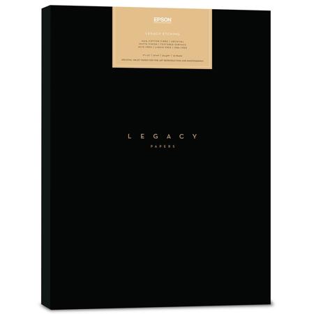
Epson Legacy Etching Paper

Epson Legacy Etching paper is a cotton fiber substrate that uses matte black ink to create archival quality fine art prints. Here are a few important facts about this paper:

  • 100% cotton fiber
  • Image Permanence: 200 years color / 400 years B&W (when used with Epson HD and Epson HDX Ink)
  • 20 mil / 508 Mu caliper
  • Acid and lignin free / pH buffered
  • No Optical Brightening Agents (OBAs)
  • Smooth surface / Matte finish

Check out the Print Your Legacy landing page with videos here to see what some well respected photographers think of this and all of the Legacy papers.

For more on my thoughts, continue reading.

Geeky Comparison

If you aren’t a geek you might want to skip this section.

When comparing Etching next to a variety of other Epson papers you’ll see that its color gamut isn’t quite as large as some of the others:


Epson Legacy Etching vs Legacy Fibre,
Cold Press Bright & Natural, and Hot Press Bright and Natural

Click  for a larger view

However, in practice the differences don’t feel that large. In fact, if you compare the color gamut as a 2d chart (from ColorThink Pro) against Cold Press Natural then you’ll see they are fairly similar:


Epson Legacy Etching vs Cold Press Natural Color Gamut
on a Epson SureColor P800

In The Hands Analysis

When holding the paper in my hand I observed that it is slightly darker than Epson Velvet and much brighter than Hot Press Natural, despite the absence of OBA’s. This makes it more aesthetically pleasing paper with whites, yet it still retains the archival longevity of papers that do not have OBA’s.

The texture and thickness of my sample paper felt much like the Hot and Cold Press papers which is a good thing, as I love a hearty matte paper that doesn’t flex when you hold it. This coupled with a noticeable texture when viewed at an angle that feels good in the hand, but doesn’t stand out on the print means that you get all of the advantages of a textured matte paper without it distracting from your photo. I like that – a lot!

In terms of durability, it’s like all matte papers with matte ink – you have to be careful as it’s easy to scratch or smudge so using gloves is recommended and protect as soon as possible. However, it seemed less fragile than the Fibre in real world testing use and abuse.

If you are someone who appreciates things that feel good in your hands, you will definitely love this paper!

Real World Print Analysis


Epson V850 scan of Legacy Etching on a Mac (16-bit)

(Click for Original Mac Version above or Windows Version Here)

While the colors look a bit washed out in the scan, in real life it isn’t quite so faded looking. In fact the prints vibrant and the blacks look deep, but it’s not like Baryta bright and deep. As a matte paper, I found it to be very good. In fact, unless you have it next to better color gamut papers you’ll most likely find that feels exceptionally vibrant for a matte paper. This is definitely true of this photo (image provided by Epson for this review):


Actual Epson V850 Scan of a Print from SureColor P9000 on Legacy Etching

as well as this one which is available as a full resolution 24MB TIFF scan printing using Epson Advanced Black & White mode:


Full Resolution Tiff V850 Scan of a SureColor P800 Legacy Etching Print

Advanced Black & White Mode Used (Warm / Dark presets)
Faded old photo look created using Texture Effects

The ABW print has excellent grayscale tonal range, but it comes at the cost of not faithfully reproducing the color. Just for completeness sake I’ve included this one which is available as a full resolution 24MB TIFF scan printing in color using the icc paper profile for the P800:


Full Resolution Tiff V850 Scan of a SureColor P800 Legacy Etching Print

For reference, I’ve also done a print and scan using Epson Hot Press Natural:


Full Resolution Tiff V850 Scan of a SureColor P800 Hot Press Natural Print

and one using Velvet Fine Art:


Full Resolution Tiff V850 Scan of a SureColor P800 Velvet Fine Art Print

During my testing I observed that the Legacy Etching had the best overall result when printing as a color image when compared to the Hot Press Natural and Velvet Fine Art papers. In theory the Hot Press should have better blacks, but the Etching print just had a richer feel to it thanks to the most accurate reproduction of the original colors – presumably due to a great paper profile. The Hot Press Natural was the warmest toned paper of the trio with the Etching landing right in the middle as the Velvet was the brightest.

The Velvet was also the worst print with more muddled blacks, so I really appreciated the Legacy Etching even more after this test – especially using Advanced Black and White mode where the grayscale range was excellent.

On a scale of 1 (worse) to 10 (the best I’ve ever seen), I’d give it a 8.8 whereas I’d give the Hot Press Signature Worthy papers a 8.5, and Velvet a 6. This is an excellent paper that feels wonderful in the hand and its great paper profile means fantastic color and black and white prints that are faithful to the original image (assuming you have a properly calibrated display – which most don’t).

Tutorial Video with ABW

This video teaches you how to print on this paper in both Photoshop CC 2015 and Lightroom CC 2015 on OS X El Capitan with an emphasis on Advanced Black & White mode, but future reviews will also cover Windows 10:

If you’d like visual instructions, including Advanced Black & White, then be sure to check out the visual tutorial in the Epson Legacy Papers Reviews & Tutorials video which covers both Windows and Mac.

The printer paper profile you use will be in the format <printer> LegacyEtching_MK_<version>.icc (or sometimes icm) so for the Epson SureColor P800 you’d choose SC-P800_Series LegacyEtching_MK_v1.icc

Conclusion

I had such a high regard for the Epson Hot Press papers for their incredible dmax and color gamut (for a matte paper) that I went in wanting to declare them the winner. When I saw the “data” that confirmed my gut instincts, I was even more ready to say this wasn’t as good. However, when I held prints in my hand and compared them under my GTI lightbox it became clear that Epson has generated an excellent icc paper profile which creates great prints that rival the statistically better Hot Press papers.

I was also a huge fan of the cold press papers for their wonderful texture, so again I expected that etching would disappoint me. However, I found the texture on this paper to be substantial enough to see and feel but subtle enough so as not to distract. In fact, I wish it was a little more aggressive with the texture, but then again I’m a huge fan of the heavily textured Hahnemühle German Etching.

As matte papers go, this is one of the finest I’ve tested. I’d have to toss a coin when comparing the Legacy Etching to the Hot Press Natural as to which is better, so I’d probably purchase the cheaper of the two if there was a deal. All things equal, I’d probably go for the Legacy Etching. With that said, I enjoy bright papers so I’d probably do Cold Press Bright or Hot Press Bright for my fine art matte paper needs, but they are all so good I can’t see a customer who appreciates matte prints being disappointed with any of them.

I highly recommend Legacy Etching for its bright OBA free color, its wonderful but not over done texture and its wide color gamut that allows for faithful reproduction of my fine art prints.

Where to order

Click here to learn more or order at Adorama and click here to learn more or order from B&H.

Other articles you may enjoy

If you enjoyed this article, you may also enjoy these:

Disclosure

If you make a purchase using links found in this article, I may make a commission. It doesn’t cost you a penny more, but it does help to support future articles like this.

NOTE: This site requires cookies and uses affiliate linking to sites that use cookies.

If you enjoyed this article, please support future articles like this by making a donation or saving money by using my discount coupon codes. Either way, your support is greatly appreciated!

This blog is intended for freelance writing and sharing of opinions and is not a representative of any of the companies whose links are provided on this site.

The opinions provided are of Ron Martinsen alone and do not reflect the view of any other entity

Friday, August 7, 2015

REVIEW: Epson SureColor P600 (Part II of II)–Excellent Value with Pro Results

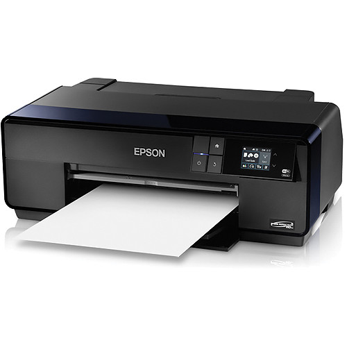
Epson SureColor P600 Inkjet Printer

I like to use a printer for a while before rendering an opinion because most photo printers can shine with just basic testing, but it is the test of time that surfaces issues with print heads clogging and network communication problems. Fortunately this printer has passed with flying colors as I’ve never once had any networking problems nor have I had a single print head issue even after not using it for seven weeks in very dry weather.

In part one of my review I sang the praises of the ease of setup, but over time I really fell in love with it even more. I loved using the P600 as my everyday printer with plain paper jobs, as well as doing simple 4x6 prints for my wife. However, when I needed a high quality print I found myself not even bothering to fire up my 3880 and trusting the P600 for the job instead. What’s more, it handled roll prints very well, so I even found myself doing small Exhibition Canvas and banner jobs with it.

Not only did this printer work flawlessly the entire 8+ months that I’ve been testing it, but it kept itself up to date with the latest software via its handy Software Updater app:

Software Updater keeps you up to date with no hassle

My contact at Epson tells me this printer is very similar to the Epson Stylus® Pro 3880 replacement, the Epson SureColor P800, except it has 25.9ml cartridges instead of 80ml. Those are tall words as the P800 is replacing a legendary model, but everything I’ve seen from the P600 except for the quality of some of its ICC profiles (which is fixable) indicates that this printer is certainly in the same league. Yes, my 3880 had better ICC profiles which helped it to outperform the P600, but the prints I got were all excellent and very close. As a result, I didn’t bother to compare the prints to the R3000 and instead put it up against the 3880 instead. Read more to see how it did!

Printing via Epson iPrint 5.1.1 from Apple iPhone 6

Epson iPrint 5.1.1 on iOS 8.4

I did print a 22mb full-size JPEG taken from a Canon 5Ds from the app and it worked great. While the source image could have used a bit more sharpening for printing via this mechanism, the color and quality was great. I was also happy that the app offered a decent selection of Epson media types, paper sizes, and even maintenance settings:

Check remaining ink directly from your phone

Apple AirPrint on iOS 8.4 worked without any hassle but the results were unimpressive due to lack of options, and the color wasn’t as accurate and vibrant as the Epson iPrint app.

Apple AirPrint on iOS 8.4 works, but use the app for best results

You must preconfigure your printer via the touch LCD with the correct paper type and size but AirPrint loved to send print jobs as 4x6 on letter paper in my limited testing.

Fine Art Printing using Matte Black vs 3880

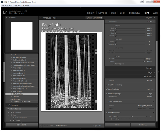
Lightroom 2015 Matte Black Ink Printing

When I printed on Velvet Fine Art matte paper, the printer driver forced me to use the manual front loading tray. Fortunately, printing via the front manual load tray was very easy and worked brilliantly. I did have to wait 1 minute, 34 seconds to change to matte black ink but that was over 30 seconds faster than the time it takes my 3880 so this wasn’t a problem either.

The print result was darker with less tonal range than the equivalent job sent to my 3880 and printed on the same paper. I suspect this is due to the 3880 having a more finely tuned ICC profile which mirrors results I’ve seen from other papers as well.

Advanced Black & White on Epson Metallic Photo Paper Glossy vs 3880

Lightroom 2015 with Advanced Black and White on Metallic

Advanced Black and White Mode

In the case of ABW the printer manages color instead of relying on an ICC Profile so the results that I got from the P600 seemed identical to what I got from the 3880. This was an absolutely stunning print with phenomenal tonal range and delicious blacks. In fact, its one of those prints that makes me wish there was a way I could show you but no electronic mechanism can do it justice compared to the results I got in real life. Simply put, if you do black and white printing, I can’t fathom how the results I got could disappoint even the most picky of print masters.

Conclusion

The Epson SureColor P600 takes everything I loved from the R3000 and makes it better. It’s a very reliable printer that makes excellent prints without any hassle – even when it sits idle for weeks on end. If you want a great photo printer for occasional fine art printing and daily print jobs, then the P600 will serve you well. If you want to do more fine art printing then it will be more cost effective to upgrade to the Epson SureColor P800 for its larger ink cartridge capacity.

Overall, I loved the Epson SureColor P600 and highly recommend it.

See part I of my review for more info.

Where to order

Click here to learn more, check for rebates/sales or order on the B&H web site. My friends at Amazon have it available here.

Due to minimum advertised pricing restrictions, it is best to add it to your cart to get the latest price and deduct any mail-in rebates on top of that.

Other articles you may enjoy

If you enjoyed this article, you may also enjoy these:

Disclosure

If you make a purchase using links found in this article, I may make a commission. It doesn’t cost you a penny more, but it does help to support future articles like this.
NOTE: This site requires cookies and uses affiliate linking to sites that use cookies.

If you enjoyed this article, please support future articles like this by making a donation or saving money by using my discount coupon codes. Either way, your support is greatly appreciated!

This blog is intended for freelance writing and sharing of opinions and is not a representative of any of the companies whose links are provided on this site.

The opinions provided are of Ron Martinsen alone and do not reflect the view of any other entity

Saturday, February 1, 2014

Pro Photo of the Week: David Rubinger Portrait by Vincent Versace

Copyright (c) Vincent Versace - All Rights Reserved

Nikon D800 160 sec at f/5, ISO 2000 at 130mm (Nikon 70-200mm f/4G ED VR)

This is another image from the unfortunately too brief "photo shoot" of the photographer David Rubinger. I had the opportunity to photograph him at Palm Beach Photographic Workshop's FotoFusion an annual week long photo instruction event.

What I can say to best describe the experience of seeing his work at the Centre's museum gallery, is that the level of the cleanness of his eye. That level of clarity of a moment  what you aspire to. I hope some day to "see" half as well as he does.

Every time We would head to the studio someone would stop him and ask him a question and then he'd answer it and tell a story that you did not want to miss hearing.... Then you were late to your next class and you were walking into a room of students wondering where the teach was.

Another thing to consider, if you are as hooked on digital Infra Red photography as I am, is that this image was captured on a D800 at 2000 ISO. The behavior of the sensor is what is extraordinarily interesting.

The noise that should be occurring at 2000 ISO on that camera prints like it was shot on super fine grain film. But digital level, not analog level (film), of sharpness. Which means they are sharper as well as exhibiting significantly better Bokeh than film.

I am not sure what that actually means, it is a new observation. I would never have thought to boost the ISO on that particular camera that high. For a lot of reasons. So as soon as my new studio goes on line this month it's something I will experiment with. I hope to do an eBook on what I have learned over the past 9 years of shooting Infra Red digitally.

Last week’s portrait is the one he liked. This is the one I liked.

Vincent Versace

Technical Details

This image was captured with a Nikon D800 modified to shoot infrared using the "Super" Enhanced Color conversion from lifepixel.com.

The image was recorded to a 128GB Lexar 1000 speed UDMA flash card.

The image was first processed in Nikon Capture NX2 then further post processed using Photoshop CC Color Efex Pro 4.0 and Silver Efex Pro 2 from the  Nik Collection by Google.

Lighting was a combination of two Westcott Skylux LED lights and a Westcott Sunlight Reflectors.

Other articles you may enjoy

If you enjoyed this article, you may also enjoy these:

Disclosure

If you make a purchase using links found in this article, I may make a commission. It doesn’t cost you a penny more, but it does help to support future articles like this. This image was submitted upon request by Vincent Versace and used with his permission for this article.

NOTE: This site requires cookies and uses affiliate linking to sites that use cookies.

If you enjoyed this article, please support future articles like this by making a donation or saving money by using my discount coupon codes. Either way, your support is greatly appreciated!

This blog is intended for freelance writing and sharing of opinions and is not a representative of any of the companies whose links are provided on this site.

The opinions provided are of Ron Martinsen alone and do not reflect the view of any other entity

Saturday, January 25, 2014

Pro Photo of the Week: David Rubinger Portrait by Vincent Versace

Copyright (c) Vincent Versace - All Rights Reserved

Nikon D800 160 sec at f/5, ISO 2000 at 185mm (Nikon 70-200mm f/4G ED VR)

This is an digital infrared portrait of the photographer David Rubinger. I had the opportunity to photograph him at Palm Beach Photographic Workshop's FotoFusion an annual week long photo instruction event.

David was here for both the opening of his show at the at the Palm Beach Photographic Centre's Museum and Gallery "Eye of Israel" he was also being honored as the Photo Mentor of the year.

For over 60 years David has photographed Israel, from it's creation to today. He is of the nicest people I have ever met. As to getting him to sit for a "formal" photograph? Like herding cats....

Every time We would head to the studio someone would stop him and ask him a question and then he'd answer it and tell a story that you did not want to miss hearing.... Then you were late to your next class and you were walking into a room of students wondering where the teach was.

Vincent Versace

Technical Details

This image was captured with a Nikon D800 modified to shoot infrared using the "Super" Enhanced Color conversion from lifepixel.com.

The image was recorded to a 128GB Lexar 1000 speed UDMA flash card.

The image was first processed in Nikon Capture NX2 then further post processed using Photoshop CC Color Efex Pro 4.0 and Silver Efex Pro 2 from the  Nik Collection by Google.

Lighting was a combination of two Westcott Skylux LED lights and a Westcott Sunlight Reflectors.

Other articles you may enjoy

If you enjoyed this article, you may also enjoy these:

Disclosure

If you make a purchase using links found in this article, I may make a commission. It doesn’t cost you a penny more, but it does help to support future articles like this. This image was submitted upon request by Vincent Versace and used with his permission for this article.

NOTE: This site requires cookies and uses affiliate linking to sites that use cookies.

If you enjoyed this article, please support future articles like this by making a donation or saving money by using my discount coupon codes. Either way, your support is greatly appreciated!

This blog is intended for freelance writing and sharing of opinions and is not a representative of any of the companies whose links are provided on this site.

The opinions provided are of Ron Martinsen alone and do not reflect the view of any other entity

Tuesday, November 19, 2013

50% OFF SALE: Topaz Labs B&W Effects ends on Wednesday November 20th

Image provided by Topaz Labs
Click to learn more

Click here and use the coupon code novbw to save 50% off B&W Effects before November 20th!

Other articles you may enjoy

If you enjoyed this article, you may also enjoy these:

Disclosure

If you make a purchase using links found in this article, I may make a commission. It doesn’t cost you a penny more, but it does help to support future articles like this.

NOTE: This site requires cookies and uses affiliate linking to sites that use cookies.

If you enjoyed this article, please support future articles like this by making a donation or saving money by using my discount coupon codes. Either way, your support is greatly appreciated!

This blog is intended for freelance writing and sharing of opinions and is not a representative of any of the companies whose links are provided on this site.

The opinions provided are of Ron Martinsen alone and do not reflect the view of any other entity

Wednesday, June 12, 2013

Celebrating the Black & White Print

clip_image001

My friend Dan Steinhardt at Epson has informed me that they’ve released a cool new video series called “In Celebration of the Black and White Print”. It features some great black and white workflows using my one of favorite black & white products, Silver Efex Pro (click here for the lowest price on the web) and my everyday printer – the R3000 by Dan and Tony Corbell. It also has some great print master interviews with John Sexton and Kim Weston.

If you love black & white printing, then I’m sure these super high quality video will be an enjoyable use of your time!

For more interesting printing topics, check out my printing series page.

NOTE: This site requires cookies and uses affiliate linking to sites that use cookies.

If you enjoyed this article, please support future articles like this by making a donation or saving money by using my discount coupon codes. Either way, your support is greatly appreciated!

This blog is intended for freelance writing and sharing of opinions and is not a representative of any of the companies whose links are provided on this site.

The opinions provided are of Ron Martinsen alone and do not reflect the view of any other entity

Thursday, April 11, 2013

UPDATE: Topaz Labs B&W Effects 2.1–Zone Mode & Borders Added

Topaz B&W Effects 2.1 - Zone Mode
Topaz catches up with Silver Efex Pro 2 with this update

The Zone System Viewing Mode lets you see your image broken down into 11 zones that represent the full tonal scale going from 0 as black to 10 as white. Zones are shown in different highlight colors for easy viewing. This viewing mode helps you determine whether or not you have the full tonal range in your image and then make exposure adjustments in our conversion module to correct these tones.

This was the big feature that was missing when I did my Black & White Comparison article where Silver Efex Pro 2 (SEP2) took the award for the best UI thanks to above and beyond features like this. In the pre-release version I tested you couldn’t hover over the numbers and see the zones like you can in SEP2, but you can toggle them (like SEP2) to quickly see which zones are present in your image. This is super useful for get a nice balanced image with all or most zones for a spectacular black and white image.

Zone Panel
Zone Panel

The B&W Effects version isn’t as elegant as the SEP2 version (shown below), but it gets the job done.

Silver Efex Pro 2 - Part of Nik Collection by Google for only $149 (before my discount)
Silver Efex Pro 2 (SEP2) – Show Zone on Hover & Borders Features

Borders


The new borders feature also matches Silver Efex Pro 2 and Perfect B&W

The Borders feature in B&W Effects 2.1 allows you to choose from several realistic darkroom borders, with several styles including both bleeding and crisp edges. This new feature also allows you to select the size of the border.

This is one area where B&W Effects leapfrogs SEP2 because it uses easier to remember names instead of SEP2’s lame Type # format. Here’s a list of available borders:

Borders Galore
Borders Galore

There’s still room for improvement as only the size is adjustable, but this is a good start. SEP2 offers more options but neither has the feature I want the most – the ability to control the inactive border color (i.e., the white portion in the screen shot above).

Conclusion

Other new features in B&W Effects 2.1 include the apply button and new languages such as French, German, Spanish, Portuguese, and Chinese. This makes a product that is now more approachable to a larger audience.

At $59.95 (at the time this was written) plus my 15% off discount (see my discount coupon code page for the latest details and amount), this is quite the value for $50. However, a LOT has change in the short time since I completed my Black & White comparison article. Google announced that the Nik Collection (which includes ALL Nik Software products) is only $149 for 6 products (which comes to about $24.83 each before my discount). This has unseated B&W Effects as the least expensive option, but the features found in here still might be compelling enough for it to win out over Nik. Just like I stated in my Black & White comparison article, you should install the trial versions and decide for yourself.

What I can say now is that a great product has become even greater, so it doesn’t really play second fiddle to anything else out there.

Where to order

For a limited time save 30% off if you use the coupon code bw21. When this code expires, use my code.

Click here to order and visit my discount coupon code page for more offers and discount information.

Other articles you may enjoy

If you enjoyed this article, you may also enjoy these:

Disclosure

If you make a purchase using links found in this article, I may make a commission. It doesn’t cost you a penny more, but it does help to support future articles like this.

NOTE: This site requires cookies and uses affiliate linking to sites that use cookies.

If you enjoyed this article, please support future articles like this by making a donation or saving money by using my discount coupon codes. Either way, your support is greatly appreciated!

This blog is intended for freelance writing and sharing of opinions and is not a representative of any of the companies whose links are provided on this site.

The opinions provided are of Ron Martinsen alone and do not reflect the view of any other entity

Monday, March 11, 2013

ANNOUNCEMENT: Nik Software Silver Efex Pro 2 and Topaz B&W Effects 2 Winners

Free Nik Software Silver Efex 2 and Topaz B&W Effects 2

The response to my B&W comparison article between Nik Silver Efex–vs–Topaz B&W Effects–vs–onOne Perfect Effects (with discounts) has been huge. As a result, I managed to convince Nik Software and Topaz Labs to offer up a free copies of Silver Efex Pro 2 and B&W Effects 2.

I ended up with more copies than originally announced, so instead of two winners I’m happy to announce 6! The winners are:

  • Mark AppelSilver Efex Pro 2
  • Kristy CharbonneauB&W Effects 2
  • Qiao Qiao JadeSilver Efex Pro 2
  • Mandy PaulSilver Efex Pro 2*
  • Toby SmithB&W Effects 2*
  • Karl StrohmeierB&W Effects 2

* = Winners from an offline contest separate from the one announced on the blog

Winners who do not have a confirmation email from me should contact me here to claim your free copy. Unclaimed copies within 72 hours will be forfeited.

Thank you Topaz Labs and Nik Software for your generosity! You can download free trials of their products using the links below:

Silver Efex Pro 2

Other articles you may enjoy

If you enjoyed this article, you may also enjoy these:

Disclosure

If you make a purchase using links found in this article, I may make a commission. It doesn’t cost you a penny more, but it does help to support future articles like this.

NOTE: This site requires cookies and uses affiliate linking to sites that use cookies.

If you enjoyed this article, please support future articles like this by making a donation or saving money by using my discount coupon codes. Either way, your support is greatly appreciated!

This blog is intended for freelance writing and sharing of opinions and is not a representative of any of the companies whose links are provided on this site.

The opinions provided are of Ron Martinsen alone and do not reflect the view of any other entity

Sunday, March 3, 2013

COMPARISON: Nik Silver Efex–vs–Topaz B&W Effects–vs–onOne Perfect Effects (with discounts) - Part I of II (Updated Apr 10, 2013)

Black & White Comparison - onOne Software Perfect B&W, Nik Software Silver Efex, & Topaz B&W Effects
Black & White Comparison
onOne Software Perfect B&W, Nik Software Silver Efex, & Topaz B&W Effects

When it comes to black and white conversions, I’ll admit that I’m a Silver Efex Pro 2 fan boy. It’s a great product with gobs of control that allow you to dial in the results you want, where you want it. However, after a good first try Topaz Labs really upped its game with awesome follow up called B&W Effects 2. I’ve really been pleased with this product to the point that I find myself using it probably more than I should! It’s just very well done and it’s fast to get good results, so it’s tempting to fire it up and say “I wonder what this would look like in B&W”. Finally onOne surprised everybody by tossing its hat into this now crowded space with Perfect B&W. It’s got some impressive features and a wealth of presets, so I started to wonder myself – which one should I use?

For this Black & White showdown I decided to do a very unscientific comparison which I’m sure will piss off my anal retentive, OCD, engineer readers who are sticklers for scientific analysis. If that’s what you are looking for then I’m afraid I’m going to disappoint you. Instead, I got this crazy idea to just edit some images the way I’d do them in real life using all three products, then compare the results. I’m all about real world results, and I think this really measures what you can expect as I’m very familiar with all three products.

I have no doubt that if someone wanted to spend a couple days doing an analysis they could get all three products to produce identical results using the same image and mapping the values set by one to the others. I don’t have the desire to do that because I don’t think that’s real. Instead, I think that when you have a product you use it based on what’s easily accessible and you edit your image with subjective results based on how you are able to use the features within the product effectively. With that in mind, that’s how I approached this – I wanted to see what’s the best result I could get using the features of the product like I’d really use them and see which of the three gave me the best result for a variety of images.

To help me in this process, I also printed all of the images I did during my testing (which is more than you see here in this article) on my Canon iPF6450 and Canon PRO-1 printers to see which result I preferred when viewed inside a lightbox. I examined them as prints to draw my final conclusions, but in all cases my opinion of the display version mirrored my opinion of the print.

User Interface Comparison Overview

I’ll begin this review with a little run down on the user interfaces of each product. Click the images to see a larger version of the screen shot, and click the links under the images to see my current review for each product. I go into more depth on my reviews than I will here.

onOne Software Perfect B&W 1


onOne Software Perfect B&W 1

This is a slick looking user-interface that can be run standalone or as a plug-in in your Apple or Adobe favorite product. It features nice interactive previews of what your image would look with its large number of presets. It also features a handy search feature so you can get to your preset quickly (which none of the other products offer). It also not only allows you to mark your favorites, but it also has a way for you to see (or instantly run from Photoshop) your most recently used conversions. This is really great if you aren’t using Smart Objects and you decide “oh crap, I wish I would have created a custom Preset for this”. You can just reload the software and go back to one of your recently used items and save it as a preset.

All products in this review feature preset import & export, so I won’t go into details about one versus the other – I like all of them. All also feature live previews of your image with your preset too.

On the right side of the UI onOne Software matches the competition feature for feature and throws in the Glow feature as well as a wider variety of options for sharpening. In version 1.0, I found the local adjustment brushes on the main window toolbar to be a little more unsophisticated than the competition, and they often had an undesirable latency when I was painting with my brush. As a result, I’d call the brushes “barely usable”, but the rest of the product was pretty solid.

While there are no pending updates available, I did hit a bug where I applied a border which was shown in the preview window, but it never applied it when I went back to Photoshop. This happened 80% of the time (but oddly enough, not 100%) so there’s an odd bug here.

This is a good UI and impressive for 1.0, but the brushes performance needs work. Hopefully that’s coming soon in an update.

Nik Software Silver Efex Pro 2


Nik Software Silver Efex Pro 2

This is, by far, the most powerful and complete user interface for black & white conversion of anything on the market. It’s the gold standard that work professionals rely on and trust, so I doubt anyone would find themselves less than happy with the controls at their disposal here. What’s more, not only do you have excellent controls you also have a brilliant zones map shown above that will overlay hashes while you over (or click to make them stay) the zone number on the histogram. This allows you to quickly identify gaps and anything missing rom the zone. Personally I always try to have all zones except for 10, but I tend to push zones 0 – 3 pretty heavily.

Some huge advantages of this user-interface for features not found in the other products are:

  1. U-Point controls – If you use Nik Software you know that this is their magic control that allows you to quickly and easily create complex masks by simply putting a dot on the tonal value that you want to enhance. It’s a brilliant feature and it’s super helpful in B&W conversions where sometimes an area goes dark or you are missing a a zone.
  2. Zones on the Histogram – mentioned above, this alone is worth the cost of this product for print masters. (UPDATE: B&W Effects 2.1 adds this feature)
  3. Dynamic Brightness – This is the magic “just make it look like I want” slider. It’s very much like fill light in the old Lightroom, but much more advanced. You just have to try it to fall in love.
  4. Brilliant Lightroom-like history – It’s so helpful to be able to go back and see what you’ve done and roll back if you need to. With the visual history featured in this product, you get the same level of rollback as you get with Lightroom. I LOVE THIS!
  5. Fast & Reliable – Of all three products, this one has been out the longest so it seems completely free of bugs and the performance is outstanding. In short, it just works – very well!

There’s other advantages as well, but the ones above are all decision maker features that put Silver Efex Pro 2 on the top of my recommended plug-ins list (as of the time this paragraph was written).

Topaz Labs B&W Effects 2


Topaz Labs B&W Effects 2

If you are a preset clicker and not a tweaker, then this is by far the best and easiest to use interface. With huge live previews shown above (they disappear when you mouse out of the preset window), you can really see what your image is going to look like with a given preset before you apply it. While the others have this feature too, the previews are postage stamp size so this is really helpful. However, what’s even more helpful is the fact that all collections (including your snapshots, favorites and personal collections) can all be viewed in a single window for that collection (shown below). This means you can quickly see large previews of what every preset in the all Traditional Collection collection looks like using your image. Here’s what it looks like:

This is huge because you really get to take advantage of the huge number of presets because it only takes a few minutes to see what your image looks like with every one of them. This makes getting a good starting point go by very fast. Of course most people will gravitate to a few number of presets which they can flag as their favorites, and still use this feature to view their image with all of their favorite presets applied – WOOHOO! I hope this comes to EVERY product with presets!

This product matches the competition in all of the other features, but I felt like its local adjustment brushes were a bit lame. While they performed well and weren’t buggy like Perfect B&W’s, they are a bit cumbersome to use and very basic (effectively just dodge and burn with a limited intelligence brush). In short, I didn’t like using them.

What’s added and is unique in this product over the others is that it features Topaz Labs Adjust’s (and Detail’s) detail processing. This is effectively a very advanced sharpening tool that can be easily abused to destroy a photo. This product also had the best group of presets by far compared to the other products. This can be a big time saver for a fast start up.

I enjoyed this UI and felt that it was certainly the best of all Topaz user interfaces up to the day this article was written. While the brushes are a bit disappointing, I think most will be very satisfied with this user interface experience. 

UI Summary

I’d quickly stack rank the UI’s as:

1. Silver Efex Pro – The most powerful with the brilliant U-Point controls. However, the lack of an adjustment brush is problematic when U-Points don’t do exactly what you want (sometime brushing is easier). 

2. B&W Effects 2.1 – While not as powerful and polished as Nik’s, the large preset previews REALLY help speed up both creativity and productivity. It’s wealth of presets will be a huge time saver for busy photographers. The recent addition of the zones feature (since this was originally written – in the new 2.1 update) really helps close the gap to SEP2.

3. Perfect B&W – A good start and its Ansel preset is sure to please, but this product is just suffering from a little 1.0 quirks (some of which are now addressed in the latest update). It lacks the something special like Topaz pulled off. I like where it’s going though and expect it to blow us away in version 2. Perfect Photo Suite users shouldn’t feel bad either as this is an excellent product.

Processing Comparison #1 - Temple Nightscape

For my first test image, I decided to go with this temple nightscape photo that I took in Japan last year. It was an evening shot taken with a Canon EOS-1D X using f/5.6 @ 24mm for 1s on a Gitzo GT1541 tripod. Since I used ISO 800 at night, I decided to start by using Noiseware on it. I also removed some of the stars from the original as they felt more like sensor hot spots since there were so few.

For this test I thought that B&W Effects 2 gave me the best result, followed by Perfect B&W and surprisingly last was Silver Efex Pro 2. All three were solid images, but I just really loved the contrast and attention drawn to the foreground of the Topaz Labs version. For this image I did use U-Point controls in Silver Efex, but I didn’t use local adjustment brushes in either of the other plug-ins.

B&W Effects 2 - Copyright (c) Ron Martinsen - ALL RIGHTS RESERVED

Perfect B&W 1 - Copyright (c) Ron Martinsen - ALL RIGHTS RESERVED

The result I got from Perfect B&W offered the best tonal range but it fell a little flat in the mid-tones. 

Silver Efex Pro 2 - Copyright (c) Ron Martinsen - ALL RIGHTS RESERVED

This image has better mid-tones than the Perfect B&W and is very good overall, but I think I overcooked it. I regret doing the burned edges and I just wasn’t thrilled with the way the dark areas looked in print – it’s just too dark overall. Yes, this is clearly user error, but my argument here is that I use the product all of the time so this represents what I’d do with it in real life. I took advantage of all the tools in Silver Efex Pro and tweaked it so much that I ended up over tweaking. That’s not the fault of the product, but if I only had this product (as I did in the past) this is very likely the result I would have obtained. The same is true of the other products.

Click here to see part 2 for additional images compared head to head.

Samples Gallery

Click here to see a complete gallery of the images used in this two part review. Read the caption names to find out what’s what. I also have the originals of the landscapes and the portrait image original can be found here.

ALL images are copyright Ron Martinsen and MAY NOT be used for any purpose beyond your personal viewing. You may not save them to your hard drive, print them, share them on social networks, use them as wallpaper, etc… without a written licenses agreement with my legal signature in ink on it.

Conclusion

To see my conclusion, visit the second part entitled B&W Showdown: Nik Software-vs-Topaz Labs-vs-onOne Software (with discounts)–Part II of II.

Discounts and where to order

Use this links below to Download the Trial Version or Order Now:

You can also find details on my discount coupon codes at the end of each of my product reviews for these products. You can also visit my discount coupon code page where I have discounts for lots of other great products too. Be sure to also scan the right side of this blog for an index of some great articles.

Other articles you may enjoy

If you enjoyed this article, you may also enjoy these:

Disclosure

If you make a purchase using links found in this article, I may make a commission. It doesn’t cost you a penny more, but it does help to support future articles like this.
NOTE: This site requires cookies and uses affiliate linking to sites that use cookies.

If you enjoyed this article, please support future articles like this by making a donation or saving money by using my discount coupon codes. Either way, your support is greatly appreciated!

This blog is intended for freelance writing and sharing of opinions and is not a representative of any of the companies whose links are provided on this site.

The opinions provided are of Ron Martinsen alone and do not reflect the view of any other entity

Tuesday, February 19, 2013

PREVIEW: Topaz Labs B&W Effects 2 (DISCOUNT)

Topaz B&W Effects 2
Topaz B&W Effects 2

*** UPDATE B&W Effects 2.1 has been released. Learn what’s new. ***

When I first reviewed B&W Effects by Topaz Labs I was impressed because I wasn’t expecting it to be even close to the same quality as Silver Efex Pro 2 by Nik Software. I expected it to be a cheap imitator, but what it turned out to be was a good bargain for a product that yielded great results. While I still had a personal preference for Silver Efex Pro 2, my advice was that those on a budget could get B&W Effects and get similar results with a little extra effort.


All Images from pre-release software provided by Topaz Labs

With B&W Effects 2, Topaz Labs aims to take on Silver Efex Pro 2 head-to-head so that it will clearly be the product of choice. Of course, onOne Software has made matters even more complicated by introducing an excellent B&W product in its Perfect Photo Suite 7  (via Perfect B&W). The net result of all of this competition is that we are left with three great products, and one tough choice about which one to purchase. I’ll try to tackle that challenge in a future article, but in the meantime I’ll discuss what’s cool about B&W Effects 2.

What’s New


The all-new user interface allows you to quickly see a larger preview
of what your image would look like with that preset


One of my favorite features is the ability to view large previews of all effects
of a given collection in a single window to see which one looks right for your image

Here are some of the improvements/features introduced in Topaz B&W Effects v2:

  1. User Interface Design. With B&W Effects v2, we are introducing a much cleaner, more
    efficient interface to improve usability and workflow.
  2. Preset Preview. A larger, floating preview is displayed when hovering over presets.
  3. Preset QuickLook View. A full-screen, pop-up grid view that shows all the presets in a
    certain collection at the same time.
  4. Grain Enhancements. The grain algorithm has been enhanced, allowing for even
    more realistic grain creation from the true grain library.
  5. Color Filter and Sensitivity Enhancements. The strength and quality of both the
    Color Filter and Color Sensitivity have been improved.
  6. Quick Tools. Adjust contrast, brightness, adaptive exposure and more without
    having to access the full adjustment panel.
  7. Loupe. Quickly view a small portion of an image at 100% zoom.
  8. Viewing Enhancements. Easily change the main preview background color and hide
    side panels for less distraction.


Silver Efex users will appreciate the new UI


Lots of great finishing touches available

In my pre-release copy I found the performance to be quite snappy and the reliability was good (no crashes).

Sample Images

The following before and after samples were provided by Topaz using pre-release software, but all are possible using this product:


Cyanotype Collection


Warm Tone with Selective Color using Local Adjustments Features


From ordinary to extraordinary


One photo – two great looks

Copyright Ron Martinsen - ALL RIGHTS RESERVED
My edit with a pre-release version

Conclusion

I didn’t see a histogram with zones like Silver Efex Pro 2 offers which was a little disappointing (NOTE: This has been added in B&W Effects 2.1). That issue aside, pretty much every thing else I need is available in a fast and easy to use new user interface. I was using a pre-release version of the product so we’ll have to see what shows up in the final release.

However, the final result you can get with all three products is about the same. This presents a compelling case for B&W Effects which is still the value leader of the bunch.

I’d encourage readers to try out the free trial versions of the best three B&W conversion products on the market so you can decide which is right for you. Here’s links to all three products with prices BEFORE my blog discounts:

SPECIAL OFFER

Click here to learn more on the Topaz Labs web site where you can order your copy of B&W Effects (with a free upgrade to version 2 when it is released).  Click here (or visit my discount coupon code page) to get a discount on any or all Topaz Labs products.

Other articles you may enjoy

If you enjoyed this article, you may also enjoy these:

Disclosure

If you make a purchase using links found in this article, I may make a commission. It doesn’t cost you a penny more, but it does help to support future articles like this. I was also provided with a review copy of this product so I could bring this information to you.

NOTE: This site requires cookies and uses affiliate linking to sites that use cookies.

If you enjoyed this article, please support future articles like this by making a donation or saving money by using my discount coupon codes. Either way, your support is greatly appreciated!

This blog is intended for freelance writing and sharing of opinions and is not a representative of any of the companies whose links are provided on this site.

The opinions provided are of Ron Martinsen alone and do not reflect the view of any other entity